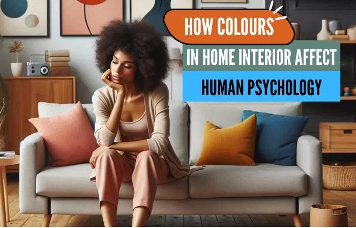
Transform Your Home with Colour:
When it comes to decorating your home, choosing the right colours can make a huge difference. Colours aren’t just about looks; they can influence how you feel and behave.
Here is the list of colours and how these colours affect human emotions. You will also find inspiration on how to Use Colour Psychology to create a happy and harmonious living space.
(1) The Role of Different Colours and the Emotions They Evoke
(1.1) Red:
This colour is bold and energetic. It’s known to increase excitement and passion.
Red can boost your energy levels and create a sense of urgency.
Emotions associated with Red: Excitement, passion, energy, urgency, love, determination, anger
Best for: Living rooms and dining areas where you want to create a lively atmosphere. However, too much red can be overwhelming, so it’s best used as an accent rather than the main colour.
Related Read: Unlocking Vibrancy-Things to Consider When Selecting Wall Paint Colours
(1.2) Blue:
Blue is calming and serene. It’s perfect for bedrooms and bathrooms where relaxation is key.
Blue can lower heart rates and promote a sense of tranquillity.
Emotions associated with Blue: Calmness, serenity, tranquillity, relaxation.
Best for: Bedrooms and bathrooms where relaxation is key. Lighter shades of blue can make a room feel spacious and airy, while darker blues bring a cozy, intimate feel.
Inspirational Images for Blue in Home Interiors here.
You might also like: 7 Timeless and Popular Sofa Colours that never go out of style.
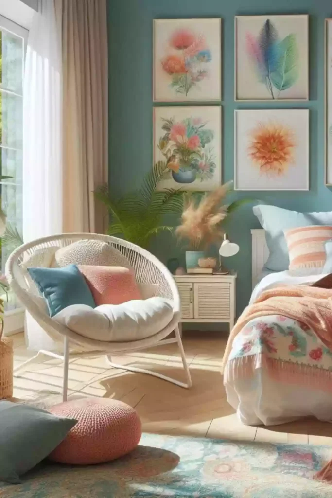
(1.3) Yellow:
Bright and cheerful, yellow is associated with happiness and energy.
Yellow can inspire joy and optimism, making spaces feel lively.
Emotions associated with Yellow: Happiness, optimism, cheerfulness, energy.
Best for: Kitchens and dining rooms, as it can stimulate appetite and conversation. Be mindful of using too much yellow, though, as it can be tiring on the eyes and lead to feelings of frustration.
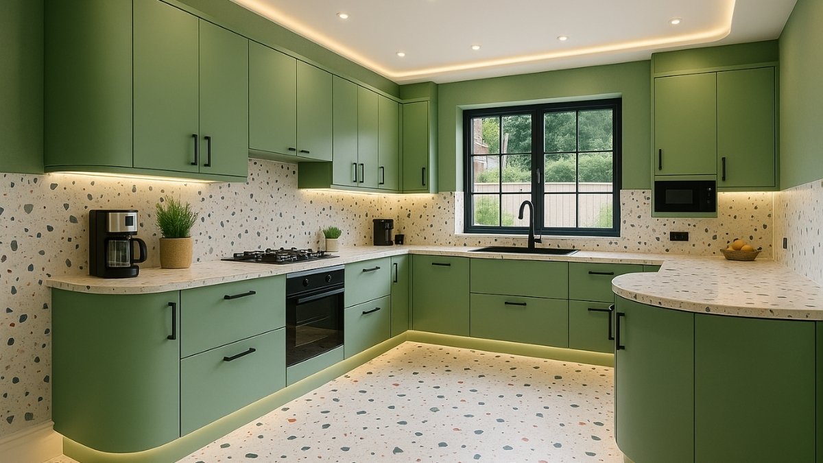
(1.4) Green:
Green is the colour of nature and balance. It’s very soothing and can create a refreshing and restful environment.
Green can evoke feelings of renewal and harmony.
Emotions associated with Green: Soothing, balance, renewal, harmony.
Best for: Living rooms and bedrooms. It also helps to reduce stress and promote healing.
Inspirational Images for Green in Home Interiors here.
(1.5) Purple:
Purple is luxurious and creative.
Purple can stimulate imagination and convey a sense of elegance.
Emotions associated with Purple: Luxury, creativity, imagination, elegance.
Best for: Bedrooms with lighter shades like lavender for restfulness and living spaces with deeper purples for a sense of sophistication and drama.
(1.6) Orange:
Like red, orange is energetic and enthusiastic.
Orange can encourage social interaction and enthusiasm.
Emotions associated with Orange: Energy, enthusiasm, social interaction, excitement.
Best for: Exercise rooms or creative spaces where you want to boost activity and excitement. Use it sparingly, though, as too much orange can be overwhelming.
(1.7) White:
White is clean, simple, and pure.
White can create a sense of space and cleanliness.
Emotions associated with White: Cleanliness, simplicity, purity, spaciousness.
Best for: Any room. It can make spaces feel open and airy but can sometimes feel sterile if not balanced with warmer accents or textures.
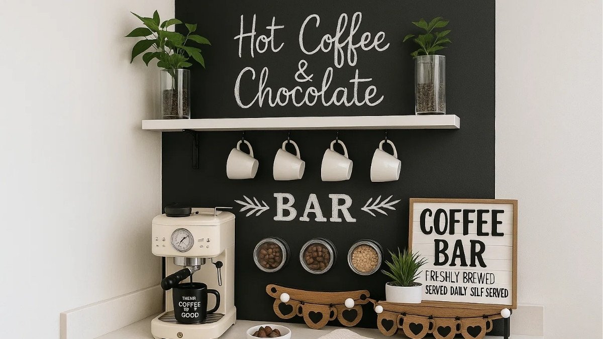
(1.8) Black:
Black is elegant and powerful. Black can add depth and drama to a space.
Emotions associated with Black: Elegance, power, depth, drama.
Best for: Accent pieces in any room. It can add depth and sophistication but can make a room feel small and oppressive if overused.
(1.9) Grey:
Grey is neutral and balanced.
Grey can create a sense of calm and modernity.
Emotions associated with Grey: Neutrality, balance, calmness, modernity.
Best for: Living rooms and bedrooms. It can create a calm and sophisticated atmosphere and works well with many other colours.
(1.10) Brown:
Brown is warm, comforting, and stable. Brown can provide a sense of security and grounding.
Emotions associated with Brown: Comfort, warmth, stability, security.
Best for: Living rooms, libraries, and study areas. It provides a grounded and cozy atmosphere.
(1.11) Lilac:
Lilac is soft and soothing, promoting a sense of peace and calm.
Lilac can evoke feelings of serenity and subtle elegance.
Emotions associated with Lilac: Serenity, peace, subtle elegance, tranquility.
Best for: Bedrooms and quiet spaces where relaxation and tranquillity are desired. It combines the calming effects of blue with the uplifting energy of red.
(1.12) Sage Green:
Sage green is calming and rejuvenating.
Sage green can bring a touch of nature indoors, enhancing a sense of tranquillity.
Emotions associated with Sage Green: Calmness, rejuvenation, nature, tranquility.
Best for: Kitchens and bathrooms. It evokes a sense of nature and freshness, promoting relaxation and well-being.
Inspirational Images for Green in Home Interiors here.
(1.13) Golden:
Golden tones are warm, luxurious, and uplifting.
Golden can create a feeling of warmth and prosperity.
Emotions associated with Golden: Warmth, luxury, opulence, prosperity.
Best for: Accent pieces in living rooms, dining rooms, and entryways. They create a rich and inviting atmosphere.
(1.14) Silver:
Silver is sleek, modern, and calming. Silver can add a touch of sophistication and coolness.
Emotions associated with Silver: Sophistication, coolness, modernity, calmness.
Best for: Contemporary settings, especially in living rooms and bathrooms, providing a cool and refined ambiance.
(2) How to Use Colour Psychology in Your Home:
Start with a Plan: Think about the purpose of each room and the emotions you want to evoke. For example, if you want your bedroom to be a calming retreat, lean towards blues and greens.
Consider the Size and Lighting: Lighter colours can make small rooms feel larger and more open, while darker colours can make large spaces feel cozier. Natural light also affects how colours appear, so test paint samples in different lighting conditions.
Balance is Key: While it’s tempting to go all out with your favourite colour, moderation is crucial. Use strong colours as accents rather than the main focus to avoid overwhelming the space.
Personal Preference Matters: Ultimately, the colours that make you happy are the best choices for your home. If a certain colour brings you joy, find a way to incorporate it, even if it’s just through accessories or artwork.
(3) Wrapping Up:
By understanding the psychology of colours, you can create a home that not only looks beautiful but also feels right. Your home should be a reflection of your personality and a place where you feel comfortable and happy.
Happy decorating!