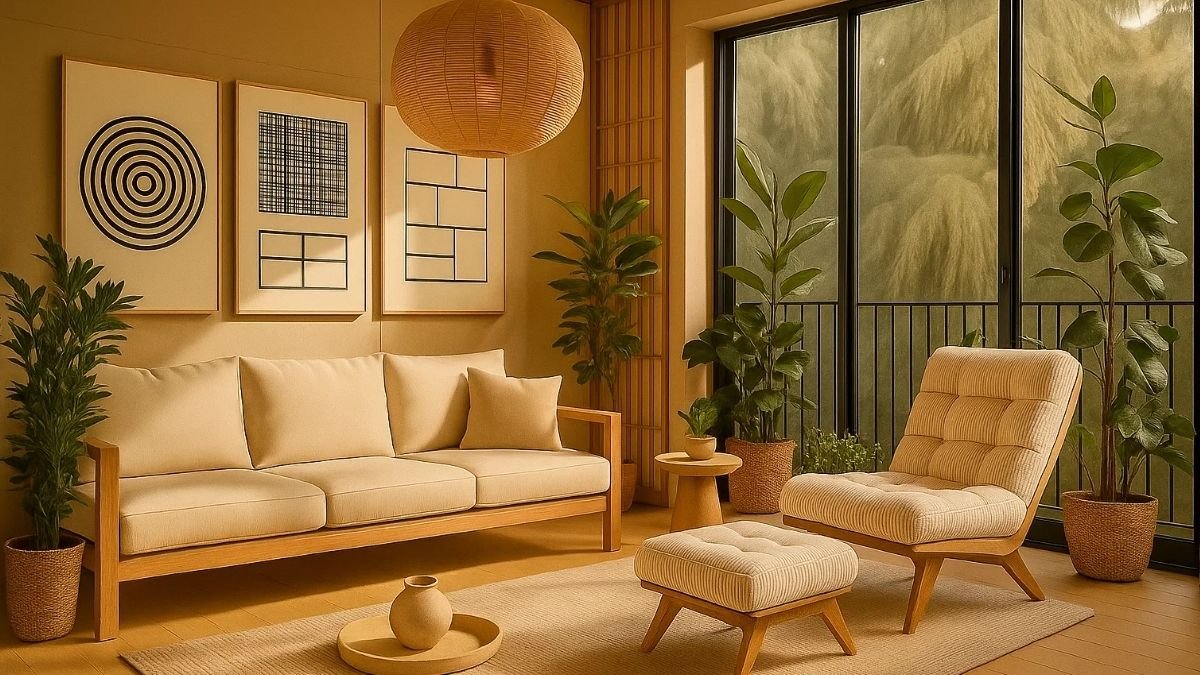
Common Interior Design Mistakes can happen even in the most beautifully designed homes. You know that feeling when you walk into a space where everything looks expensive and carefully chosen — yet something still feels off? The room feels impressive but oddly disconnected.
It’s not that the homeowner didn’t try; they probably tried a little too hard. Maybe every piece is competing for attention, the layout feels stiff, or the room just doesn’t flow. You can’t always explain it, but your gut knows when a space feels expensive yet uninviting.

That’s what we’re exploring today — those subtle, easy-to-miss interior design and decor mistakes that can quietly throw off even the most beautiful rooms.
If you’d rather skip straight to the practical list, scroll to Common Decorating Mistakes. But if you stick around, you’ll see a couple of real-life design examples that show how these mistakes happen — and how to avoid them in your own home.
Top 10 Tips For Tuscan Style Home Interior Design
Are White Kitchen Cabinets Going Out of Style? See for Yourself.
Learn from Real Homes to Avoid Common Interior Design Mistakes
As a designer, I’ve seen all kinds of homes — from the minimalist spaces that feel a little too empty, to the ones overflowing with color and personality. The truth? Most common decorating mistakes don’t come from bad taste. They happen when we decorate with enthusiasm but without direction.
Let’s look at a few real-life examples — the kind that make you smile, nod, and maybe even recognize your own space.
Case 1: The Sofa That Took Over the Room
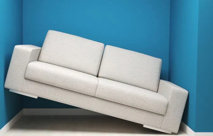
A lovely family ordered a big, plush L-shaped sofa — perfect for movie nights. But when it arrived, it wouldn’t fit through the apartment door. They removed an armrest, squeezed it in, and reassembled it inside. Problem solved? Not quite.
The sofa now takes up half the living room, leaving barely any walking space. And because they modified it, the warranty no longer applies.
Lesson: Always measure your doors, hallways, and room dimensions before buying furniture. Oversized pieces can make a room feel smaller, no matter how beautiful they are. Comfort should never come at the cost of practicality.
If you’re planning to buy a new sofa, check out our guides — Types of Sofas You Should Know Before Buying and 7 Timeless and Popular Sofa Colours That Never Go Out of Style — to help you make a smarter, long-lasting choice.
Case 2: The Color Overload

My friend loves color — and it shows. Bright walls, patterned curtains, floral cushions, and a geometric rug all in one room. Each item was gorgeous, but together they fought for attention. The result? A space that felt busy instead of cheerful.
Lesson: Think of color as conversation, not competition. Use bold shades thoughtfully, and balance them with neutrals or textures that let the eye rest. Even the most colorful home needs moments of calm.
Learn more about choosing colors wisely in our detailed guides: Color Psychology in Interior Design: A Beginner’s Guide and How to Choose Wall Paint Colors—Before You Regret That First Coat!.
Case 3: When Everything Tried to Stand Out

In another home, every item was a statement piece — bold art, textured rugs, patterned wallpaper, dramatic lighting, sculptural furniture. Each element was stunning, but together they created visual chaos.
Lesson: Not everything in a room needs to be the star. Choose one or two focal points, then let the rest of the space support them. Great design feels balanced, not busy.
Want to learn how designers create that perfect balance? Read Principles of Interior Design to Make a Room Feel Just Right — it’s a great guide to understanding proportion, contrast, and visual flow.
Common Interior Design Mistakes
Every home has heart and effort behind it. Most common interior design mistakes don’t come from bad taste — they happen when we try a little too hard to make everything perfect.
Even a well-designed room can lose its charm when there’s no balance, no breathing space, or no natural flow.
Let’s look at the most common decorating mistakes people make — and more importantly, how to fix them. Because good design isn’t just about what you add to a room; it’s about what you edit, simplify, and make feel right.
1. Neglecting Space Planning
One of the most common interior design mistakes isn’t about color or style — it’s poor space planning.
A room might look perfect in photos but still feel uncomfortable if the layout ignores how people actually move and use the space.
Think of dining tables blocking balcony doors, beds pressed against wardrobes, or sofas facing away from the TV. These aren’t bad ideas — just skipped planning.
A well-planned room quietly supports your daily life. You can move around easily, reach for things naturally, and everything feels like it’s in the right place. Poor planning, however, makes you bump into furniture and feel frustrated.

Space planning is really about flow — how life moves through your home. Before buying or arranging furniture, think about how you move each morning, relax in the evening, or host guests.
And remember not every space needs to be filled. What you leave open — the negative space — is just as important. It’s the area that lets your room breathe and keeps it balanced. Without it, spaces feel heavy and cluttered, like reading a paragraph with no punctuation.
If you want to see your space like a designer, start with How to Draw a Floor Plan and Understand It Like a Designer and How to Train Your Eye for Good Home Decor: A Beginner’s Guide — both will help you visualize how flow and proportion come together to make a room feel right.
🧭 Cozy Haven Tales’ Expert Tip:
- Map your daily flow: Walk through your space before setting furniture. Imagine daily routines.
- Keep clear paths: Leave at least 3 feet of walking space between major pieces.
- Test everything: Make sure doors, drawers, and windows open fully.
- Design for life, not just looks: Comfort should guide your choices.
A well-planned room doesn’t just look nice — it feels effortless to live in.
2. Oversized Furniture: When comfort eats the room.
Another one of the common decorating mistakes is choosing furniture that’s too big for the space.
You fall in love with a big, comfy sofa — it looks amazing in the showroom. Then it arrives, and suddenly your living room feels half its size.
Oversized furniture doesn’t just take up floor space; it blocks movement and light. You end up crowding corners and covering windows, wondering why your home feels smaller even after adding comfort.

The problem isn’t the sofa — it’s scale. What looks perfect in a large store can overwhelm your living room. Furniture should invite you in, not make you squeeze past.
🧭 Cozy Haven Tales’ Expert Tip:
- Think beyond fit: Measure usable space, not just dimensions on paper.
- Allow breathing room: Keep 18–24 inches between furniture and walls, and 3 feet for walkways.
- Plan for movement: Leave space for doors and drawers to open easily.
- Stay flexible: Try modular or multi-purpose pieces like sectionals and nesting tables.
The right scale makes your room feel open, balanced, and easy to move through. True coziness comes from comfort and space to breathe.
3. Losing the Balancing Act: When proportions don’t match.
Another most common interior design mistake is forgetting about proportion — when the size of furniture or decor pieces doesn’t look right together.
Maybe you’ve seen a large sofa next to a small side chair, or a big dining table surrounded by delicate chairs. Each piece might look great on its own, but together they feel mismatched.

Proportion is what keeps a room looking balanced and comfortable. It’s not about making everything the same size — it’s about how pieces relate to each other and to the space. When one thing feels too big or too small, the room starts to look awkward or incomplete.
A coffee table that’s too short for the sofa, lamps that look too small next to the bed, or artwork that’s undersized for a wide wall — these little details quietly throw off the flow of your room.
🧭 Cozy Haven Tales’ Expert Tip:
- Match furniture scale: Pair large pieces with other medium or large items. A big sofa looks better with a proportionate coffee table or side chairs.
- Keep good ratios: A coffee table should be about two-thirds the length of your sofa. Dining chairs should match the height and presence of the table.
- Think vertical too: Artwork should fill roughly two-thirds of the wall above a piece of furniture — not look lost or oversized.
- Step back and check: Take a quick photo of the room. Your eyes should move easily from one element to another without anything feeling out of place.
When the proportions feel right, your room instantly looks calmer, more polished, and naturally welcoming — no extra styling needed.
4. No Focal Point – When the Room Doesn’t Know Where to Look
A very common mistake is skipping a clear focal point. You walk into a room, and your eyes don’t know where to land — the TVs on one wall, a mirror shines from another, and a chandelier competes for attention. Everything stands out, but nothing connects.
When everything tries to be the star, the room loses direction.

Every space tells a story. A living room might be about connection — laughter, conversations, movie nights. But if the layout scatters attention, that story disappears. The same goes for bedrooms where the bed, vanity, and TV all compete for attention.
A focal point doesn’t have to be fancy — it could be a fireplace, a window view, or a favorite art piece. Once you decide what the “hero” of the room is, everything else should quietly support it.
🧭 Cozy Haven Tales’ Expert Tip:
- Pick your focal point: Choose the element you want to highlight — art, view, fireplace, or TV.
- Anchor your layout: Arrange furniture, lighting, and decor to emphasize it.
- Simplify distractions: Keep the rest of the decor calm so the focus stands out.
A strong focal point gives your space direction and calm — like punctuation in a sentence. Without it, even beautiful rooms can feel unfinished.
5. Bad Lighting – a Beautiful Room Still Feels Flat
Lighting is the quiet mood-maker of every home — it decides whether your space feels warm and alive or dull and lifeless.
You can have great furniture, colors, and décor, but if your lighting is wrong, everything looks flat.
I’ve seen beautiful living rooms with just one harsh ceiling light — the kind that makes everyone feel like they’re being interviewed. Or bedrooms with only a bright tube light — fine for chores, terrible for relaxing.

That’s why lighting is one of the most common interior design mistakes — people think brightness is enough, but it’s really about layers and atmosphere.
Morning light should gently wake you up, not glare in your eyes.
Evening light should help you slow down, not make your home feel like a store.
And when guests visit, a mix of soft and warm lights adds depth, coziness, and charm.
Too many homes rely only on ceiling lights — the result is flat shadows, dull corners, and no mood at all. You lose the warmth that makes a room feel inviting.
🧭 Cozy Haven Tales’ Expert Tip:
- Layer your lighting: Mix ceiling lights with floor lamps, table lamps, or wall sconces.
- Use dimmers: Adjust brightness to match the mood — bright for cleaning, soft for dining or relaxing.
- Highlight intentionally: Point a warm light at an art piece, a plant, or a textured wall to add instant depth.
- Match the tone: Use soft yellow light in bedrooms, warm white in living areas, and neutral white in kitchens or bathrooms.
Lighting isn’t just decoration — it’s direction. It guides how you feel in your space, from your first coffee to your quiet nights.
6. Losing Your Identity in Trend Waves – When “Pinterest Perfect” Feels Like Everyone Else’s Home
Here’s another one of the common design mistakes — letting trends take over your personality.
We’ve all done it: saved a dreamy Pinterest room, copied an Instagram reel, and thought, “That’s my dream home!” But when you finally recreate it, it somehow doesn’t feel like you.
Your home should tell your story — not Pinterest’s.

I’ve visited homes that looked beautiful in photos but felt oddly empty in person. Everything was trendy — boucle chairs, checkerboard rugs, arched mirrors — but there was no warmth, no soul. It looked like it belonged online, not to the people living there.
Trends are fun to explore, but they fade fast. Your home shouldn’t change every time a new color or style goes viral. What makes a home truly timeless are the personal touches — a vase from your travels, your grandmother’s table painted fresh, or a local handmade artwork.
Those small stories give your home its heart.
🧭 Cozy Haven Tales’ Expert Tip:
- Use trends wisely: Treat them like spices — a little adds flavor, too much overwhelms.
- Personalize your space: Mix in meaningful items — heirlooms, local art, travel finds.
- Blend styles: Pair something modern with something personal — a sleek sofa with a handmade rug, a vintage table with new lighting.
- Pause before you buy: Ask, “Does this feel like me, or just like everyone else’s feed?”
Trends come and go. But when your home reflects you, it stays timeless — and always feels right.
7. Drowning in Darkness – When Deep Colors Shrink Your Space and Energy
Dark colors can be gorgeous — elegant, cozy, dramatic. But in small spaces, they can easily go from moody to gloomy.
This is one of the common decorating mistakes that sneaks up on you. I’ve seen small living rooms painted in navy or charcoal with dark furniture and heavy curtains. At first, it looks rich and stylish — but after a while, it starts to feel heavy and closed in.

Color affects how we feel. Dark tones absorb light, making small rooms feel smaller and darker, especially when there’s not much natural light. The space starts to feel like it’s closing in on you instead of wrapping you in comfort.
That doesn’t mean you should avoid dark colors — you just need balance.
🧭 Cozy Haven Tales’ Expert Tip:
- Use darks wisely: Paint one accent wall in a deep tone, and keep the others lighter.
- Bounce the light: Add mirrors, metallic décor, or pale flooring to reflect brightness.
- Mix textures: Combine matte walls with soft fabrics or woven materials to keep it cozy but open.
- Balance top to bottom: Keep darker tones lower (like rugs or sofas) and lighter shades higher (walls or curtains) to lift the room visually.
If your space already feels heavy, start small — swap dark curtains for lighter ones, or remove bulky dark furniture.
Layer in soft whites, creams, or muted colors to let the light return.
Dark tones aren’t the villain — they just need space and light to shine. The secret is contrast — that’s what brings life and balance to your home.
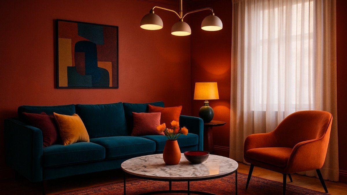
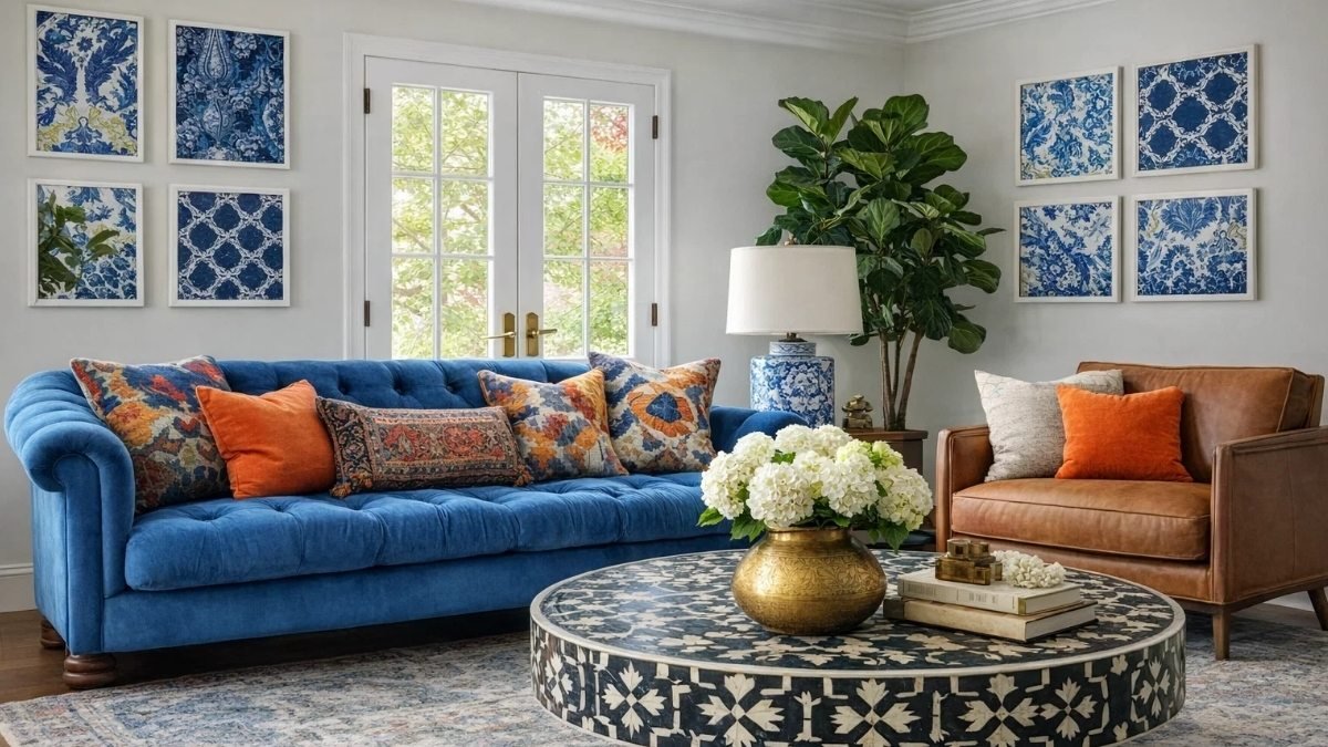
8. Color Chaos – When Every Shade Wants the Spotlight
Color is one of the easiest ways to show personality — and one of the quickest ways to overwhelm a space.
When every color tries to be the star, harmony disappears.
I’ve seen homes where every room tells a completely different story — a bright blue living room, a maroon dining space, a teal kitchen, and a mustard bedroom. Each color might be beautiful on its own, but together they feel chaotic — like flipping TV channels too fast.

That’s what happens when there’s no color balance — when every hue fights for attention instead of working together.
Color harmony isn’t about being safe or boring. It’s about rhythm — giving your eyes time to rest between strong statements. Too much excitement everywhere, and even a cheerful home starts to feel restless.
One of the most common decorating mistakes I’ve seen is people choosing a color they loved in a magazine without considering their home’s lighting, furniture tones, or how it connects to other rooms. The result? A palette that competes instead of complements.
🧭 Cozy Haven Tales’ Expert Tip:
- Follow the 60-30-10 rule — it’s an easy formula for color balance.
- 60% dominant color: walls, floors, large furniture (your main backdrop).
- 30% secondary color: rugs, curtains, or smaller furniture that complement the main tone.
- 10% accent color: pillows, art, or décor that add personality and energy.
- If your home already feels like a rainbow, start editing. Choose one main color you love and tone down the rest.
- Test new colors through accessories before committing to paint or furniture.
Great design doesn’t silence color — it gives each shade its own moment to shine.
9. The Texture Trap – When Everything Looks Perfect but Feels Lifeless
You walk into a room — shiny floors, glossy panels, sleek furniture, gold accents — it looks beautiful, but something feels missing. It’s stunning, yet strangely cold.
That’s the power (and absence) of texture.
Skipping texture is one of those common decorating mistakes that can make even a luxurious room feel flat. When everything is smooth and reflective, there’s nothing for the senses to connect with.

A home without texture is like music without rhythm — technically right, but emotionally empty. Texture adds warmth, depth, and life — it’s what makes a room feel lived in and welcoming.
Think about the softness of a rug, the grain of wood, the weave of a linen cushion — these layers bring comfort to the eye and to the touch.
🧭 Cozy Haven Tales’ Expert Tip:
- Mix materials: Combine wood with metal, stone with fabric, matte with gloss.
- Add warmth: If floors and walls are shiny, balance them with woven baskets, pottery, or textured fabrics.
- Use textiles: Curtains, rugs, and throws are your easiest texture tools.
- Layer naturally: A knitted throw over a smooth sofa instantly adds comfort and charm.
Take a quick walk around your home — touch, don’t just look. If everything feels the same, it’s time to add contrast. Even a small change — like a jute rug or a fabric headboard — can completely shift the mood.
A beautiful home shouldn’t just please the eyes — it should invite you to reach out and feel.
10. Too Many Accessories – When Style Turns into Clutter
Accessories are like seasoning — a little adds flavor, but too much ruins the dish.
One of the easiest common decorating mistakes is over-accessorizing. I’ve walked into homes where every surface is covered — candles, plants, books, photo frames, souvenirs — each one lovely, but all together overwhelming.

When there’s too much to look at, the eye stops seeing beauty and only sees busyness.
We often keep things out of attachment or guilt: “It was a gift,” “It was expensive,” “It looked great in the store.” Over time, that turns your home into a collection of stuff instead of a calm space.
And the irony? The more decor you have, the harder it is to clean or enjoy it.
🧭 Cozy Haven Tales’ Expert Tip:
- Give space to breathe: Empty areas are just as important as decorated ones.
- Curate, don’t clutter: Group décor in small clusters — like a vase, a candle, and a book — instead of scattering items everywhere.
- Create height and contrast: Mix tall and short pieces to add interest without chaos.
- Let one star shine: Each surface should have one main feature, not ten competing ones.
Take a quick photo of your room — it helps you see what your eyes miss daily. Remove half of what’s on display, and suddenly everything left feels intentional, elegant, and peaceful.
Design isn’t about how much you show — it’s about what you choose to highlight.
11. Forgetting Traffic Flow – When Beautiful Rooms Become Obstacle Courses
A home should move with you, not against you.
Yet one of the most common decorating mistakes is ignoring traffic flow — when furniture looks good in photos but makes daily life a struggle.
I’ve seen homes where you have to sidestep ottomans, squeeze past chairs, or detour around planters just to get across the room. It all looks perfect for a picture, but living in it feels like an obstacle course.

You notice it most when you’re carrying laundry, rushing out with a mug, or hosting guests — the beautiful layout suddenly feels inconvenient.
Good design should move with you.
🧭 Cozy Haven Tales’ Expert Tip:
- Think like a city planner: Your hallways are streets, furniture are buildings — keep clear routes.
- Leave enough space: Allow at least 3 feet for walkways and about 18 inches around seating for comfort.
- Avoid sharp corners: Especially near doors or narrow areas — safer for kids and elders.
- Define zones: In open layouts, use rugs or lighting to separate spaces instead of bulky dividers.
Do a simple “walk test.” Carry a tray or laundry basket and walk your usual route — if you have to twist or sidestep, adjust the layout.
A well-designed home feels like a smooth dance — effortless, natural, and perfectly in rhythm with your life.
12. The Small Rug Mistake
A rug should bring a room together, not make it feel like everything’s floating. But this is also one of those decorating mistakes that quietly throw off balance.
A rug that’s too small can make even a beautiful room feel awkward and unfinished. The furniture ends up looking scattered — the sofa and chairs drift apart, and the space loses that cozy sense of connection.

A good rug anchors your room, defines zones, and adds instant warmth. Without it, everything feels a little bit “off,” no matter how nice your furniture is.
🧭 Cozy Haven Tales’ Expert Tip:
Choose a rug that connects your furniture. In the living room, at least the front legs of your sofa and chairs should rest on it. In dining areas, it should extend about 24 inches beyond the table so chairs stay on it when pulled out. In bedrooms, let it stretch at least 18–24 inches past the bed for a soft, grounding touch.
The right rug doesn’t just decorate your floor — it completes the story of your room.
13. Hanging Curtains Too Low – When Windows Lose Their Drama
Curtains are like the eyeliner of a room — subtle, but powerful. Hung right, they make your space feel taller, brighter, and more graceful. Hung wrong — too low or too short — they instantly shorten your walls and dull the elegance.
Another common decorating mistake people make is hanging curtains just above the window frame because it feels “safe.” But that safety zone actually cuts your wall height visually, making the room feel smaller and boxed in.

I once visited a home with gorgeous high ceilings, but the curtains stopped at window height. Once we raised the rods closer to the ceiling, the difference was amazing — the space looked taller, softer, and more luxurious.
🧭 Cozy Haven Tales’ Expert Tip:
Hang your curtains high and wide. Mount rods about 6–8 inches above the window frame — or as close to the ceiling as you can — and extend them 6–10 inches beyond each side. Let the curtains just touch the floor for that elegant, custom look. If your current curtains are too short, add a fabric border at the bottom — it looks intentional and stylish.
When curtains frame light the right way, your entire room feels taller, brighter, and instantly more refined.
14. Hoarding Too Many Things – When Comfort Turns into Clutter
We all start with good intentions — “It’s sentimental,” “It still works,” “It was a gift.” But before long, you’re surrounded by more stuff than space to breathe.
This decorating misstep happens more often than you’d think. Clutter doesn’t just fill shelves — it fills your mind. When every surface is crowded, your eyes never get to rest, and even beautiful pieces lose their impact.
A calm home isn’t one with nothing in it — it’s one where everything has meaning and a place to belong.

🧭 Cozy Haven Tales’ Expert Tip:
Be intentional with what you keep. Hold onto things that serve a purpose or truly make you smile — let go of the rest. Use hidden storage for everyday items and leave open space for your eyes to rest. And try the “one in, one out” rule — if something new comes in, something old should go.
A clutter-free home doesn’t feel empty — it feels peaceful, clear, and truly yours.

15. Hanging Wall Art at the Wrong Height – When Beauty Misses the Mark
Art should draw your eye and complement your space — not make you tilt your head to see it. Yet this is another decorating mistake that quietly throws off balance.
When art is hung too high, it feels disconnected from the furniture; too low, and it drags the wall down. You might not notice it right away, but you feel it — the wall seems off, and the design doesn’t flow.
I’ve seen stunning pieces hung almost to the ceiling, lost in empty space. Once lowered to eye level, the room instantly felt calmer, more polished, and naturally complete.

🧭 Cozy Haven Tales’ Expert Tip:
Keep artwork centered at about 57–60 inches from the floor — around average eye level. If it’s above furniture, leave 6–8 inches of space between the top of the furniture and the bottom of the frame. For gallery walls, treat the collection as one piece and keep the overall composition centered.
When art sits at the right height, it feels effortless — grounded, graceful, and perfectly in tune with your room.
16. Forgetting Vertical Space – When Design Stops at Eye Level
Most people design left to right — not up and down.
You plan the sofa, the table, the TV unit — everything beautifully arranged on the floor. But then you look around and realize: the top half of the room is empty. Everything happens below your shoulders, leaving a blank upper space that makes the room feel flat.
It’s a decorating mistake that quietly steals energy and dimension.

Vertical space is your secret weapon. It’s what makes a small home feel taller and a tall room feel balanced. Without it, even a stylish setup looks “bottom-heavy” — crowded at the base, bare on top.
Think of kitchens with cabinets that stop halfway to the ceiling or bedrooms where artwork sits too low and the walls above are empty. The eye stops moving halfway up and loses interest. That’s why tall curtains, vertical mirrors, pendant lights, and leafy plants feel so transformative — they lead your gaze upward and make the room feel alive.

🧭 Cozy Haven Tales’ Expert Tip:
Look at your space as a whole — floor to ceiling. Add at least one tall or upward-reaching element in each area: long drapes, tall shelves, hanging lights, or even a vertical plant. Try layering art at different heights or adding a mirror that draws the eye up.
When your home encourages the gaze to rise, it doesn’t just look taller — it feels more open, inspiring, and complete.
17. Not Having Dedicated Storage – When Style Meets Everyday Chaos
Clutter doesn’t always come from owning too much — it often comes from not having the right place to put what you own.
This is another common decorating mistake that turns stylish rooms into daily mess zones. A beautiful living room without storage quickly becomes a battlefield of books, cables, and coffee mugs. It looks perfect only until life actually happens.
A home without storage is like a designer bag with no compartments — lovely on the outside but chaotic inside. You can tell instantly when storage hasn’t been planned: remotes live on tables, toys spill under sofas, and the kitchen counter becomes a catch-all for everything.

Design isn’t about how a room looks when it’s staged — it’s how it functions when everyone’s home, tired, and living real life.
🧭 Cozy Haven Tales’ Expert Tip:
Plan storage as part of your design from the start. Built-ins, window benches, or ottomans with hidden compartments can hide the mess while adding charm. Use tall shelving to maximize space, and mix open and closed storage so display areas stay calm, not cluttered. Start with your “clutter zones” — entryways, coffee tables, kitchen counters — and add simple baskets or boxes where things pile up.
A beautiful home feels calm because everything has a place. When storage meets style, comfort finally feels effortless.
18. Not Allocating Budget in Proportion – When Style Meets Reality
Every dream design faces one reality check — the budget.
You start full of excitement, with mood boards and ideas flowing, but halfway through the project, the money’s gone and the walls are still empty.
It’s a budgeting mistake that happens far too often: splurging on one showstopper piece — a chandelier, an imported tile — and then having little left for the rest of the room.

Budgeting isn’t the boring side of design — it’s the backbone that makes it work. A smart plan gives you freedom, not limits. It helps you spend intentionally so your home looks cohesive and complete, not half-finished.
I’ve seen couples pour nearly half their budget into one luxury material, only to compromise later on lighting or furniture — and every time they walk into that space, it reminds them what they couldn’t finish.

🧭 Cozy Haven Tales’ Expert Tip:
Plan your spending by priority. Invest in what lasts — flooring, electricals, cabinetry, and furniture that supports daily comfort. Save on easily replaceable accents like cushions or décor. Keep 10–15% aside as a safety buffer for surprises.
Make a simple list of Must-Haves, Nice-to-Haves, and Wait-for-Later to stay clear. And remember — design isn’t about spending more; it’s about spending smart.
When your budget follows purpose, your home feels not just beautiful — but complete, balanced, and genuinely yours.
19. No Natural Elements – When Your Home Forgets to Breathe

Stylish, but missing that touch of life.
Have you ever noticed how instantly calmer you feel in a café with plants or by a sunny window? That’s the quiet magic of nature — it restores balance without asking for attention. Yet in so many modern homes, everything is synthetic: engineered wood, faux fabrics, LED lighting. It all looks sleek, but sometimes it feels sterile — like the room itself forgot to exhale.
Nature has a way of softening edges and grounding energy. A simple wooden table with visible grain, a linen cushion, or sunlight filtering through sheer curtains can make your home feel more human. Even the air feels different when a little greenery joins the scene.

🧭 Cozy Haven Tales’ Expert Tip:
Start small. Add one real plant — a snake plant, pothos, or ZZ plant — something easy to care for. Replace a plastic accent with something natural, like a wooden tray or woven basket. Let in natural light whenever possible and open the windows daily to refresh the air. If space allows, add a tall plant or a bowl of floating candles for a calming touch of movement.
When your home includes nature, it doesn’t just look better — it feels alive, grounded, and quietly at peace.
20. Picking Form Over Function – When Pretty Gets in the Way of Practical
We’ve all been there — that stunning chair that no one can sit on, the stylish lamp that barely lights a corner, or the dining table that looks perfect but leaves no room to pull out a chair.
This is another decorating mistake that happens more often than you’d think — choosing looks over living.
A home isn’t a showroom; it’s where life unfolds. I’ve seen homes where everything matched beautifully, yet nothing truly worked. The space photographed like a dream but lived like a museum — no comfort, no ease, no soul.

Good design isn’t just about what pleases the eye — it’s about what supports your daily life with grace.
🧭 Cozy Haven Tales’ Expert Tip:
Before you buy anything, test it. Sit on that chair, open that drawer, check if that lamp actually lights your space. Design for how you live, not how you want it to look in pictures. Invest in comfort — ergonomic seating, well-placed outlets, durable finishes — and let function shape the beauty around it.
A truly beautiful home isn’t perfect; it’s one where life flows easily — where you can kick off your shoes, spill a little coffee, and still feel completely at home.
21. Too Many Different Designs and Patterns – When the Room Forgets to Breathe
Variety brings character — but too much of it can feel like visual chaos.
I’ve seen homes where every corner competes for attention: patterned tiles, floral cushions, geometric rugs, carved furniture, and printed curtains all fighting for the spotlight. Each piece is beautiful, yet together, they overwhelm the senses.
It’s a classic decorating mistake — too much personality with no pause.

Design harmony isn’t about matching everything; it’s about creating rhythm and flow. When every pattern shouts, your eye never rests. But when you repeat subtle details — a shared color, texture, or tone — the whole space starts to breathe.
🧭 Cozy Haven Tales’ Expert Tip:
Find a thread that ties your rooms together — it could be a recurring material like wood, a shared color palette, or a consistent metal finish. Pair bold patterns with softer solids, and give your eyes some rest with neutral walls or plain upholstery. If your space already feels too busy, edit it gently — remove a few loud pieces and let one or two design heroes take the spotlight.
Harmony doesn’t mean dull — it means balance. When your home has rhythm, it feels calm, cohesive, and full of quiet beauty.
22. Furniture Against Walls – When Comfort Loses Connection
Ah, the classic “push everything to the wall” move — it feels like it creates more space, but in reality, it does the opposite.
When every sofa, chair, and console hugs the perimeter, your room starts feeling like a waiting area instead of a living space.

It’s a simple but widespread layout mistake — one that steals comfort and connection.
When furniture lines the walls, conversations stretch awkwardly across empty floors, and the energy of the room scatters. I once visited a lovely home where the furniture was perfectly placed — against every wall. It looked neat, but the family admitted they never actually sat there together. Once we floated the sofa inward and created a smaller circle, the room came alive.
🧭 Cozy Haven Tales’ Expert Tip:
Pull furniture away from the walls, even just a few inches. Arrange chairs and sofas to face each other around a central point — a rug, a coffee table, or a window view. Use the back of a sofa as a soft divider if your space is open. And remember, leggy furniture keeps things airy even when placed closer together.
Your living room isn’t meant to be a display — it’s meant to hold connection. When furniture gathers instead of clings to the edges, your home instantly feels warmer, more personal, and beautifully lived-in.
What Is a Good Design, Really?
So, after all these points, you might wonder — what is a good design?
It’s not about picture-perfect rooms or matching everything to the latest Pinterest trend. A good design is one that lives well.
It’s the way sunlight hits your breakfast table in the morning.
It’s having a place to put your keys every single day without thinking.
It’s the feeling of warmth when guests walk in and say, “It just feels good in here.”
Good design isn’t about grandeur — it’s about connection.
Every piece, color, and texture should quietly work together, not to impress, but to support the way you actually live.
A well-designed home has rhythm — a balance of light and shadow, color and calm, beauty and function. It’s the space where nothing screams for attention, yet everything feels seen.
So when you design or decorate, don’t chase “perfect.”
Chase peace.
Because a truly good design doesn’t just please the eye — it settles the soul.
Wrapping Up: Designing with Heart and Intention
Creating a home is a journey — sometimes messy, often magical.
You’ll make mistakes (we all do), but each one teaches you something about your habits, your comfort, and your rhythm of living.
Start where you are. Rearrange. Edit. Experiment.
Avoiding these common interior design mistakes isn’t about rules — it’s about awareness.
The goal isn’t a flawless house; it’s a space that feels unmistakably yours.
And remember — the best homes aren’t the ones that just photograph beautifully.
They’re the ones that welcome you back at the end of a long day and quietly whisper,
“You belong here.”
Loved these insights? Save this post or share it with a friend who’s planning their next makeover!
And before you go — tell me in the comments: which of these mistakes have you made (and secretly laughed about later)?
2 Comments