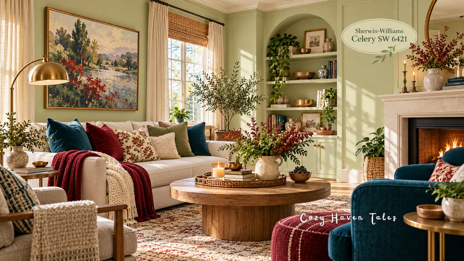
Quick answer: Sherwin-Williams Celery SW 6421 is a light green with a yellow undertone, so it looks best with bright warm whites, golden tans, and light wood. White Flour or Pure White make good trim. Woven Wicker and Cocoon give it weight. For accents, try Kirsch Red, Potentially Purple, or Georgian Bay. You’ll find every paint code in one list near the end. If you’re also looking at Benjamin Moore’s deep green pick, my guide to colors that go with Webster Green covers that one.

Celery is Sherwin-Williams’ 2027 Color of the Year, announced in September 2026. Pale greens are easy to love on a paint chip and surprisingly easy to get wrong on a wall. Below, I’ll show you the colors, materials, and rooms that make it look its best.
What Kind of Green Is Sherwin-Williams Celery?
Celery sits somewhere between a soft sage and a pale butter yellow. Sherwin-Williams describes it as a light herbal green with a gentle yellow undertone. In a room, it behaves almost like a neutral with a hint of color.
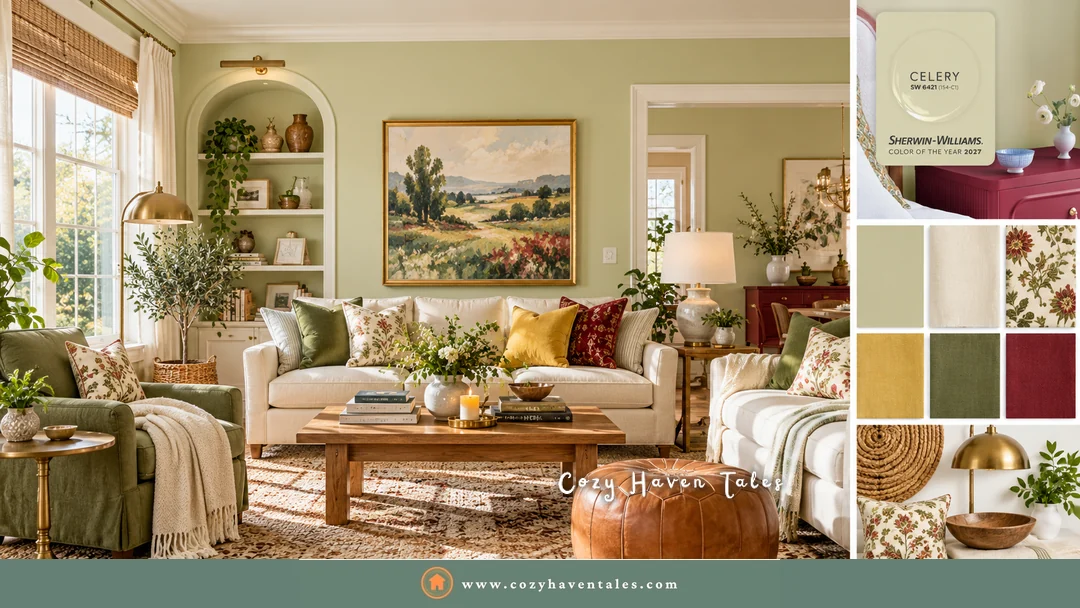
Because it’s so light, Celery changes a lot with the light in your room:
- Sunny rooms (south- or west-facing) bring out its warm, fresh side. This is where it looks prettiest.
- Shady rooms (north-facing) make it look cooler and a little gray. Test it there before you commit.
- Warm bulbs keep it soft at night. Very cool, bluish bulbs can make the yellow look sour.
Paint a large sample on two walls and look at it morning and evening. My guide on how to choose wall paint colors walks through testing step by step.
Quick Guide to Colors That Go With Celery
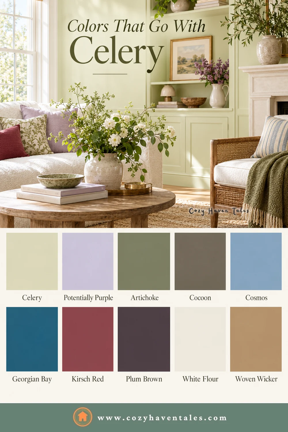
| Role | Sherwin-Williams colors | Why |
|---|---|---|
| Trim and ceilings | White Flour, Pure White, Alabaster, Queen Anne’s Lace | Brighter than Celery, so trim still looks like trim |
| Warm neutrals | Woven Wicker, Cocoon, Dovetail | Golden tan, khaki brown, and warm gray give the pale green weight |
| Green on green | Artichoke | A deeper olive for a tonal look |
| Bold accents | Kirsch Red, Plum Brown, Georgian Bay | Deep color stops Celery from looking faded |
| Soft accents | Potentially Purple, Cosmos | Pale lavender and dusty blue keep it gentle |
| Metals and wood | Aged brass, bronze, light and mid-tone oak | Warm finishes pick up the yellow undertone |
Most of these come straight from the palette Sherwin-Williams released with Celery. Queen Anne’s Lace is listed as a coordinating color on the Sherwin-Williams Celery color page. Pure White, Alabaster, and Dovetail are my own additions.
4 Celery Rooms and What Makes Them Beautiful
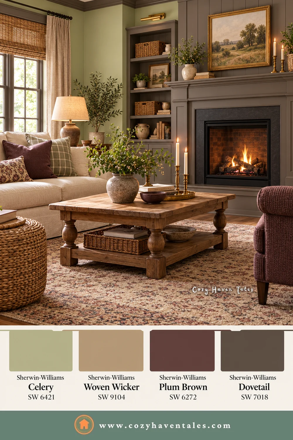
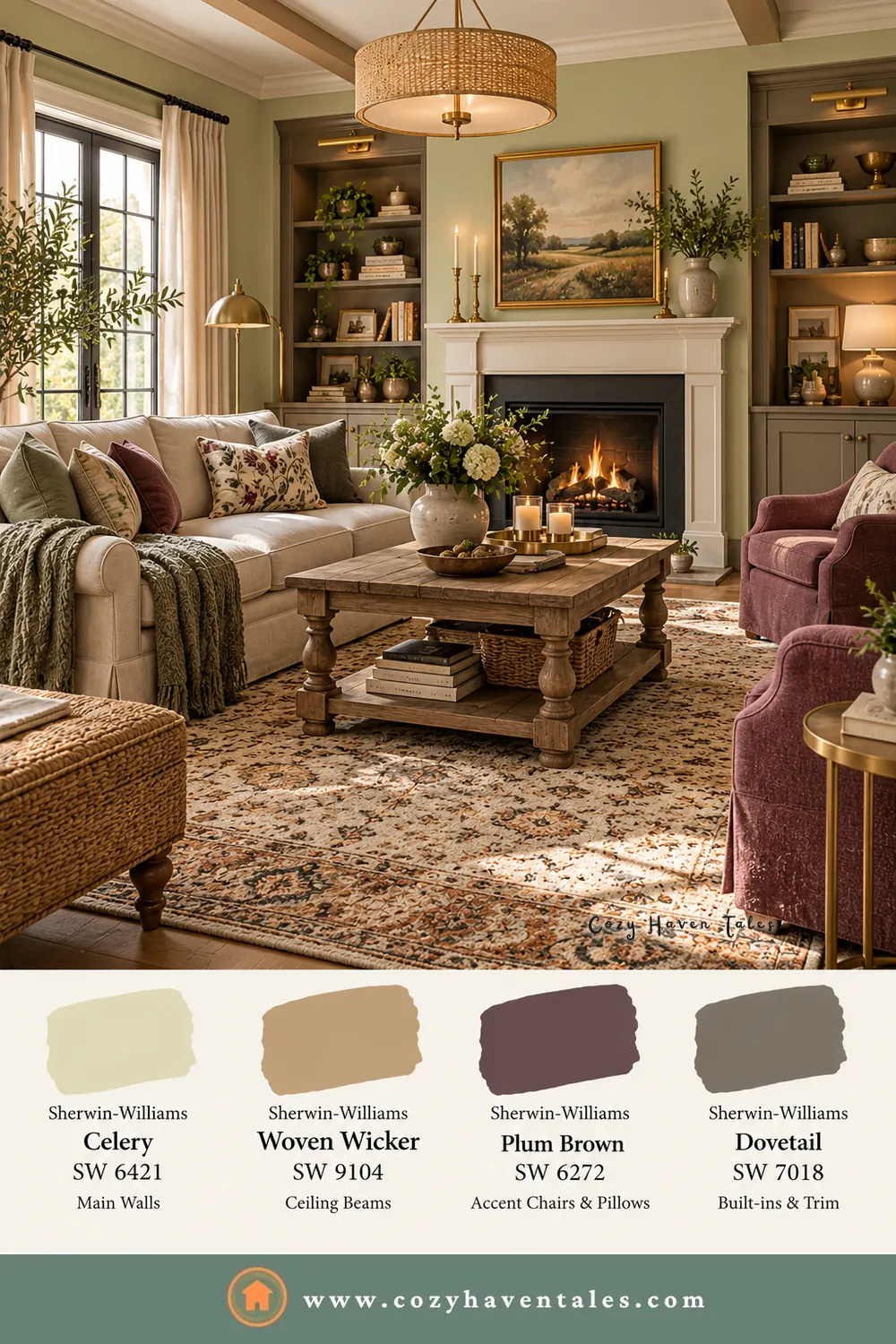
1. Celery with Woven Wicker, Plum Brown, and Dovetail. This country living room works because the darker colors do the heavy lifting. A warm gray fireplace wall, plum armchairs, and a busy rug sit around the pale green, so the walls feel fresh instead of faded.
2. Celery with deep teal. Georgian Bay on the built-ins and a velvet armchair gives the room one strong, cool color. The light green walls keep that teal from feeling heavy, and the gold in the art warms everything up.

3. Celery with a pop of red. Red and pale green are an old pairing, and here it feels modern. One big piece of red art, a few red pillows, and a throw are enough. The oak table and jute rug keep it relaxed.

4. Celery for winter. People think of pale green as a spring color, but it’s lovely in winter too. A caramel leather chair, a chunky knit throw, candles, and a fire make Celery feel warm and cozy.

Whites and Trim Colors for Sherwin-Williams Celery
This is where Celery is the opposite of a deep green. Next to a dark wall, almost any white stands out. Next to a light one, the white has to be clearly brighter, or the trim just blurs into the wall.
So I’d skip creamy whites that are almost as light as Celery itself. Shoji White is lovely, but next to Celery it can look like a tired version of the wall. Choose a brighter white instead:
- White Flour is the white Sherwin-Williams chose for the Celery palette. It’s warm and soft, so it doesn’t fight the yellow undertone.
- Pure White is crisper and more neutral. It suits rooms with lots of warm wood.
- Alabaster is a soft, creamy white that’s still bright enough for trim and ceilings.
- Queen Anne’s Lace is a pale, green-tinged white. On a ceiling, it carries a hint of the green overhead.
Cozy Haven Tales Pro Tip: You can also flip it. Paint the walls White Flour and put Celery on the doors, molding, or wainscoting in satin or semi-gloss. It gives a soft cottage look with very little risk.
Warm Neutrals That Ground It
A pale green on its own can feel a bit thin, like a summer dress in November. Warm neutrals give it a coat.
Woven Wicker is a golden caramel tan from the palette. On ceiling beams, a sofa, or a stack of baskets, it brings out the yellow side of the green.
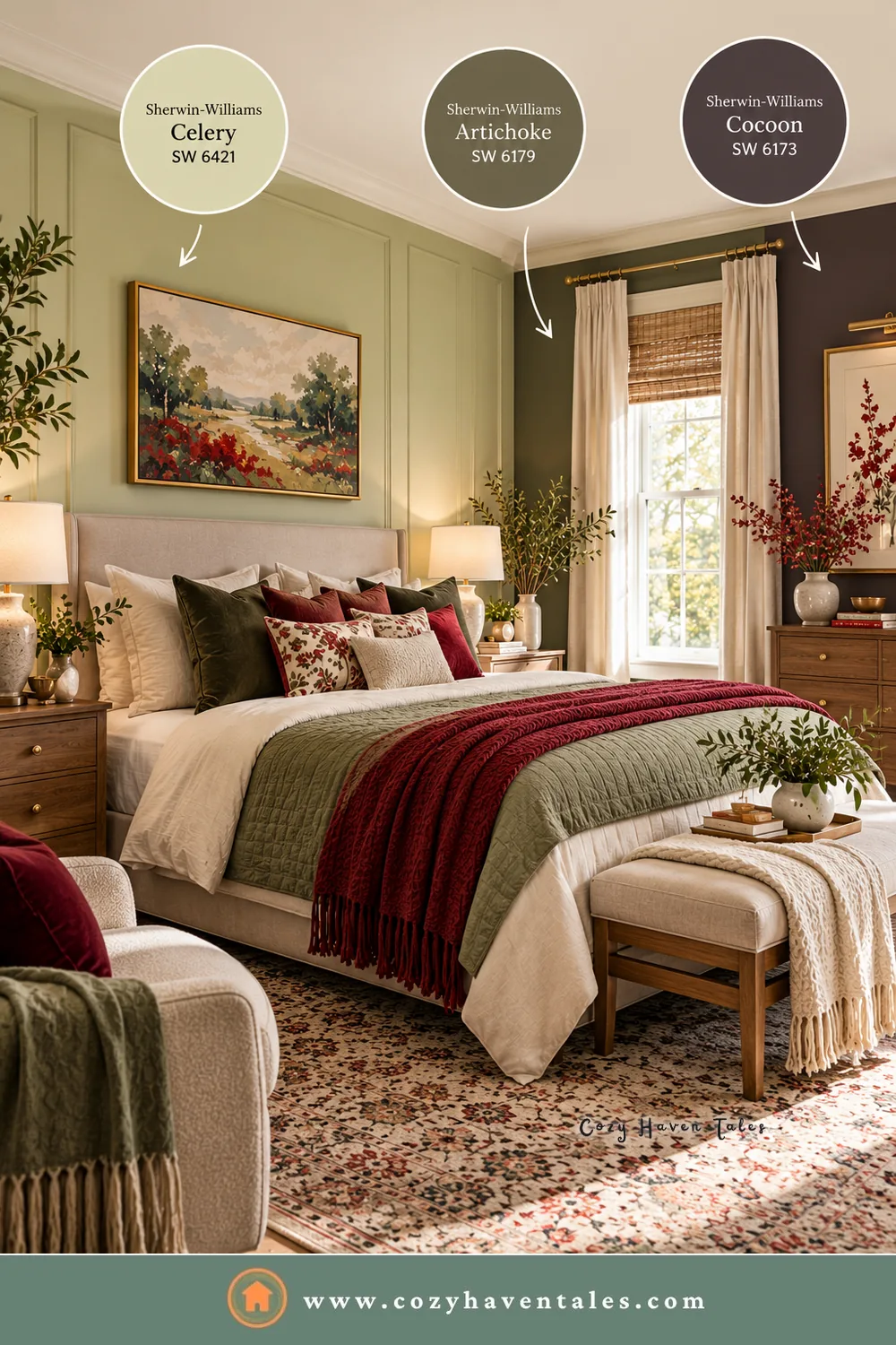
Cocoon is much deeper, a khaki brown with olive in it. It’s a smart pick for a kitchen island, a bookcase, or one accent wall in a bedroom.
Dovetail is a warm, earthy gray. On built-ins or a fireplace wall, it gives Celery a quiet, grown-up backdrop.
Enduring Bronze is another coordinating color on the Sherwin-Williams Celery color page. It’s a deep bronze brown for interior doors or a painted dresser.
One thing I’d avoid is cool blue-gray. Next to Celery, it makes the yellow undertone look sallow. Warm grays like Dovetail are fine.
Readers also loved: Color Psychology in Interior Design: A Beginner’s Guide
Accent Colors That Go With Sherwin-Williams Celery
Sherwin-Williams built a surprisingly bold palette around such a soft green. Celery needs some contrast, or it fades away. These are the accents I’d look at first:
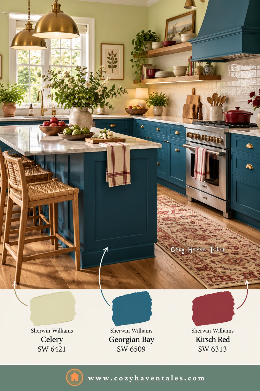
- Kirsch Red, a berry red. It feels cheerful next to Celery. Try it in a rug, cushions, or a quilt before a whole wall.
- Plum Brown, a near-black plum. It’s a good choice for a vanity, an accent chair, or picture frames.
- Georgian Bay, a deep teal blue. It’s lovely on a kitchen island, built-ins, or curtains.
- Potentially Purple, a pale lavender. Green and lilac feel fresh and a little unexpected in a bedroom.
- Cosmos, a dusty periwinkle blue. It cools the room down gently.
- Artichoke, a muted olive. Use it on lower cabinets or a lower wall for a two-green look.
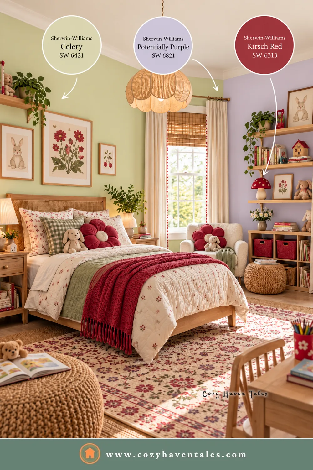
Pick one deep accent and one soft one per room, like the lavender and red in this child’s bedroom. For a color this gentle, that’s plenty.
Materials and Finishes That Work With It
Paint is only half the story. Celery looks its best next to warm, natural textures and materials:
- Aged brass and bronze for lighting and hardware. They pick up the yellow in the green.
- Light and mid-tone oak for floors, shelves, and furniture. Sherwin-Williams even matched the palette to a wood stain, Minwax Pickled Oak MW 260.
- Linen, cane, and woven pieces in cream and natural tones.
- Handmade tile and honed stone in kitchens and bathrooms.
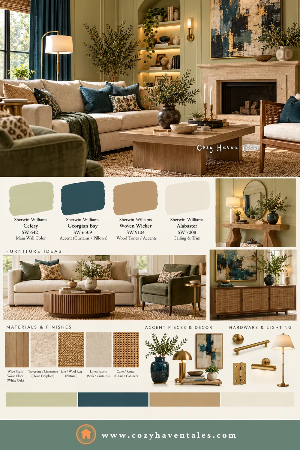
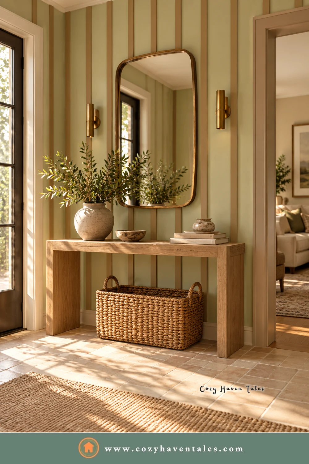
Chrome and glossy black can make Celery feel cold, so keep black to thin lines, like a frame. In this foyer, a stone console, a woven basket, and a brass lamp do all the work.

Where to Use Celery
Kitchens and breakfast nooks. Ashley Banbury, Sherwin-Williams’ color marketing manager, names kitchens among the best spots for it. Celery on the walls or upper cabinets, with a deeper color like Georgian Bay on the island, feels cheerful without shouting. Brass pendants tie the two together. My sage green kitchen cabinets shows a grayer take on the same idea.

Sunrooms and bedrooms. Bright rooms let the yellow undertone glow. In a bedroom, pair it with White Flour trim and soft lavender bedding, or go richer with a plum accent wall and a burgundy throw.

Entryways and front doors. Banbury also likes it in entryways, where a small space gives the color quick impact. Outside, a Celery door with bronze hardware suits a white or cream house. My post on front door colors has more ideas.
Trim, wainscoting, and ceilings. The low-risk way in, with no four-wall commitment.
Where I’d be careful: dark, north-facing rooms with little daylight. Celery can look flat there, and a deeper color usually does better.
Readers also loved: 24 Brilliant Living Room Paint Color Ideas You’ll Love
All the Sherwin-Williams Colors in This Post (With Codes)
Take this list to the paint store:
- Celery SW 6421 (main color)
- White Flour SW 7102
- Pure White SW 7005
- Alabaster SW 7008
- Queen Anne’s Lace SW 6420
- Woven Wicker SW 9104
- Cocoon SW 6173
- Dovetail SW 7018
- Enduring Bronze SW 7055
- Artichoke SW 6179
- Kirsch Red SW 6313
- Plum Brown SW 6272
- Georgian Bay SW 6509
- Potentially Purple SW 6821
- Cosmos SW 6528
Sherwin-Williams Celery: FAQs
It’s a warm green. The yellow undertone shows most in south and west light. North light makes it look cooler and a bit grayer.
White Flour is the palette’s own white. Pure White is a crisper option. Skip creamy whites that are almost as light as Celery, or the trim will disappear.
Yes. HGTV Home by Sherwin-Williams sells it at Lowe’s as Celery HGSW6421, and Sherwin-Williams stores carry it as SW 6421.
A light color like Celery lives or dies by its neighbors. Give it a brighter white, one warm neutral, and one deeper accent, and it will look fresh, not faded.
Helpful Resources
- Sherwin-Williams Color of the Year 2027: Celery SW 6421, the official page with the full coordinating palette and samples.
- The 10 Best Light Green Paint Colors from Kylie M Interiors, an e-designer’s close look at how pale greens behave in real rooms.