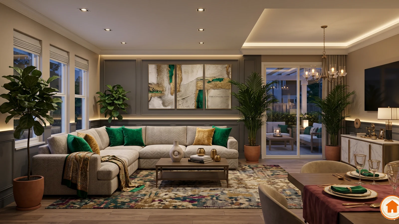
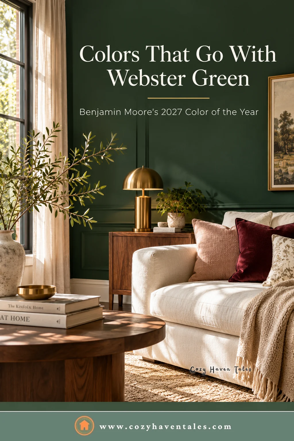
The colors that go with Webster Green HC-130, Benjamin Moore’s Color of the Year for 2027, are soft warm whites, golden tans, cream, and warm wood. For accents, it works well with burgundy, copper brown, dusty pink, and pale blue. Brass, walnut, leather, and natural linen are the textures and materials that make it look rich instead of heavy. Avoid stark, cool whites and bright, cool grays next to it, which make the green look flat and harsh.
Benjamin Moore announced Webster Green on October 14, 2026. It’s a deep green with real personality, and dark colors like this are less forgiving than a beige. The colors you put around it decide whether the room feels warm and settled or dark and closed in. Here’s how to choose them.
What Kind of Green Is Webster Green?
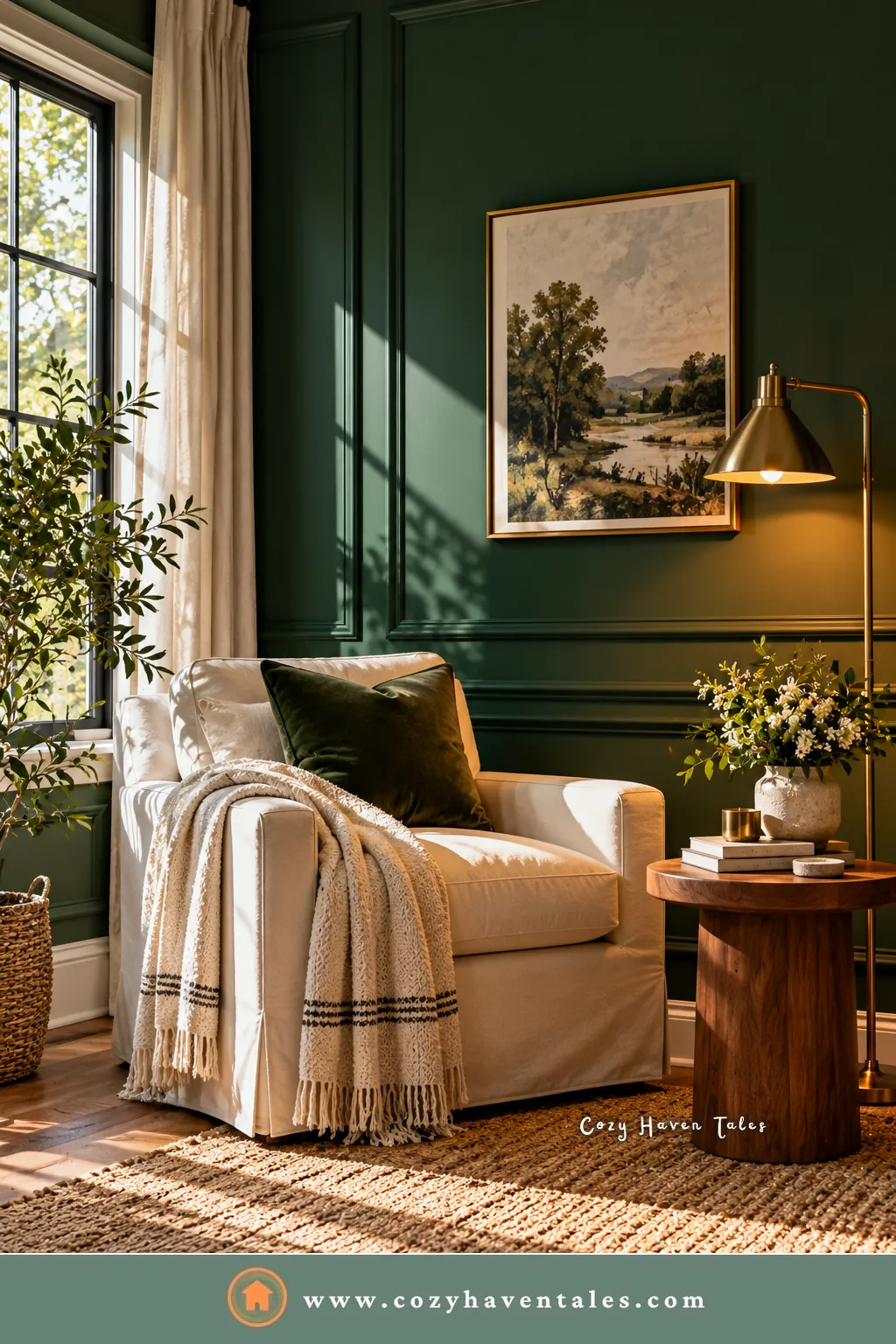
Webster Green sits between emerald and a dark evergreen. It’s saturated enough to read clearly as green, not as a near-black or gray-green. It’s part of Benjamin Moore’s Historical Collection (that’s what the “HC” means), so it was designed with traditional American homes in mind, though it suits modern rooms too.
Its light reflectance value (LRV) is around 20, which puts it firmly in the dark range. For comparison, most white paints sit between 80 and 90. In practice, that means:
- In a north-facing room, it will look darker and slightly cooler, especially in the afternoon.
- In a south- or west-facing room, warm light brings out a richer, deeper green.
- Under cool white bulbs, it can look flat. Warm bulbs around 2700K suit it best.
Benjamin Moore’s own Webster Green page, linked at the end of this post, lists its current details and coordinating colors.
Always test a large sample on two walls and look at it in the morning and in the evening before deciding. A small chip will look very different from a full wall. My guide on how to choose wall paint colors walks through testing step by step.
Quick Guide to Colors That Go With Webster Green
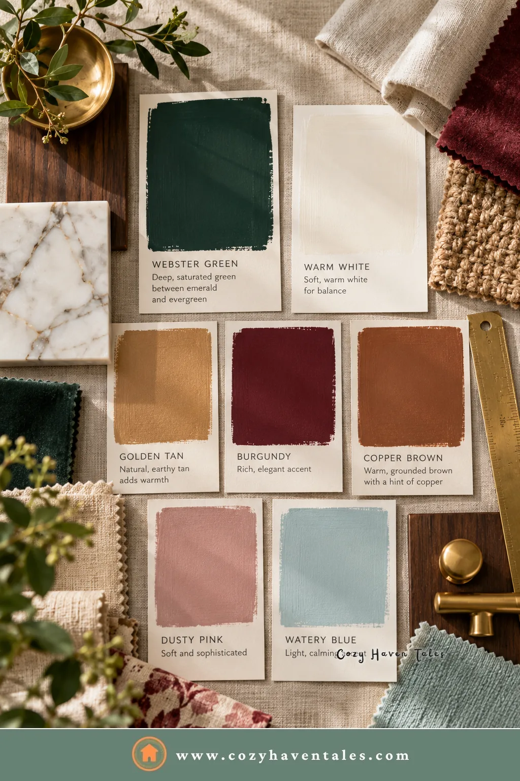
| Role | Colors that work | Why |
|---|---|---|
| Trim and ceilings | White Down OC-131, White Dove OC-17 | Soft, slightly warm whites that don’t glare against dark green |
| Main neutrals | Shakespeare Tan 228, warm cream, oatmeal linen | Warm and golden tones balance the cool edge of green |
| Deep accents | Townsend Harbor Brown HC-64, Antique Copper 1169 | Burgundy and spiced brown add warmth and depth |
| Soft accents | Wild Aster 1240, Nelson Blue CW-635 | Pale pink and watery blue lighten the mood |
| Metals and woods | Brass, walnut, oak, leather | Warm materials make the green glow |
All of the colors named above except White Dove are part of Benjamin Moore’s Color Trends 2027 palette, which was built around Webster Green.
Whites and Trim Colors That Go With Webster Green
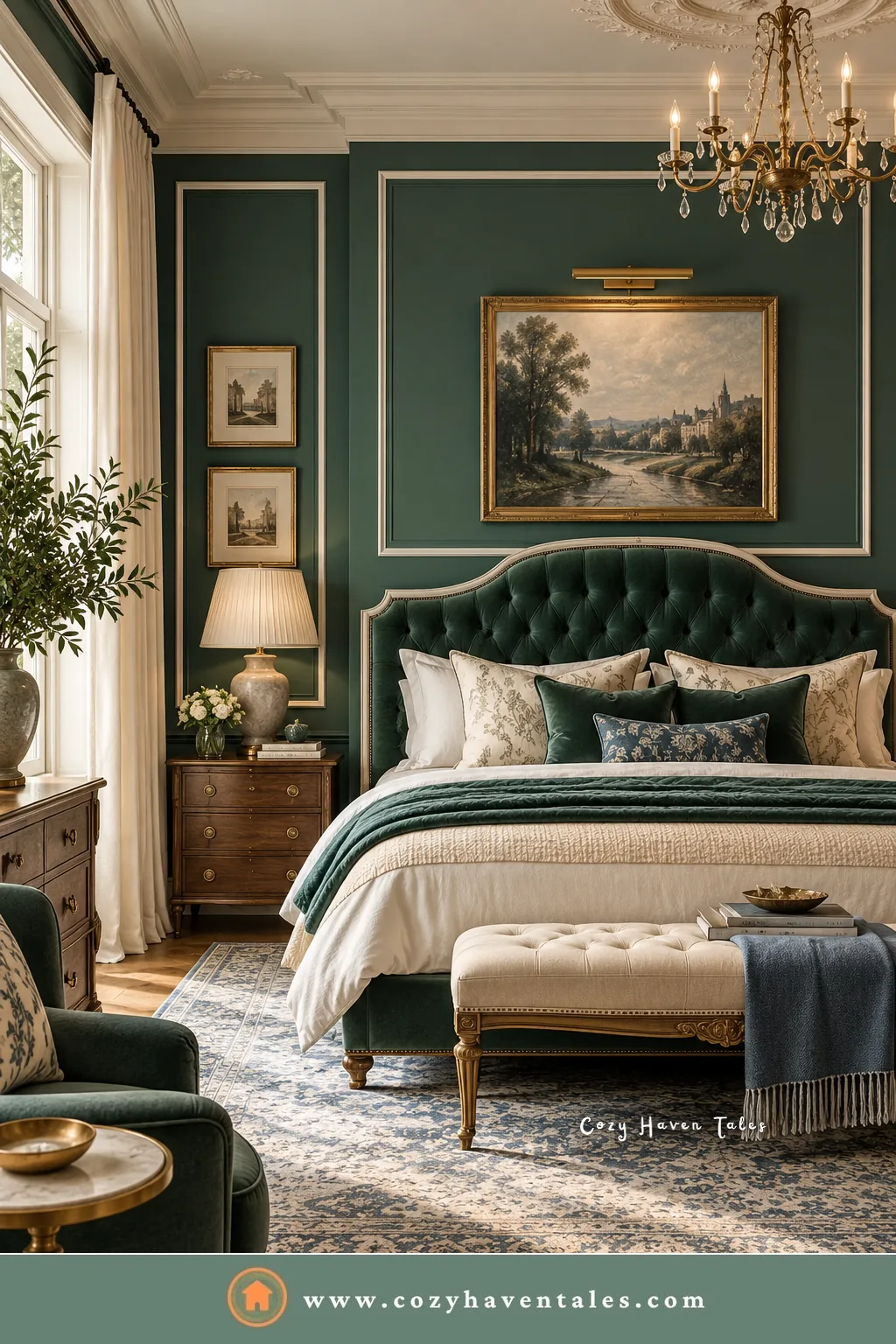
The biggest mistake with dark green is pairing it with a bright, cool white. The contrast is too sharp, and the white starts to look blue next to the green.
Choose a soft white with a little warmth:
- White Down OC-131 is the off-white Benjamin Moore chose for the 2027 palette. It’s cozy and slightly warm, a natural match.
- White Dove OC-17 is a widely used soft white that works on trim, doors, and ceilings in most light.
If you want a quieter, more modern look, skip white trim altogether and paint the trim in Webster Green too, in a satin or semi-gloss finish. This “color drenching” makes a room feel enveloping and hides awkward trim details.
Cozy Haven Tales Pro Tip: Use a sheen difference instead of a color difference when you paint walls and trim the same green. Matte on the walls and satin on the trim gives just enough definition without breaking up the color.
Warm Neutrals That Soften It
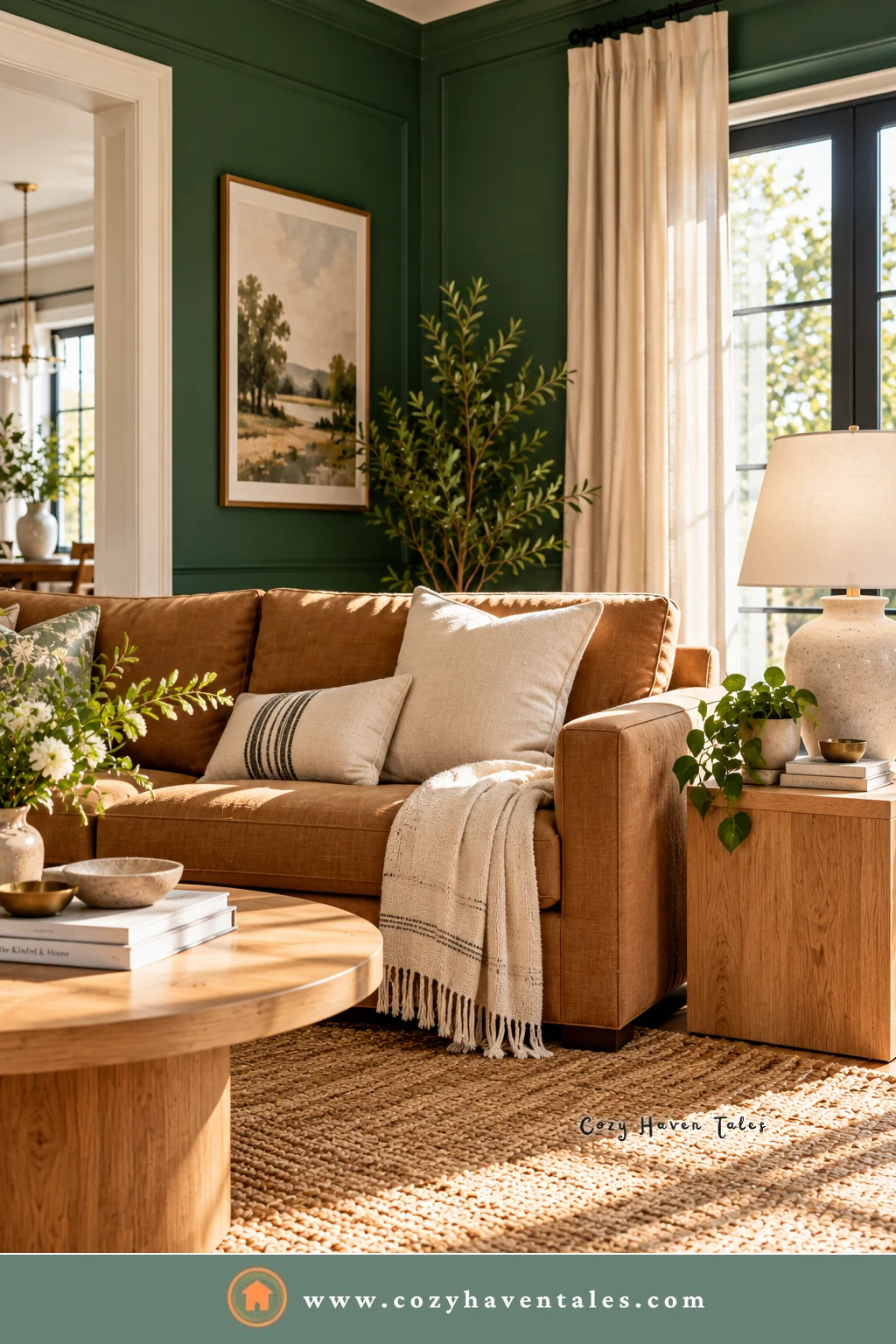
Warm neutrals are the colors that go with Webster Green most easily, and they make it livable day to day.
Shakespeare Tan 228 is a golden neutral from the same palette. On a sofa, curtains, or an adjoining wall, it brings warmth that green alone doesn’t have.
Cream and oatmeal in textiles (linen curtains, a boucle chair, wool throws) lift the room without the harshness of pure white.
Camel and cognac in leather pieces are a classic pairing with dark green, and they wear well in busy family rooms.
If your floors are warm wood, you already have one of the best neutrals for this color in place.
Accent Colors That Go With Webster Green
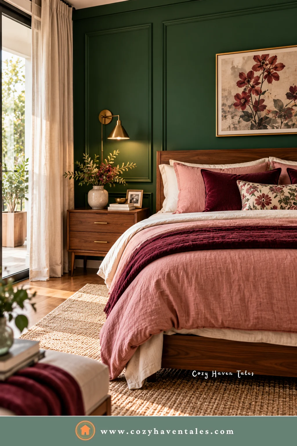
Benjamin Moore built its 2027 palette as a set of companions to Webster Green. These are the ones I’d reach for first:
- Townsend Harbor Brown HC-64, a grounded burgundy. Green and deep red is a traditional pairing, and it suits a library, dining room, or bedroom. Use it in a rug, upholstery, or a painted piece of furniture rather than a full wall at first.
- Antique Copper 1169, a spiced brown. It warms up green in the same way a leather chair does.
- Wild Aster 1240, a soft pink with gray notes. This is the pairing that makes green feel fresh and a little unexpected, lovely in bedrooms.
- Nelson Blue CW-635, a pale, watery blue. It cools things down gently. It works well for a bathroom or a bedroom that faces south and gets plenty of warm light.
- Durango 2137-30, a deep olive-leaning neutral. Use it if you want a tone-on-tone look with two greens that aren’t fighting each other.
Choose one or two accents per room. Webster Green already has a strong personality, so it doesn’t need many colors competing with it.
Readers also liked: Color Psychology in Interior Design: A Beginner’s Guide
Materials and Finishes That Work With It
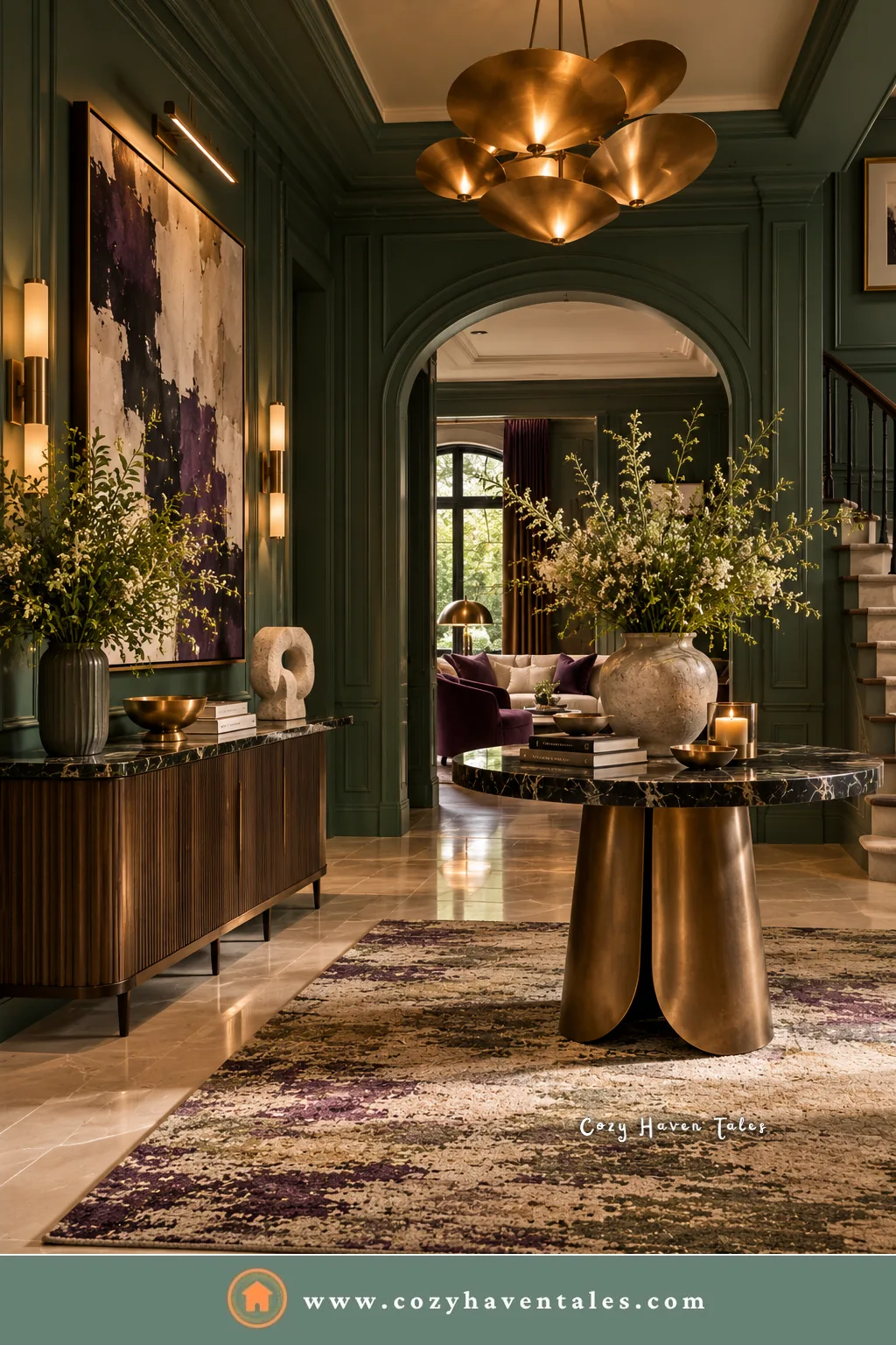
Beyond paint, the colors that go with Webster Green show up in materials too. Dark green looks its best next to warm, natural materials:
- Brass and unlacquered brass for lighting, hardware, and frames. This is the classic partner.
- Walnut and mid-tone oak for furniture and floors.
- Leather in cognac or tan.
- Natural linen and wool in cream and oatmeal.
- Marble or stone with warm veining for kitchens and bathrooms.
Be careful with chrome, high-gloss black, and gray stone. They can make the green feel cold and dated rather than rich.
Where to Use Webster Green
Living rooms and studies. Benjamin Moore suggests it for these rooms, and it suits them because they’re used most in the evening, when warm lamp light makes the color glow. I’ve collected 15 ways to use deep green in my dark green living room ideas.
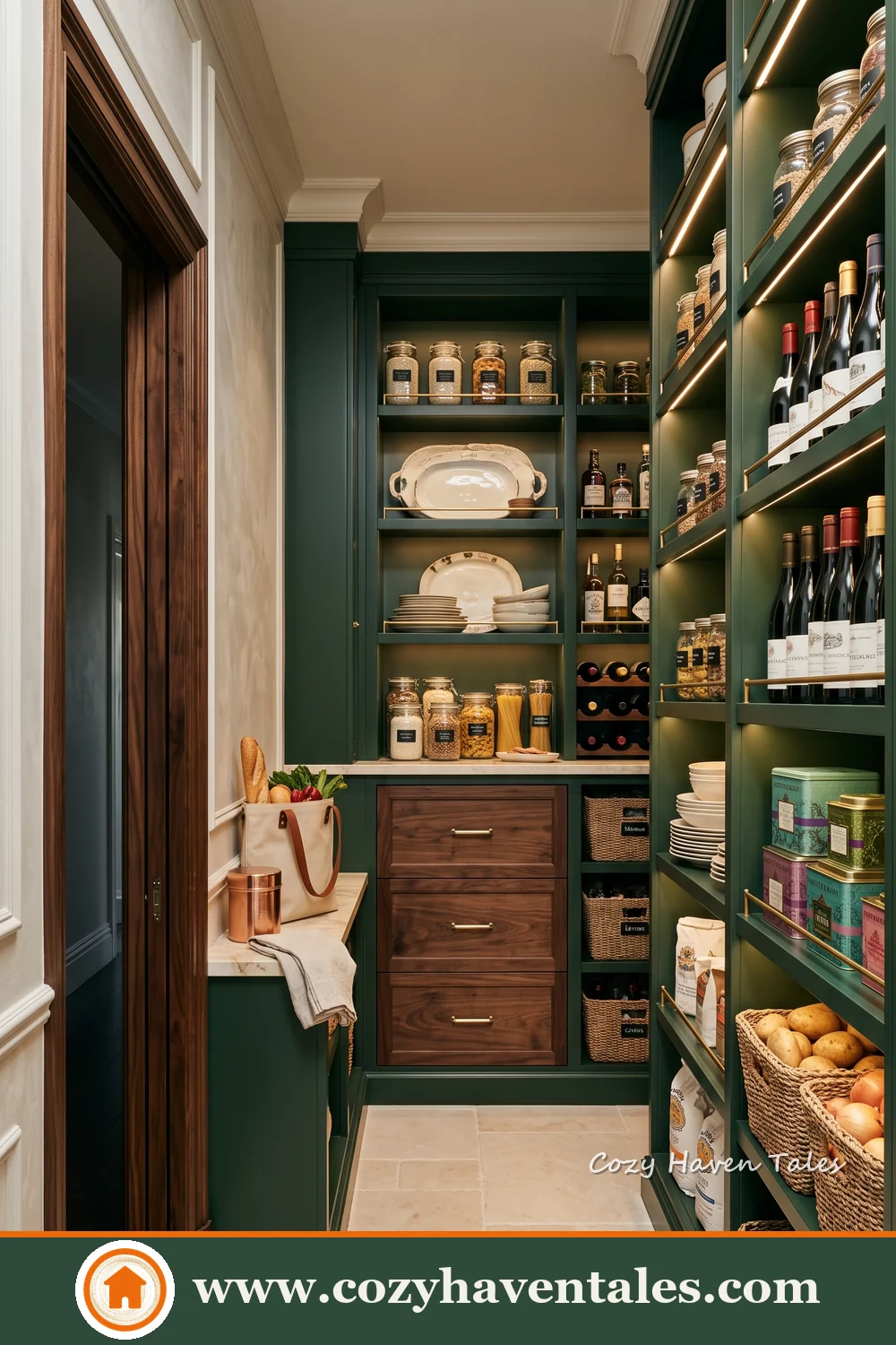
Kitchen cabinets and pantries. Deep green cabinetry looks especially rich in a pantry, behind warm wood shelves. Webster Green on lower cabinets, with brass hardware and a light counter, is a strong look. Keep the upper cabinets or walls lighter so the kitchen doesn’t feel closed in. If you like green kitchens, my post on sage green kitchen cabinets shows a softer alternative.
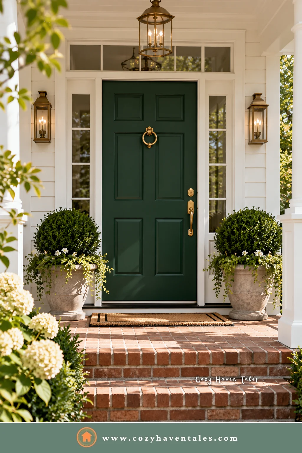
Front doors. A deep green door with brass hardware works on white, cream, red brick, and gray houses alike. See more options in my post on front door colors.
Bedrooms. On one wall behind the bed, or on all four walls in a bedroom you use mostly at night. My emerald and dark green bedroom ideas show how other deep greens behave in bedrooms.
Powder rooms. Small rooms with no windows are a safe place to try a dark color, and the room will feel more intentional, not smaller.
If you’re unsure about painting a full room, start smaller: a front door, a vanity, a bookcase, or the back of open shelves.
You might also like: Paint Colors to Avoid When Selling Your Home
Colors That Go With Webster Green: FAQs
It’s a balanced deep green that can lean cooler in north light and look warmer and richer in south or west light. The colors and materials around it make the biggest difference.
A soft, slightly warm white such as White Down OC-131 or White Dove OC-17. Avoid stark, cool whites.
Not necessarily. Dark colors can blur the corners of a room, which often makes it feel more enclosed and cozy rather than smaller. Good lighting is what keeps it from feeling dark.
It can, but choose a warm gray with a beige undertone. Cool, blue-leaning grays make the green look flat.
Matte or eggshell for walls, satin or semi-gloss for trim, doors, and cabinets. Dark colors show scuffs and touch-ups more in higher sheens on walls.
Choose the colors that go with Webster Green with the same care as the green itself. Webster Green is a confident color, and confident colors need calm companions. Give it soft whites, warm wood, and one good accent, and it will carry the room.
Helpful Resources
- Benjamin Moore’s Color of the Year 2027 announcement, with the full Color Trends 2027 palette.
- Webster Green HC-130 color page on Benjamin Moore’s site, for current details, coordinating colors, and samples.
- Benjamin Moore dark green paint colors from Postcards from the Ridge, with real-room photos of similar greens.