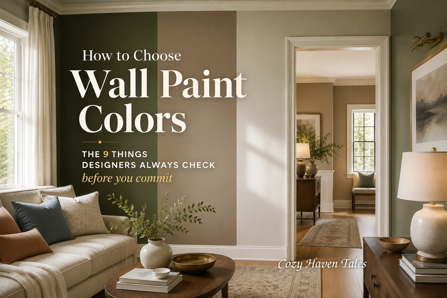
Some colors look lovely on the paint chip and still feel wrong once they are on the wall. When that happens, it is rarely bad taste. It usually means one or two important factors were missed before selecting wall paint colors for the room. A paint color is the result of light, undertone, finish, and everything already in the room, not just the name on the label.
These are the factors I weigh before finalizing any wall color, explained so you can weigh them too.
In short: The factors that matter most when selecting wall paint colors are the room’s purpose and mood, the undertone of the shade, its LRV, the room’s natural light and direction, your fixed elements like flooring and countertops, the paint finish, and how the color affects the sense of space. Get the undertone and the light right first. Those are usually what make a “nice” color still look wrong.
Related Posts:
- 24 Brilliant Ideas for Living Room Paint Colors
- Paint Colors to Avoid When Selling Your Home
- 13 Ways to Create a cozy corner That Feeds Your Mind and Soul
1. Start with the room’s purpose and the mood you want
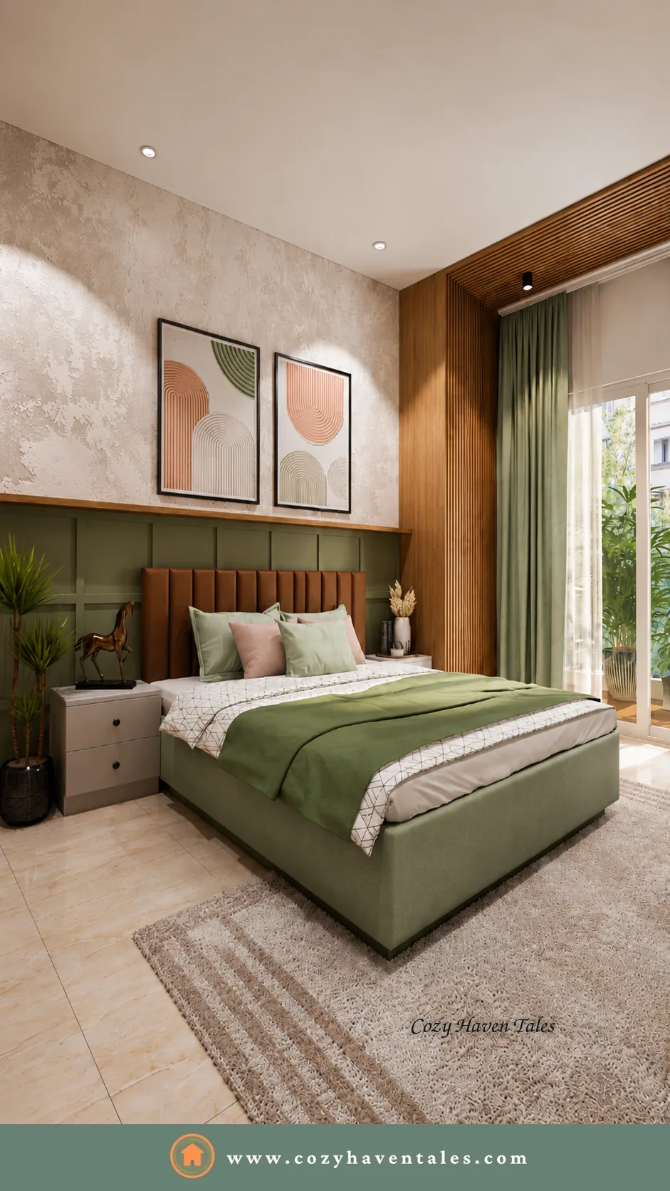
Before the paint color, decide the feeling. A bedroom you want to rest in and a study you want to think in are not asking for the same shade. Color carries mood, so the wall color should match the job the room does.
| If you want the room to feel… | Reach for… |
|---|---|
| Calm and restful | Soft blues, muted greens, warm off-whites |
| Grounded and cozy | Earthy browns, terracotta, deep warm neutrals |
| Fresh and open | Light, high-LRV whites and pale cool tones |
| Sociable and lively | Warm yellows, clay, spiced tones |
Start here and every later decision gets easier, because you are choosing a wall color to do a job, not just to look nice on its own.
You might also like: Easy Decorating Ideas to Brighten Up Your Home with Color
2. Read your fixed elements first
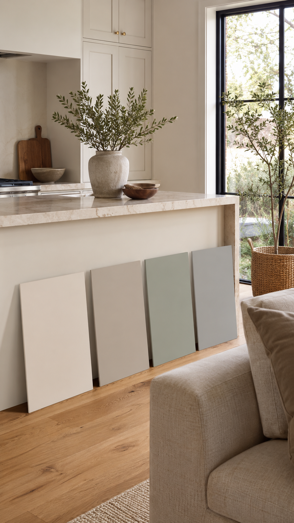
Good wall color choices are rarely made on a blank slate. Look carefully at what is staying in the room: the flooring, the tiles, a stone countertop, the cabinetry, or the largest piece of furniture. These fixed elements already carry undertones your wall color has to live beside for years.
Pull your direction from the biggest fixed element rather than fighting it. If the floor is a warm honey oak, a wall color with a cool gray base can look faintly sour next to it. Let the permanent things lead, and the paint color falls into place more easily.
Cozy Haven Tales’ s Expert Tip:
Pull inspiration from the largest existing element—like a sofa or rug. Even subtle undertones in materials can guide you to the right wall paint colour.
3. Undertones: why a “nice” color can still feel wrong

Two beiges can look almost identical on a chip and completely different on the wall. That difference is the undertone, the quieter color hiding underneath the main one. A greige can lean green in one room and pink in another, depending on the light and what sits beside it.
It is often not the main color that clashes with your floor, sofa, or curtains. It is the undertone. The quickest way to see it is to hold the sample against a sheet of plain white paper. Next to true white, the bias reveals itself, and you can catch a clash before it ever reaches the wall.

Cozy Haven Tales Pro Tip: Compare your shortlist against white first, then against your flooring, countertop, or largest fixed finish. The shade that agrees with both is almost always the safer choice.
4. LRV: how light or dark the color actually behaves
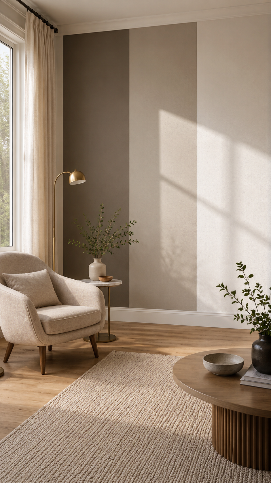
LRV stands for Light Reflectance Value, a number from 0, which is black, to 100, which is white. It tells you how much light a paint color reflects back into the room. Most major paint brands list the LRV on the color’s product page or technical sheet, so it is easy to find once you know to look.
It matters because LRV helps predict how a shade will behave in your actual room. A low-LRV color, roughly 0 to 40, reads deep and can feel heavy in a space that is already short on light. A high-LRV color, around 60 to 100, reflects more light and can help a small or north-facing room feel more open. LRV is not the same as undertone: LRV tells you how light or dark the color is, while undertone tells you which way it leans. Check both before selecting your final wall paint color.
5. Natural light and which way the room faces
The same paint color is not the same in two different rooms, because the light is not the same. The direction a room faces can change how the color looks throughout the day.
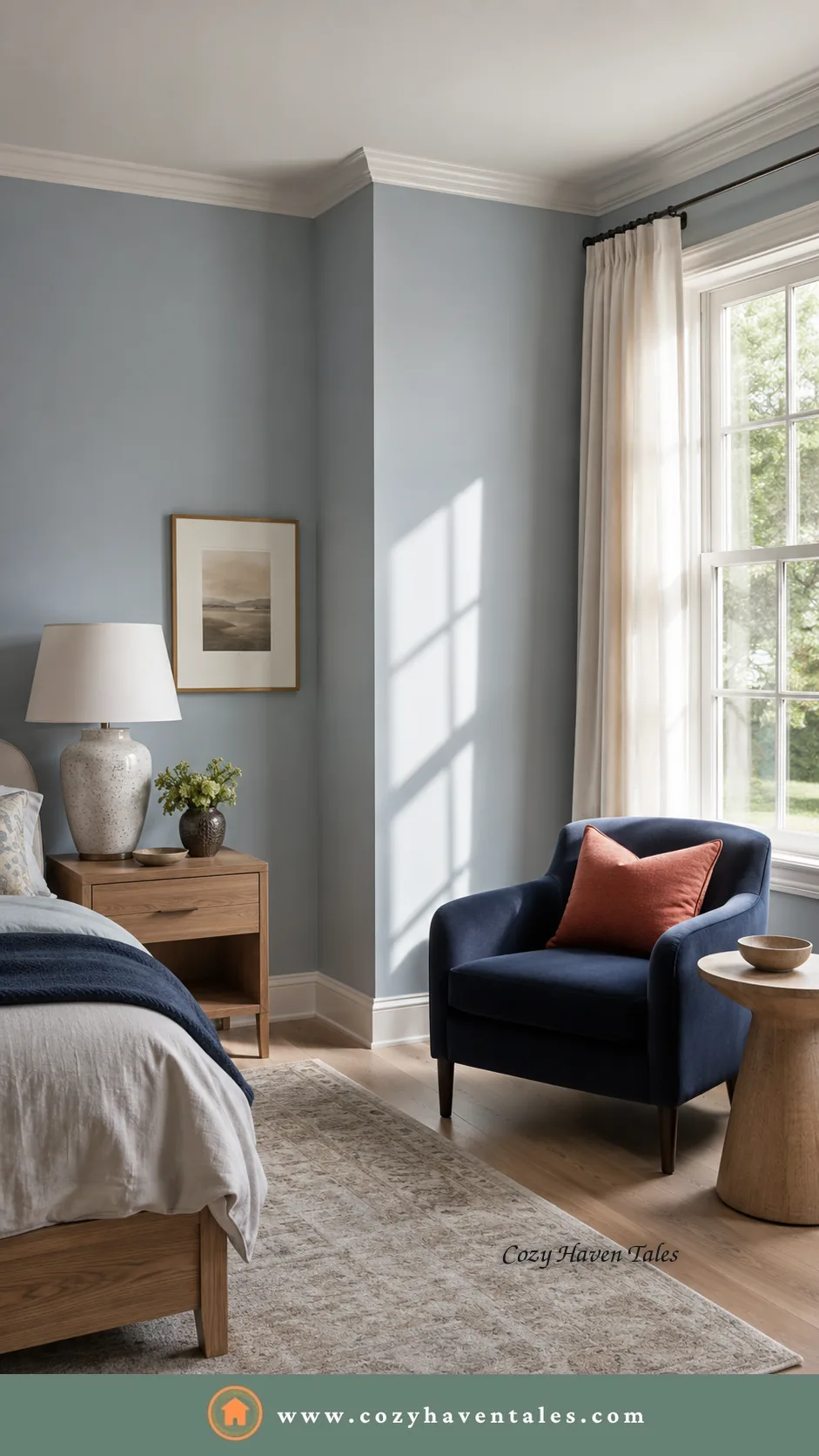
| Room direction | How the light affects paint color |
| North-facing rooms | Cooler, steadier light that can make cool colors feel cold. Warmer shades often balance them better. |
| South-facing rooms | Brighter, more generous light for much of the day, so many colors hold up well. |
| East-facing rooms | Warm, gentle morning light, then cooler or flatter light later in the day. |
| West-facing rooms | More muted earlier in the day, then warmer and stronger in the afternoon and evening. |
This is why a paint color you admired in a friend’s sunny south-facing living room can disappoint on your north wall. The color did not change. The light did.
6. Architecture, wall texture, and trim
The wall itself changes the color. A textured or exposed surface throws small shadows, so the shade can read slightly deeper. A smooth wall usually keeps the paint color closer to what you expected. Moldings, paneling, ceiling height, and the color of your trim also frame the wall and shift how it looks.
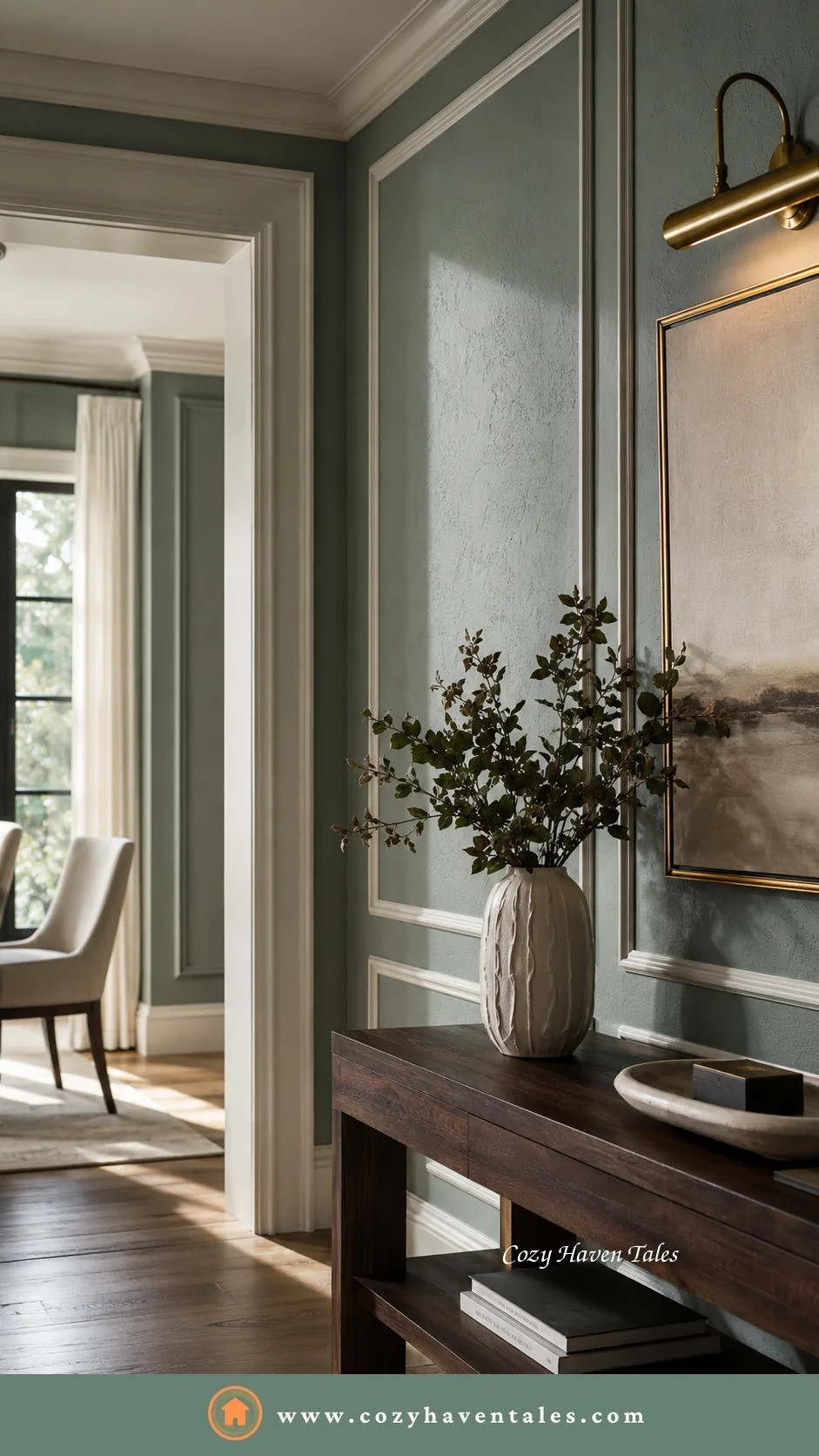
Test a paint color on the wall it will actually live on, texture and all, rather than judging it only from a small chip. Decide the trim color at the same time, because bright white trim and soft cream trim can make the very same wall color feel quite different.
7. Match the finish to the room
Finish, or sheen, is a decision in its own right. It changes durability, how much light the wall reflects, and even how intense the paint color looks.
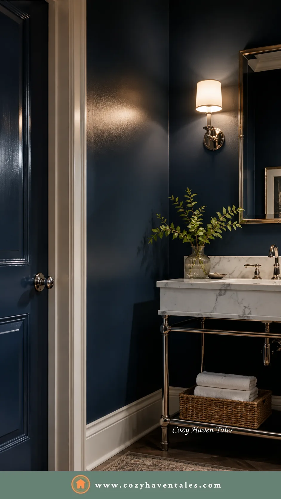
| Finish | Look | Durability | Best for |
| Matte / flat | Softest look, hides wall flaws | Lowest, harder to clean | Ceilings, adult bedrooms, low-traffic walls |
| Eggshell | Low glow | Moderate, wipeable | Living rooms, dining rooms |
| Satin | Soft sheen | Good, cleanable | Hallways, children’s rooms, family spaces |
| Semi-gloss | Noticeable shine | High, scrubbable | Kitchens, baths, trim, doors |
| Gloss | Mirror-like shine | Highest | Accent trim, cabinetry, feature doors |
One thing the table cannot show: the higher the sheen, the more the color can shift as light moves across it. A bold shade often looks calmer in matte and more intense in satin, so the finish is part of the wall color decision, not a separate afterthought.
8. Use color to change how big a room feels
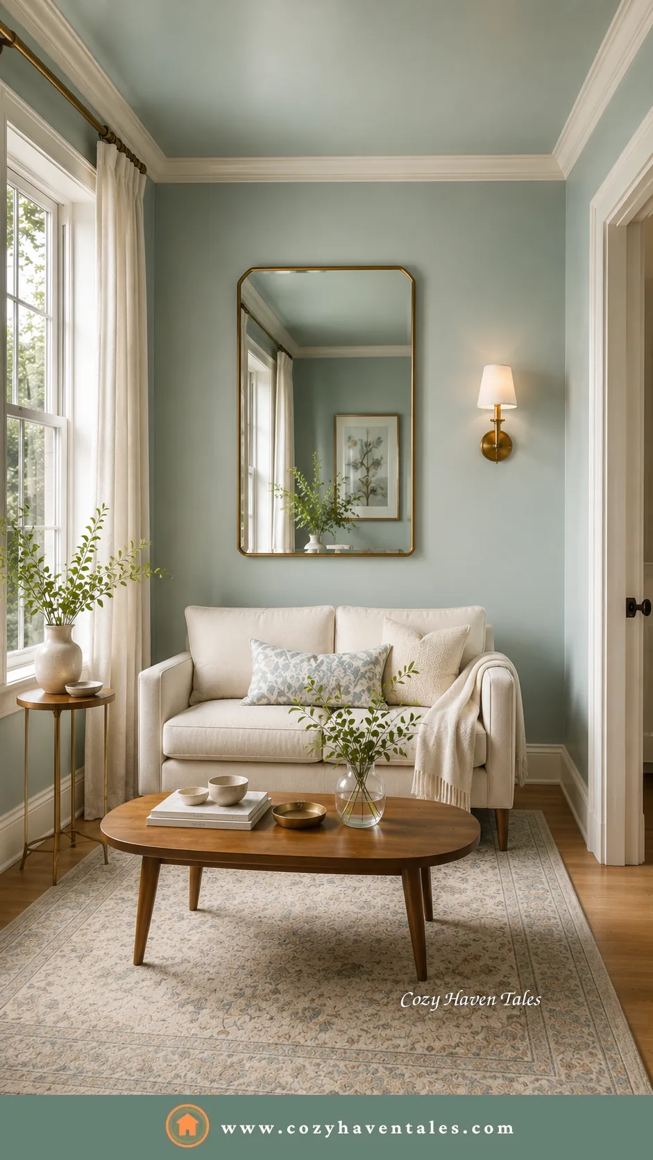
Paint color can quietly reshape a room. Light shades tend to push the walls back and make a small space feel larger. Deep tones pull the walls in and can make a big, cool room feel more grounded. Painting the ceiling the same light shade as the walls can blur the edges and make the room feel taller and softer.
Decide what you want the room to do before you reach for these tricks. A narrow hallway and a cavernous living room may need opposite treatments, and color is one of the simplest ways to correct either problem without changing the architecture.
9. Think long-term before you follow a trend
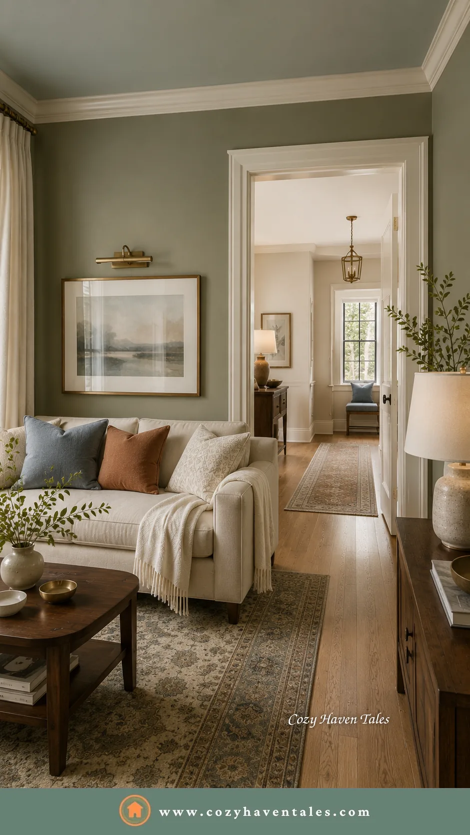
Rooms are lived in as a whole, so the paint colors should relate as you move between them. You do not need one color everywhere. You need one palette, with shared undertones, so each room can differ in shade while the transitions still feel intentional.
Paint trends are worth watching, but lightly. Trends can show where design mood is moving, but they should not decide your wall color for you. The broad shift in recent years has moved away from cool gray and stark white toward warmer, more grounded, nature-led shades. Treat that as a useful mood direction, not an instruction. Let a trend point you toward a feeling if it appeals to you, then let your room’s light, fixed finishes, and undertones decide the actual shade.
The question I ask clients still holds: can you live with this paint color every day and still like it a year from now?
For shades that tend to date a room or put buyers off, paint colors to avoid is a useful companion read.
Before you commit to the final paint color
Once you have a shortlist, do not choose from the chip alone. Paint large samples on at least two walls, or use large peel-and-stick samples if you prefer less mess. Check them in the morning, afternoon, and evening. Hold them beside your flooring, sofa, curtains, trim, and any fixed finishes.

This last step is where many mistakes are caught. A paint color that looked perfect online may turn too yellow beside your floor, too gray in your natural light, or too sharp against your trim. Testing is not a delay. It is what helps you choose once and choose well.
FAQs on Selecting Wall Paint Colours
A: Before selecting wall paint colors, consider the room’s purpose, natural light, undertones, LRV, fixed finishes, paint sheen, trim color, and how you want the room to feel. These factors affect how the color actually looks once it is on the wall.
A: An undertone is the subtle secondary color beneath the main shade. It matters because it is usually what clashes with your flooring, countertop, sofa, or curtains, even when the main color looks right.
A: LRV, or Light Reflectance Value, runs from 0 to 100 and shows how much light a paint color reflects. For a dark or small room, lean higher, around 60 or above, to keep the room feeling open. For a cozy, grounded feel, you can go lower.
A: North-facing rooms get cooler light that can make cool colors feel cold, so warmer shades often balance them. South-facing rooms usually handle many tones well. East-facing rooms get warmer morning light and cooler light later, while west-facing rooms become warmer in the afternoon and evening.
A: Matte works well for quiet, low-traffic rooms. Eggshell or satin is usually better for living spaces, dining rooms, hallways, and family areas. Semi-gloss works well for kitchens, baths, trim, and doors where you need a more wipeable finish.
A: Use one whole-home palette with shared undertones. Let each room vary in shade, depth, or mood, but keep the underlying warmth or coolness consistent so the transitions feel calm rather than abrupt.
A: Yes. Always test paint colors in the room before committing. Paint large samples on different walls and check them at different times of day. This helps you see how the color reacts to your light, flooring, furniture, and trim.
The thread that ties it together
When selecting wall paint colors, undertone and light usually matter more than the name of the shade. If the undertone is right and the light is respected, most paint colors behave. Work through the rest with the room’s purpose in mind, and the shade you choose will still feel right long after the newness wears off.
Once you know which factors matter, the step-by-step method for actually choosing and testing a wall color can walk you through the process from shortlist to final coat.





2 Comments