
As interior designers, we often say that paint is the most transformative tool in our design kit. But choosing the right wall paint colour isn’t just about matching shade cards—it’s about understanding people, light, architecture, and how spaces are meant to feel. If you’re just starting out in your design journey, here’s something I’ve learned over the years: a successful paint colour choice isn’t about picking what looks pretty on Pinterest. It’s about creating harmony, comfort, and longevity in your client’s daily life.
This blog shares a few thoughtful things you, as a designer, should always consider before finalising paint colours for any space.
Related Posts:
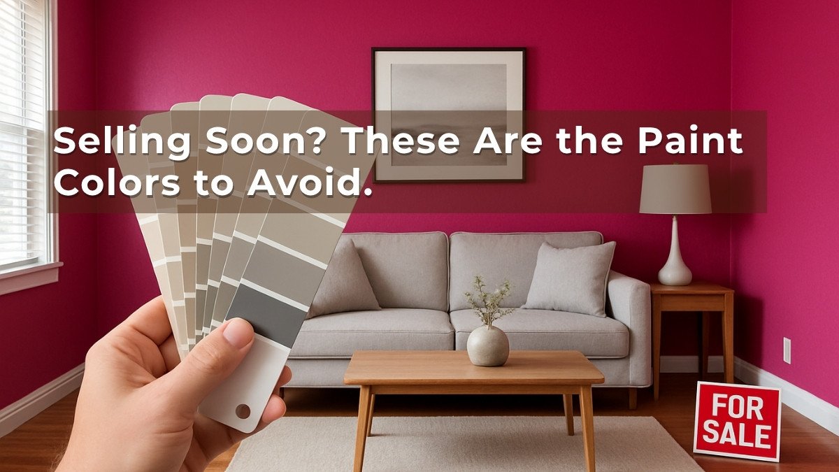
- 24 Brilliant Ideas for Living Room Paint Colors
- Paint Colors to Avoid When Selling Your Home
- What Colors Go With Light Blue Wall Paint Color in a Living Room
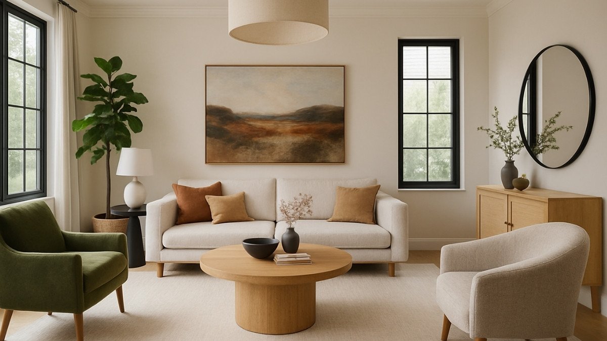
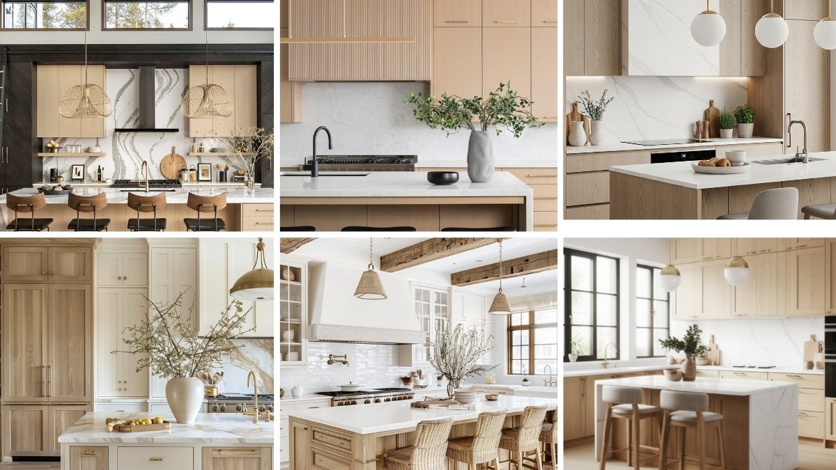
1. Begin with the Room’s Function and Mood
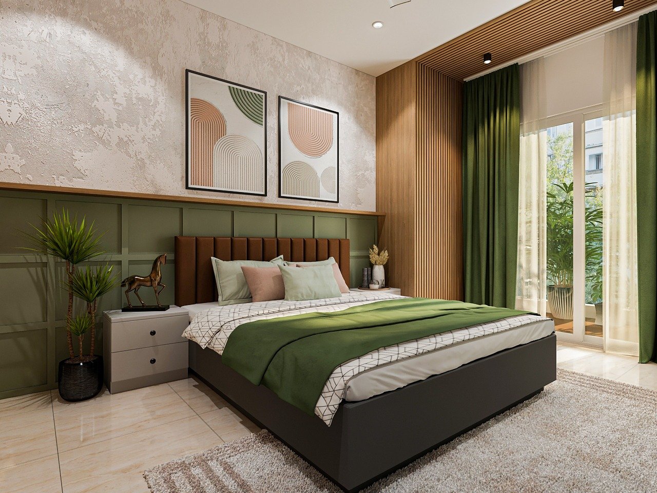
Before diving into colours, start with the space’s purpose. Is it a restful bedroom? A creative study? A lively kitchen? Each function calls for a different emotional tone—and colour can support that. Soft pastels might calm a bedroom, while bold tones can energise a dining space. Make it a habit to align the room’s purpose with its desired feel before you open a shade card.
Cozy Haven Tales’ s Expert Tip:
Start by pairing emotions with colours—serenity with soft blues, energy with yellows, warmth with earthy tones. This helps you guide the client’s choice beyond just “liking a colour.”
2. Observe What’s Already in the Space

Good design doesn’t exist in isolation. Teach yourself to look closely at what’s already in the room—flooring, curtains, artwork, or even a client’s favourite chair. These elements will guide your palette. A beautifully grained wooden floor or a vibrant painting can become your starting point. The goal is to make the wall colour feel intentional and connected—not an afterthought.
Cozy Haven Tales’ s Expert Tip:
Pull inspiration from the largest existing element—like a sofa or rug. Even subtle undertones in materials can guide you to the right wall paint colour.
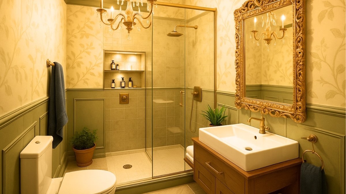
3. Study the Architecture and Wall Texture
Wall conditions can influence colour decisions more than you’d expect. A textured wall, exposed brick, or unique molding can change how a colour appears—and how much attention it draws. Also, consider natural light and wall orientation. North-facing rooms can make cool colours feel colder, while sunlight in south-facing rooms can amplify warm tones. This awareness is key when advising clients confidently.
Cozy Haven Tales’ s Expert Tip:
Always test a colour on a textured wall versus a smooth wall. The way light plays on texture can completely transform the final look.
4. Paint Samples are Non-Negotiable

Shade cards may be useful references, but they’re never the final word. Always test large paint swatches directly on the walls—ideally on more than one wall and in different rooms. Encourage clients to live with those swatches for a few days. Observe how they shift in morning light, afternoon sun, and evening glow. Colour is not static—it’s alive within a space.
Cozy Haven Tales’ s Expert Tip:
Apply at least two coats of sample paint on different walls. Observe them across the day—morning light, afternoon brightness, and evening lamps.
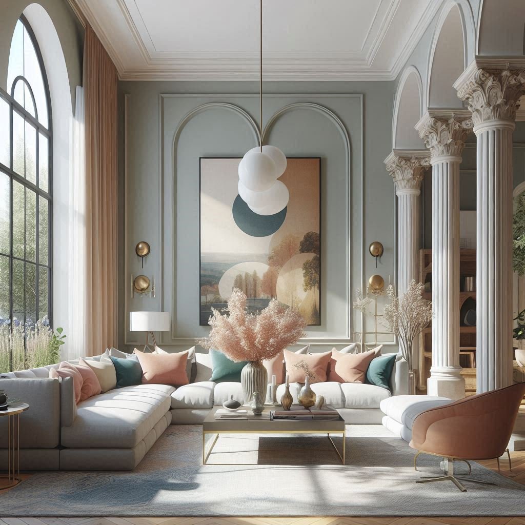
5. Consider How Rooms Connect

It’s easy to treat each room as a standalone project, but real homes are lived in as a whole. Think about how one room flows into the next. Are the colours clashing? Are transitions smooth and intentional? You don’t need to use the same colour everywhere, but there should be a sense of rhythm across the home—just like chapters in a well-written book.
Cozy Haven Tales’ s Expert Tip:
Use a cohesive palette across shared spaces. Even if each room has a different personality, subtle undertone links create harmony.
6. Match Paint Finish with Use
Finishes matter. Matte finishes are elegant and diffuse light beautifully—but they may not suit high-traffic areas. Satin and eggshell are versatile and cleanable. Semi-gloss is durable but reflective. A young child’s room might need washable walls. A formal living room might benefit from soft sheen. Learning to pair finish with function shows maturity in your design thinking.
Cozy Haven Tales’ s Expert Tip:
In living rooms, satin offers durability with elegance. Bedrooms glow with matte finishes, while kitchens and baths often need semi-gloss for easy cleaning.
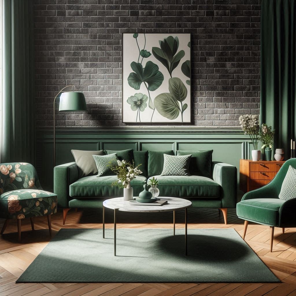
7. Use Colour to Play with Perception
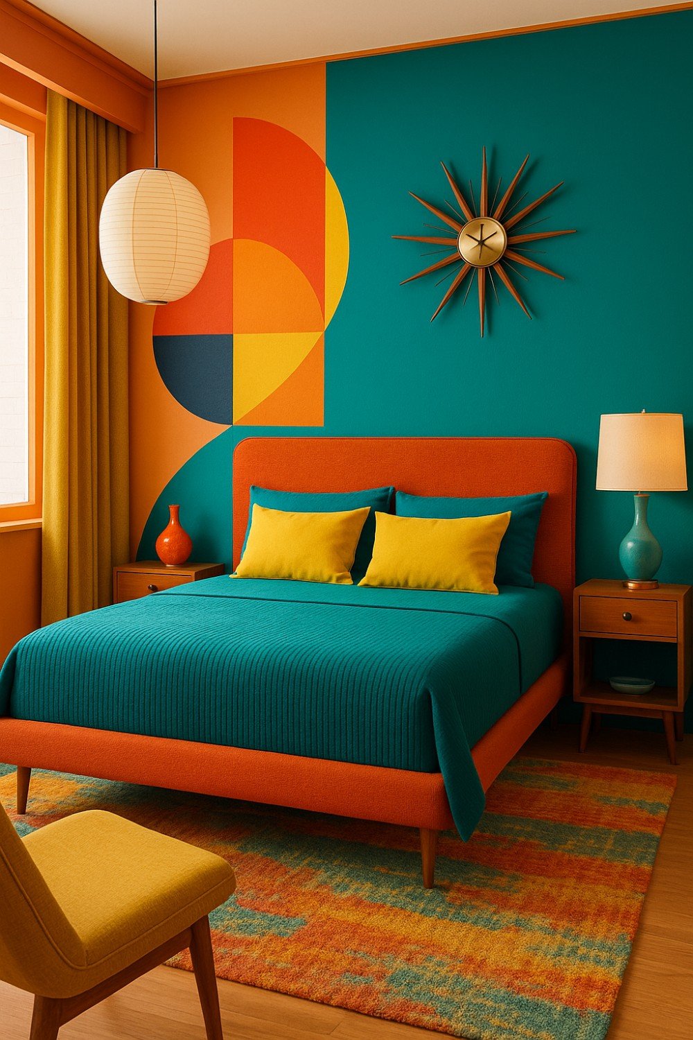
You can reshape how a room feels with colour. Light shades expand small rooms. Deep tones can cozy up vast, impersonal spaces. Painting ceilings in the same or a slightly lighter tone than walls can visually lift height. Interior design is as much about perception as it is about layout. Use colour to guide how people feel in a space—not just how they see it.
Cozy Haven Tales’ s Expert Tip:
For small rooms, paint walls and ceiling the same light shade—it makes boundaries blur. For cozy corners, use a darker accent wall to ground the space.
8. Help Clients Prioritise Personal Connection Over Trends

As designers, we often get asked, “What’s in trend right now?” But our job isn’t to chase trends—it’s to build spaces that reflect the client’s personality. A good question to ask them is: “Can you live with this every day and still love it a year from now?” This single question can help both of you arrive at an honest, lasting choice—something trend-proof and truly personal.
Cozy Haven Tales’ s Expert Tip:
Ask clients about their happiest places—beaches, forests, mountains—and draw colour inspiration from those memories. This creates a timeless, personal palette.
Conclusion: Design with Empathy, Decide with Intention
Selecting a paint colour is never just about colour. It’s about light, function, texture, energy—and most importantly, the people who will live in the space. As a designer, your role is to consider all of this and then make choices that feel timeless and intentional.
If you’re an aspiring interior designer, remember: every great decision you make starts by slowing down and truly seeing the space in front of you.
Let your paint colours be a reflection of your thoughtfulness as a designer.
FAQs on Selecting Wall Paint Colours
A: Light and neutral shades make small rooms look more spacious and airier. You can also paint walls and ceilings the same light colour to blur boundaries. Adding mirrors or reflective décor further enhances the effect.
A: Absolutely. Paint can look completely different under natural light, artificial light, and shadows. Always test samples on multiple walls and observe them at different times of the day before making a decision.
A: Both matter. The right finish ensures durability and suitability for the space. For example, matte works well in bedrooms, satin in living rooms, and semi-gloss in kitchens and bathrooms for easy cleaning.
A: Use a cohesive palette across connected spaces. Even if each room has a different personality, link them with common undertones, complementary accents, or neutral transition shades. This creates harmony instead of visual chaos.
A: Personal connection is always more important than trends. While trends can inspire, choosing colours that resonate with the people who will live in the space ensures timelessness and comfort.
A: Colours carry emotional energy. Warm tones like yellow and orange create vibrancy, blues and greens calm the mind, and earthy neutrals bring grounding. Always align the colour choice with the desired mood of the room.
A: Yes. Textured walls often make colours appear deeper or darker, while smooth walls keep shades true. Architectural elements like ceiling height and window placement also influence how colours are perceived.
2 Comments