Once you’ve learned the elements of interior design (like color, space, texture, and line), the next big step is to understand how to use them together to create beautiful, functional rooms.
That’s where the principles of interior design come in.
These are not strict rules — they’re guiding ideas that help you bring balance, flow, and connection into your space. They help you move from “I like this chair” or “this color looks good” to “this room just works.”
Related Articles:
- 7 Visual Examples of Elements of Design in Interior Design
- Unlocking Design Secrets: 7 Elements of Interior Design
- Escape Chaos: How to find Your Personal Design Style
💡A Common Beginner Mistake
Most of the time, beginners approach room design piece by piece:
- “This sofa looks sculptural.”
- “This accent chair is awesome.”
- “This planter is cute.”
- “This color scheme is trendy.”
But they forget to ask: How does it all work together?
That’s why understanding the principles of design is so powerful. It helps you see the big picture and create rooms that not only look good but feel complete and intentional.
What Are the Principles of Interior Design and Why Do They Matter?
Designing a room isn’t just about picking beautiful furniture or choosing the right wall color — it’s about how all those choices work together. That’s where the principles of interior design come in.
These principles are the silent forces behind every room that feels right — even if you can’t quite put your finger on why. They guide how you arrange space, balance objects, and create flow so that your home isn’t just visually appealing but also comforting and functional.
Whether you’re styling a corner or designing an entire house, understanding these principles can help you avoid common design mistakes and make intentional, confident choices. They turn decorating into something more meaningful — like telling a story with shape, texture, light, and layout.
Let’s explore these 6 principles one by one — with some examples to help you recognize (and use) them in your project or own home.
⚖️ 1. Balance
🧩 What Is Balance in Interior Design?
Balance is the principle that keeps a room from feeling chaotic or incomplete. It’s about making sure the visual weight in a space is evenly distributed, so the room feels grounded and stable — not too heavy on one side and too light on the other.
Balance isn’t just about placing things evenly. It’s about how color, size, shape, texture, and negative space work together across the room. It makes your eye move across the room naturally and comfortably.
There are three types of balance in interior design:
- Symmetrical (mirror-image)
- Asymmetrical (different but equally weighted)
- Radial (elements arranged around a center point)
🧠 Why It Matters
Without balance, a space can feel lopsided, awkward, or disorganized — even if all the individual pieces are beautiful. Balanced spaces give the eye structure and rest, which creates a calming effect.
Especially for beginners, focusing on balance can help solve that “something feels off” feeling in a room.
✅ What You Should Do:
- Use furniture, color, and decor to balance visual weight on both sides of a room.
- Match the scale and height of objects across the space (e.g., tall plant on one side = floor lamp on the other).
- Think of balance horizontally and vertically — not just left to right, but also low/high across walls and floor space.
- Leave some breathing space so things don’t feel crowded or cluttered.
🚫 What You Should Avoid:
- Don’t push all large furniture to one side of the room.
- Avoid placing all color or pattern on one end while leaving the other side bare.
- Avoid placing too many small items together, which can feel visually busy even if they’re technically “balanced.”
💡 Great Tips to Create Balance:
- Use a central anchor piece (like a coffee table or rug) and build around it with balance in mind.
- In asymmetrical layouts, balance large pieces with groups of smaller items.
- Think of negative space as a design tool — balance busy areas with open, restful spots.
- Try taking a photo of your room and looking at it in black and white — it helps you see where the visual weight is concentrated.
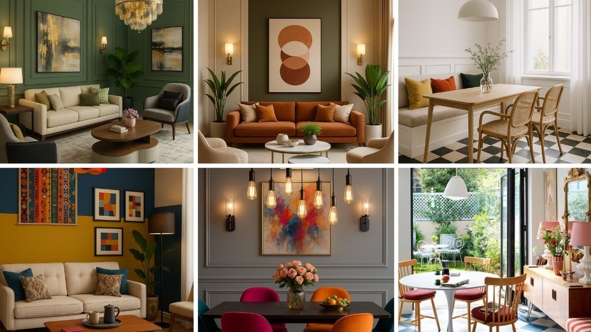
1: Symmetrical Balance
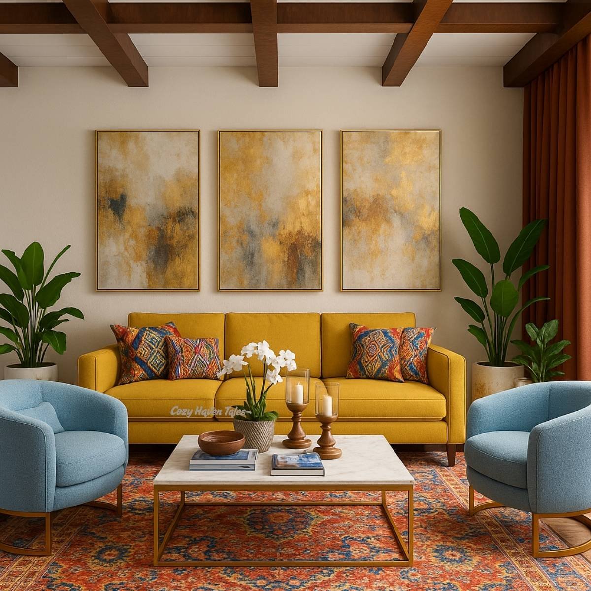
🔍 What’s in the Image:
- Mustard yellow sofa against the wall
- Two light blue armchairs on either side
- Potted plants on either side of the sofa
- A trio of gold abstract artworks above the sofa
- Symmetrical layout creates a formal and harmonious arrangement
✅ How This Room Demonstrates Symmetrical Balance:
- The mustard yellow sofa is placed precisely at the center of the back wall, acting as the main anchor in the composition.
- Two identical blue armchairs face inward from both sides.
- Three gold abstract artworks are evenly spaced and centered above the sofa. The middle piece aligns with the center of the sofa, and the side pieces extend the symmetry outward.
- Two matching potted plants are flanking the sofa symmetrically.
- Two decorative pillows on each side of the sofa are placed symmetrically, using matching patterns and sizes.
- Coffee table decor is centered.
🎯 Final Verdict:
The room doesn’t just have matching items — it has a clear central axis (through the middle of the sofa and artwork), and everything is designed to mirror across that axis. That’s the essence of symmetrical balance — visual calm, formality, and order.
2: Asymmetrical Balance
🔍 What’s in the Image
- Central iron bed frame with warm-toned bedding
- A tall arched window and plant on the left side
- A curved wall mirror on the right, paired with two wall sconces
- Matching nightstands with minimal decor keep the design grounded
- Asymmetry feels intentional, balancing architectural differences with styling
✅ How This Room Demonstrates Asymmetrical Balance:
- The left side has a window and tall plant, introducing vertical weight.
- The right-side balances that visual weight using:
- A curved wall mirror
- Two wall sconces, one beside the mirror and one matching the left wall
- The elements aren’t mirrored — but they create visual equilibrium.
✨ Design Intention:
Asymmetrical balance is created here by adjusting the scale and number of decor elements — with a curved mirror and two wall sconces on one side to visually counter the arched window and tall plant on the other. This setup helps balance out the architectural differences between the two sides of the room
🎯 Final Verdict:
This is a clear example of asymmetrical balance, where styling choices are used to address the architectural differences between the two sides of the room. The layout feels intentional and balanced, offering a relaxed alternative to traditional mirroring.
3: Radial Balance
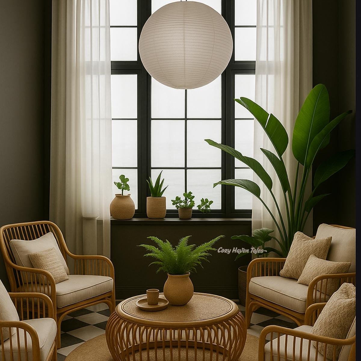
🔍 What’s in the Image:
- Four rattan armchairs arranged in a circle around a round table
- A central paper lantern pendant light above the seating area
- Matching neutral cushions on each chair for uniformity
- Indoor potted plants placed evenly to reinforce circular symmetry
- Black-framed window acts as a strong central backdrop
✅ How This Room Demonstrates Radial Balance:
- Four chairs are arranged in a circle around the round coffee table.
- The circular pendant light echoes the round shape below, reinforcing the center point.
- Potted plants, both on the table and in corners, enhance the visual flow around the middle.
- The window and curtain folds add vertical symmetry but don’t disrupt the radial layout.
🎯 Final Verdict:
This space is a textbook radial composition. The layout pulls the eye inward and around, ideal for intimate conversation spaces or meditative reading corners.
4: Near Imbalance (Bonus)
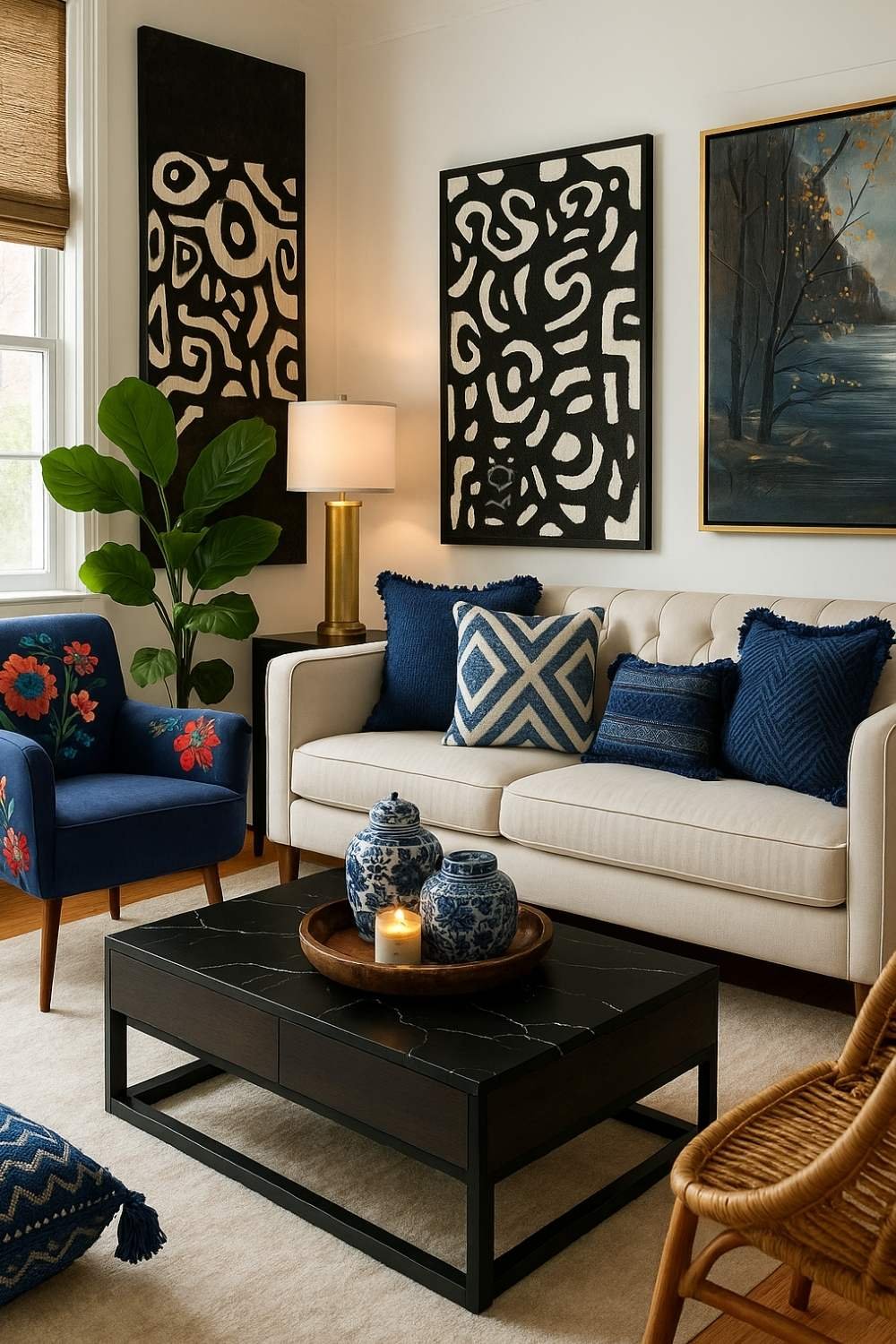
🔍 What’s in the Image:
Left Side:
- Eye-catching blue accent chair
- Tall green plant
- Floor lamp
- Dark wall art
Right Side:
- Plain sofa arm
- Minimal cushions
- A second wall art piece (lighter and lower)
⚠️ Why It Feels Unbalanced:
- Left side is visually heavier due to taller elements and strong colors
- Right side feels visually empty or lower in energy
- Artwork lacks height symmetry
✅ What Helps:
- A central coffee table brings some balance
- The color palette (blues, blacks, neutrals) still unifies the space
- It feels like a case of asymmetrical balance with a tilt toward imbalance
🎯 Final Verdict:
This room is close to working but needs a few tweaks. A taller plant or lamp on the right side, or repositioning the artwork, would create better balance. A great example for learning how small adjustments can change a room’s energy.
🔁 2. Rhythm
🧩 What Is Rhythm in Interior Design?
Rhythm in design is about movement — it guides the eye through a room in a flowing, intentional way. It’s created by repeating elements like color, shapes, patterns, textures, or lines.
Think of it like a song: rhythm helps maintain a beat. In interiors, it creates a feeling of visual continuity and energy without being chaotic.
🧠 Why It Matters
Without rhythm, the eye doesn’t know where to go. A room might feel flat or cluttered. With rhythm, your space feels dynamic and cohesive — pulling everything together smoothly and helping your favorite features shine.
✅ General Tips to Create Rhythm:
✔️ What You Should Do:
- Use repetition in colors, shapes, or materials across the room (e.g., same fabric on cushions and chairs)
- Introduce progressive rhythm — like varying artwork sizes in a pattern or using shades of a color from light to dark
- Use transitional rhythm to guide the eye from one focal point to another (e.g., pendant lights leading toward wall art)
- Maintain spacing between repeating items (shelves, lighting, plants)
🚫 What You Should Avoid:
- Avoid abrupt visual interruptions — a sudden color or shape can feel jarring if not tied in elsewhere
- Don’t overdo repetition — if everything is the same, it becomes monotonous
- Mismatched spacing or scale in repeated items can ruin the rhythm
💡 Great Ideas to Build Rhythm:
- Repeat round forms in lighting, mirrors, and tabletop decor
- Match your wood tones or metal finishes across furniture legs, frames, and fixtures
- Use a patterned rug to anchor repeated color accents in the room
- Arrange wall art in a sequence — like a triptych or gallery wall with uniform spacing
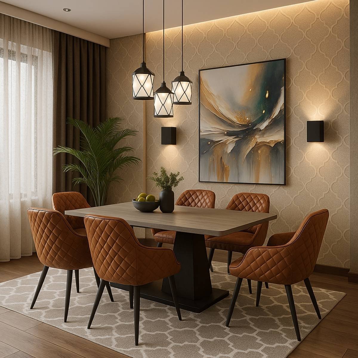
🔍 What’s in the Image:
- Trio of pendant lights arranged in a rhythmic linear progression
- Matching dining chairs with quilted texture echoing the pattern in the rug
- Wall sconces placed evenly on both sides of the artwork
- Abstract artwork itself has flowing brush strokes that mimic movement
- Repeated color tones in the wood, wall, and chairs create visual unity
✅ How This Room Demonstrates Rhythm:
- The trio of pendant lights creates a visual sequence, guiding the eye downward.
- Wall sconces are placed in alignment with the artwork, reinforcing balance and flow.
- Warm brown tones are repeated across the chairs, table, floor, and wall, tying the palette together.
- The quilted texture on the chairs echoes the geometric pattern on the rug.
- The abstract artwork adds visual movement through its flowing brushstrokes.
- Subtle wallpaper patterns provide a soft background rhythm without overpowering the space.
- Overall, repetition is used purposefully — nothing feels random, and the space flows effortlessly.
🎯 Final Verdict:
It’s a soft but effective use of rhythm — nothing shouts, but everything gently flows. This kind of rhythm makes the room feel put-together without being too “designed.”
🎯 3. Emphasis
🧩 What Is Emphasis in Interior Design?
Emphasis is the design principle that creates a focal point — the place your eyes naturally land when you enter a room. It can be a bold artwork, fireplace, statement wall, or even a view.
It’s not about making everything stand out — it’s about highlighting one thing so everything else supports it.
🧠 Why It Matters
Without emphasis, a room can feel flat or confusing — like it’s missing a purpose. A focal point gives direction, order, and often the personality of the space.
✅ General Tips to Create Emphasis:
✔️ What You Should Do:
- Choose a single standout feature in each room (artwork, lighting, wall paint, architectural element)
- Surround it with quieter or complementary elements so it can shine
- Use scale, color, or contrast to make the focal point pop
- Frame it — with lighting, furniture arrangement, or wall molding
🚫 What You Should Avoid:
- Avoid creating multiple focal points that compete — it confuses the eye
- Don’t use loud patterns or colors everywhere — they distract from the hero piece
- Avoid placing your focal point in an awkward spot (too high, too low, or off-center)
💡 Great Ideas to Build Emphasis:
- Use bold artwork or murals behind beds, sofas, or dining tables
- Highlight a fireplace or bookshelf with special lighting or contrasting paint
- Use symmetry or lines to draw attention toward your focal feature
- Add texture (like stone, velvet, or wood paneling) to your standout element
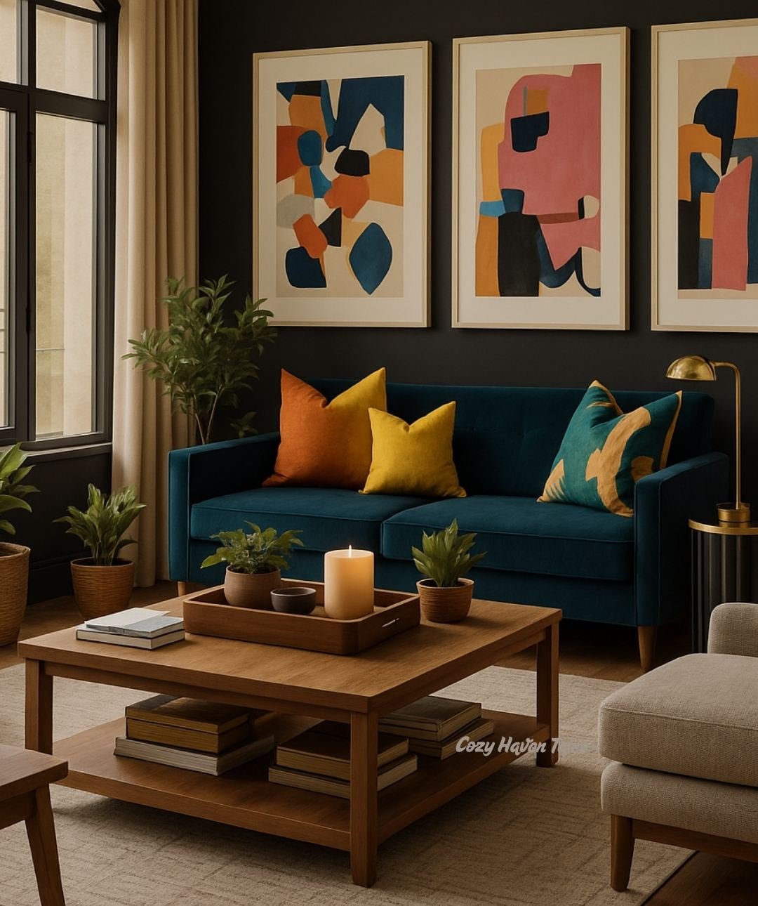
🔍 What’s in the Image:
- Bold, colorful abstract art immediately draws the eye on the dark wall
- The blue velvet sofa acts as a grounding focal point with contrast
- Warm accents (pillows, rug, wood tones) surround the focal zone but don’t overpower it
- The black wall enhances the art’s visibility and drama
✅ How This Room Demonstrates Emphasis:
- Emphasis is clearly placed on the art and sofa area — everything points toward it
- Colors are repeated in soft ways around the room for visual unity
- Lighting and layout help frame the focal area perfectly
🎯 Final Verdict:
This living room proves that focal points don’t need to shout — they need smart styling. Emphasis is achieved beautifully here by using scale, contrast, and curated repetition.
🎨 4. Harmony & Unity
🧩 What Is Harmony & Unity in Interior Design?
Harmony and unity are what make a space feel cohesive and complete. They ensure that every piece in a room — from furniture and decor to materials and finishes — works together as part of a bigger visual story.
Think of harmony as the emotional tone of a room. When done well, nothing feels random, out of place, or like it’s competing for attention. Instead, everything flows seamlessly, creating a space that feels calm, thoughtful, and intentional.
🧠 Why It Matters
You could have beautiful individual pieces — a stylish sofa, trendy lights, bold art — but if they clash in tone, scale, or palette, the room will feel disjointed.
Harmony & unity are what connect all the parts into a whole.
It doesn’t mean everything has to match — but it should feel like it belongs in the same family.
✅ General Tips to Create Harmony & Unity:
✔️ What You Should Do:
- Choose a consistent color palette and repeat it throughout the space in large and small ways — walls, pillows, rugs, artwork, etc.
- Stick to 3–4 main materials or finishes (wood, brass, linen, etc.) and echo them across furniture and accessories.
- Create a clear style or mood (like coastal, modern, or earthy) and make sure each item supports that narrative.
- Use repetition in textures, shapes, or tones (like round mirrors, curved chairs, circular decor).
- Introduce patterns mindfully — make sure they coordinate in color, scale, or theme.
🚫 What You Should Avoid:
- Avoid using too many unrelated styles (e.g., rustic coffee table + ultra-modern sofa + boho art = visual chaos).
- Don’t overload the room with mismatched wood tones or unrelated metals without a linking element.
- Be careful with accent colors — too many bold pops in different hues can make the space feel noisy.
- Avoid buying decor “just because it’s cute” if it doesn’t fit the room’s larger story.
💡 Great Ideas to Build Harmony:
- Mood boards can help you plan and visualize everything before buying.
- Use accessories to softly reinforce your palette — books, pottery, trays, even candles.
- Add contrast thoughtfully — for example, one bold piece (like a painting or chair) can still work if everything else harmonizes with it.
- Keep one or two anchor pieces neutral (like sofa or rug) to let color and texture flow more easily around them.
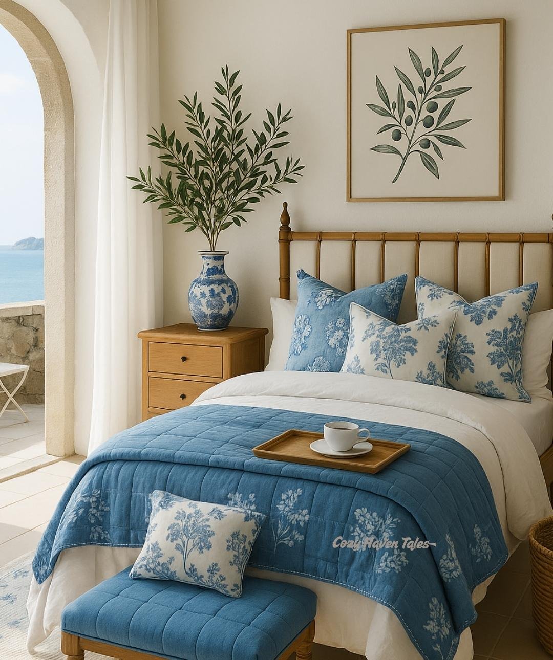
🔍 What’s in the Image:
- A consistent blue-and-white palette runs through the bedding, rug, artwork, and pillows.
- The natural wood tone of the bed, nightstands, and ceiling beams adds warmth and links the architectural features to the decor.
- A seaside painting above the bed reinforces the theme without being literal or kitschy.
- Decorative objects (lamps, plant, small artwork) stay within the same soft, relaxed visual language.
✅ How This Room Demonstrates Harmony and Unity:
- The color palette is coherent but not monotonous — white keeps things fresh, blue adds depth, and wood tones ground the space.
- Every element supports the coastal mood — airy, natural, soft.
- Textures and shapes are gentle and rounded, which enhances the feeling of peace and flow.
🎯 Final Verdict:
This bedroom is a perfect example of harmony and unity in action. Each item belongs. Nothing shouts. Together, the space feels serene, natural, and beautifully connected — just like a room should when it’s telling one clear design story.
📏 5. Scale & Proportion
🧩 What Is Scale & Proportion in Interior Design?
Scale refers to the size of an object compared to the room. Proportion refers to how parts relate to each other in size.
A massive sofa in a tiny room feels off-scale. A tiny artwork over a huge bed feels out of proportion. When these two are off, the space feels awkward — even if everything is stylish.
🧠 Why It Matters
Good design feels “right,” and scale/proportion play a major part. When sizes feel balanced — not too big, not too small — a room feels more functional and comfortable.
✅ General Tips to Get Scale & Proportion Right:
✔️ What You Should Do:
- Choose furniture that fits the room size — not too bulky or too small
- Use the rule of thirds — for example, artwork should be about 2/3 the width of the furniture it hangs above
- Layer heights — vary the levels of furniture, decor, and lighting for dimension
- Create groupings in odd numbers (3 candles, 5 frames, etc.) for visual interest
🚫 What You Should Avoid:
- Avoid using furniture that crowds the space — leave enough negative space
- Don’t use tiny rugs under big furniture — scale mismatch is distracting
- Don’t place tall items in corners unless they’re balanced by other tall features
💡 Great Ideas to Master Scale & Proportion:
- Use large-scale art in spacious rooms and small groupings in tighter areas
- Hang curtains high and wide to increase perceived ceiling height
- Pair a chunky coffee table with substantial sofas — or vice versa
- Adjust pendant height based on table size and ceiling height
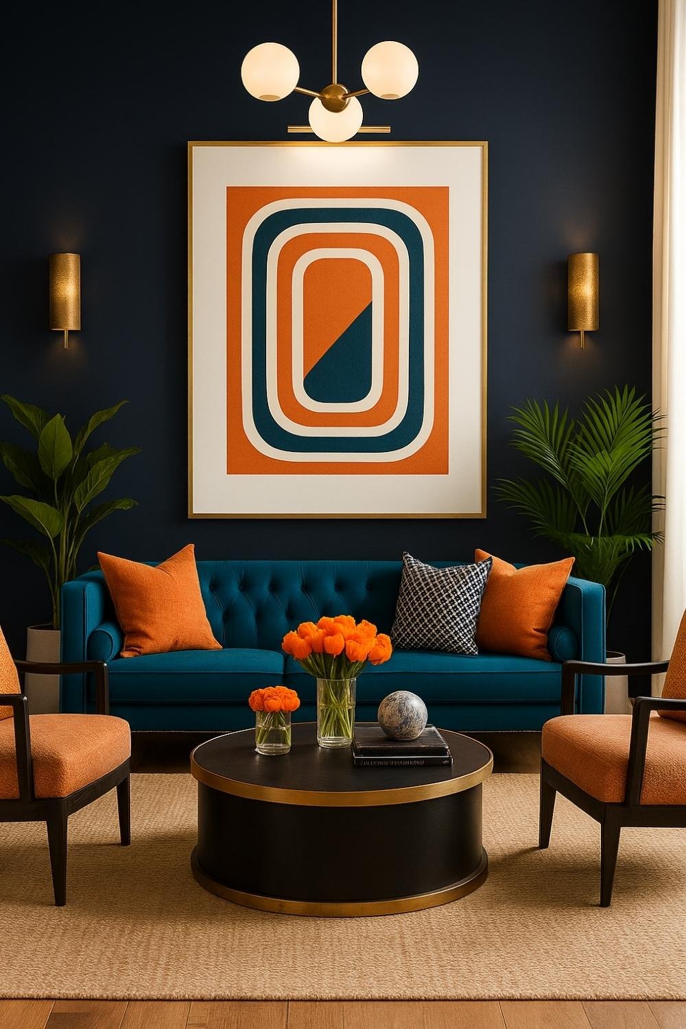
🔍 What’s in the Image:
- Oversized modern artwork centered above a tufted teal sofa
- Round black coffee table with gold accents and neatly placed decor
- Matching orange accent chairs and pillows adding symmetry and color rhythm
- Tall indoor plants placed behind both chairs
- Vertical gold wall sconces and a modern ceiling light fixture
- Large navy wall that anchors the whole setup
✅ How This Room Demonstrates Scale & Proportion:
- Artwork width aligns perfectly with the sofa, creating balance without overwhelming the wall.
- Sofa, chairs, and table are all sized to work well together — nothing feels off-scale.
- Plants and sconces add vertical balance without cluttering the space.
- Round table softens the setup and fits well within the seating area.
- Every piece feels thoughtfully placed in relation to others, creating visual flow.
🎯 Final Verdict:
This image nails scale and proportion. Everything feels right sized for the space it’s in, proving that proportion is just as important as color or style.
🎭 6. Contrast
🧩 What Is Contrast in Interior Design?
Contrast is what makes a space exciting — it’s about difference. Light and dark, smooth and rough, big and small — contrast adds depth, drama, and clarity to a room.
It helps individual items stand out while still being part of the whole story.
🧠 Why It Matters
Without contrast, everything blends in and nothing stands out. A space can feel boring or flat. With contrast, the eye stays engaged — it notices the differences and appreciates the visual tension.
✅ General Tips to Add Contrast:
✔️ What You Should Do:
- Combine light and dark colors — black + white, navy + beige
- Mix textures — pair glossy with matte, smooth with rough, wood with velvet
- Vary shapes — a round mirror over a rectangular console adds interest
- Play with scale — tall vases beside low bowls, oversized lamps over small tables
🚫 What You Should Avoid:
- Don’t overdo contrast — too many opposing elements can feel chaotic
- Avoid unrelated contrasts — contrast should still make sense in your theme
- Be careful mixing textures in small spaces — it can feel cluttered
💡 Great Ideas to Use Contrast:
- Paint window frames or doors in dark hues against light walls
- Use a textured or colorful backsplash in a minimal kitchen
- Add black accents (frames, legs, trays) in warm-toned rooms
- Mix vintage pieces with modern lines
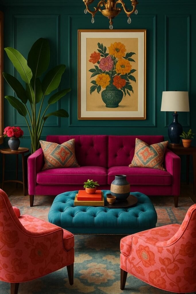
🔍 What’s in the Image:
- A deep emerald green paneled wall creates a rich, dramatic backdrop.
- A magenta velvet sofa sits center-stage with two patterned pillows.
- In front is a tufted teal ottoman, styled with a tray, ceramic vases, and a small plant.
- Two coral-orange accent chairs with soft curves and warm undertones frame the scene.
- A large framed floral artwork in yellow, orange, and green tones hangs above the sofa.
- Side tables on both sides with lamps, vases, and a potted plant complete the setup.
- A color-coordinated rug subtly ties together coral, teal, and cream tones.
- A tall banana leaf indoor plant adds natural texture and height.
✅ How This Room Demonstrates Contrast:
- The bold mix of magenta, teal, and coral feels daring but well-balanced.
- The emerald green wall anchors the colors and adds depth.
- Contrasting furniture pieces are tied together through the rug and cushions.
- The tall plant and floral art add vertical balance to the space.
- Minimal yet intentional decor lets the colors and furniture stand out.
🎯 Final Verdict:
This image is a bold and brilliant example of how to layer color in a living room without overwhelming the senses. Every piece holds its weight, yet nothing feels out of place. The room has a strong personality, artistic flair, and warm hospitality. If you love expressive interiors, this is maximalism done right.
🧵 Wrapping It All Together: Why These Principles Matter
Great interior design isn’t just about what looks “pretty” — it’s about what feels right. The principles of interior design help you make thoughtful decisions so your home doesn’t just look good but also functions beautifully and reflects you.
Whether you’re arranging a living room, designing a bedroom, or refreshing a kitchen corner — these six principles are your guideposts. They remind you to look at the big picture and the small details.
- Balance ensures your space feels steady and grounded.
- Rhythm keeps the visual flow alive.
- Emphasis makes your space memorable.
- Harmony & Unity connect every piece to a bigger story.
- Scale & Proportion bring comfort and practicality.
- Contrast adds personality and spark.
The more you notice and apply these ideas, the more intuitive your design decisions become — and the more your home begins to feel like home in the truest sense.