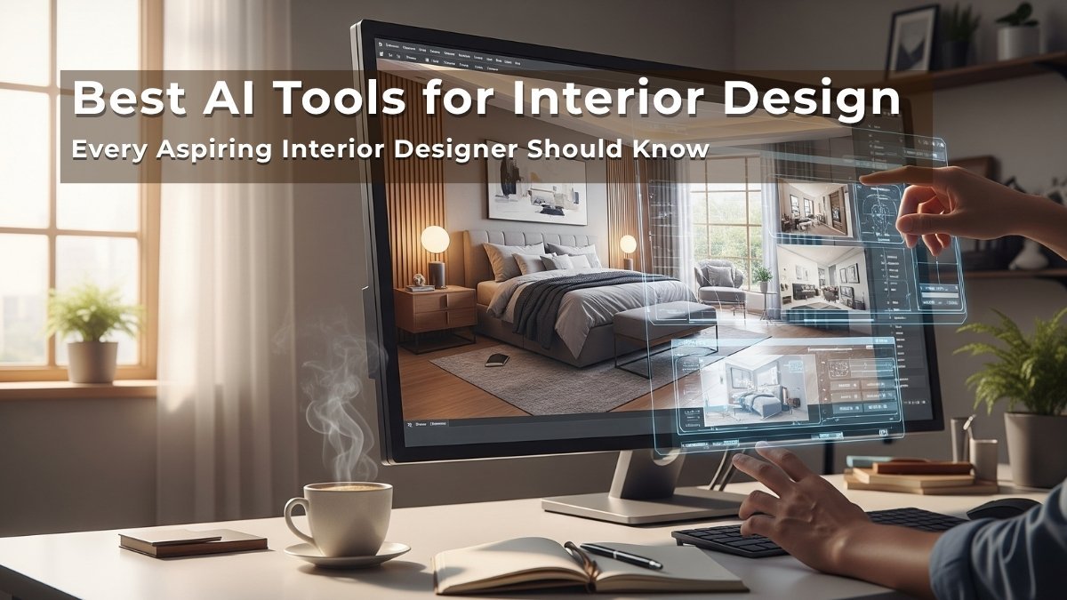
✨ Introduction to Elements of Design in Interior Design
When you first step into the world of interiors, all the colors, textures, and layout ideas can feel overwhelming. But if you look closely, every thoughtfully designed room—whether it’s a cozy living room or a modern kitchen—is built on a foundation of 7 core Elements of Design in Interior Design.
“This post includes inspirational images created using ChatGPT (Sora) to visually explain each element of design.”
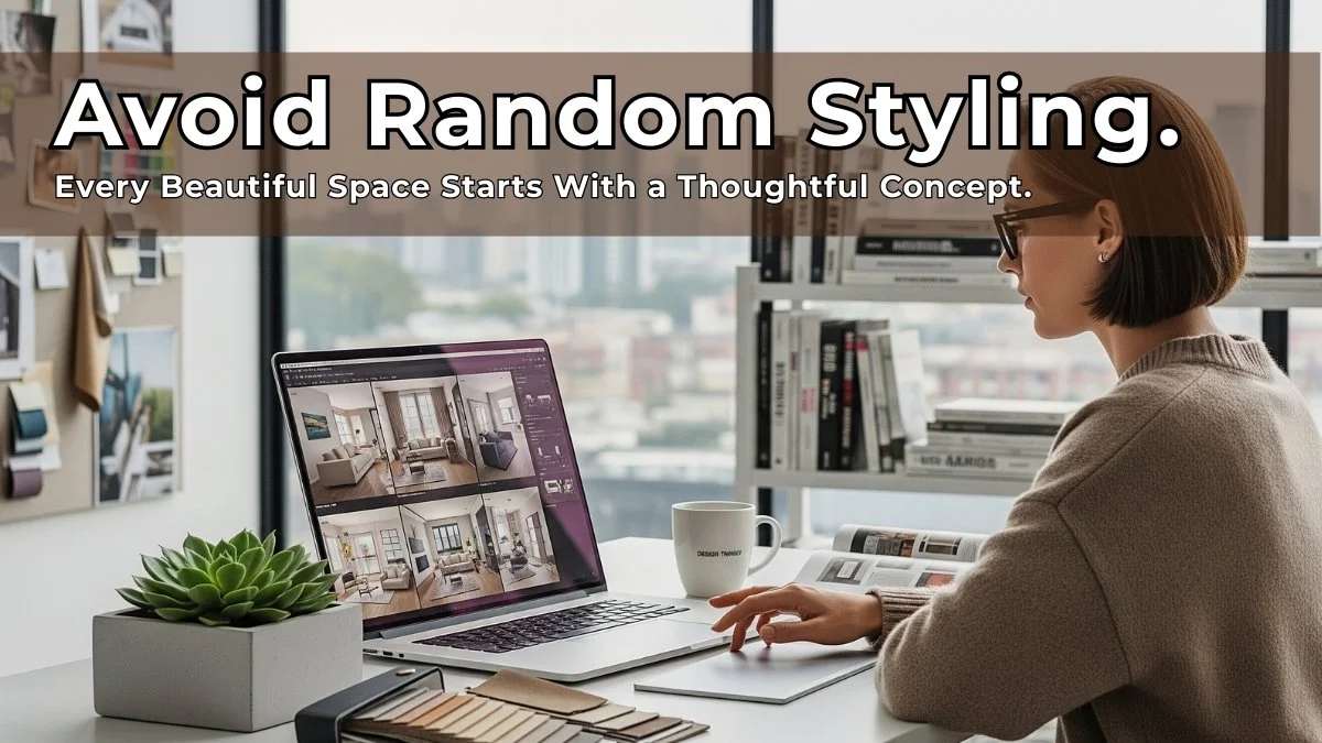
If you’ve read my previous post on how to use the 7 elements of interior design, you already know how powerful they are in transforming a space. Today, I’m taking that knowledge one step further—with a visual guide that shows each element in action.
Using inspirational design photos, I’ll Walk you through how each principle—space, line, form, texture, color, light, and pattern—is applied in actual interiors. Whether you’re just learning design or building a mood board for your next project, these examples will help you understand not just what these elements mean, but how they look and feel in a finished space.
Related Article:
- 7 Ways to Add Texture in Interior Designing
- How to Mix Rustic and Elegant Decor at Home
- 15 Budget Friendly Decor Ideas to Make Your Home Cozier
1. Space – Let the Room Breathe
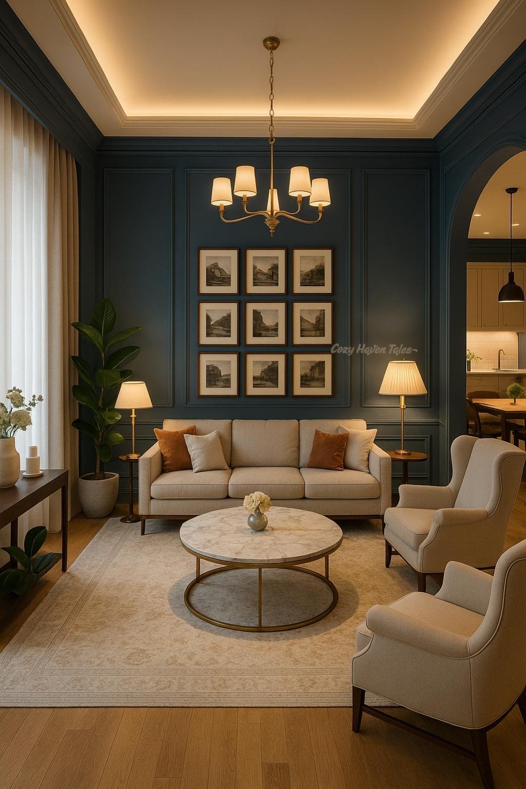
Everything starts with space—it’s your canvas. This includes the walls, floor, ceiling, and even the gaps between furniture.
- Positive space is where your furniture or decor lives.
- Negative space is the open, unoccupied area around and between objects.
A good design respects both. Overcrowding the room makes it feel suffocating, while too much negative space can feel empty or unfinished.
Balance is key.
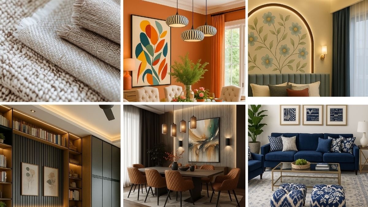
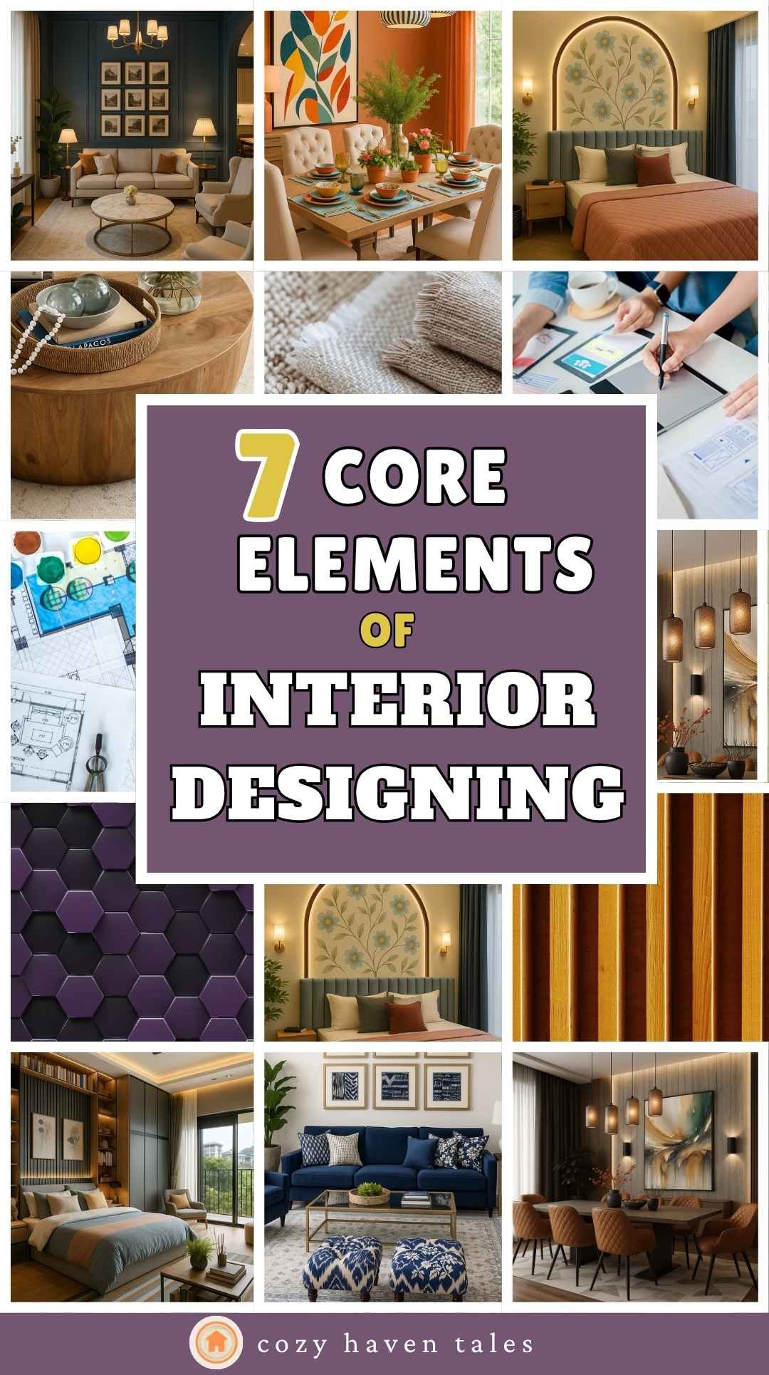
In this living room, notice how every piece of furniture has room to breathe. The sofas and coffee tables are spaced apart to allow natural walkways, and there’s no crowding against walls. This creates a relaxed, open feel. The negative space (empty floor and wall areas) balances out the positive space (furniture and decor), resulting in a light and airy layout.
👉 Designer Tip: Don’t try to fill every corner. Embrace negative space to give the rest of your furniture and decor room to shine.
2. Line – Guide the Eye with Structure
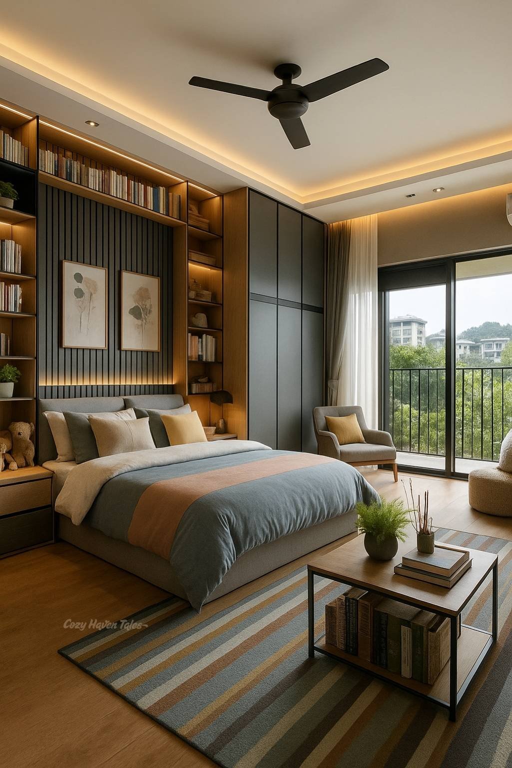
Lines guide the eye and structure the space. They influence mood and how we visually experience a room.
- Horizontal lines (like long tables or open shelving) create calm and stability.
- Vertical lines (like tall cabinets or curtains) evoke height and formality.
- Dynamic lines (curves, diagonals, zigzags) add movement and interest.
Think of lines as silent organizers—they control flow without saying a word.
Look closely at the architectural and decorative lines in the above bedroom. The vertical grooves on the wall panels and curtains stretch the space visually, making the ceiling feel taller. The horizontal lines from the rug, bed frame, and ceiling beams offer stability and balance. Together, they subtly guide your eye across the space.
👉 Designer Tip: Use vertical lines in smaller rooms to make ceilings feel taller, and horizontal lines to create a calming base.
3. Form – Mix Shapes for Visual Balance
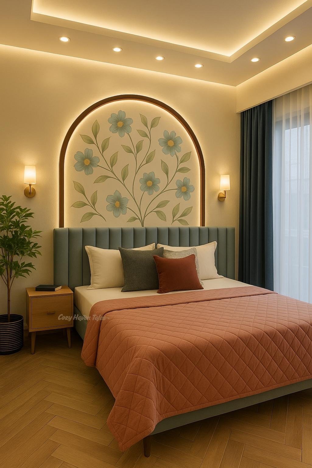
Form is the shape and structure of things, both decorative and architectural.
- Geometric forms (squares, rectangles, cylinders) are more structured and clean.
- Organic forms (curves, waves, arches) feel natural and soft.
A thoughtful mix of both creates interest without making the space feel chaotic.
This bedroom combines both geometric and organic forms effortlessly. The arched wall niche introduces a soft, flowing shape, contrasting beautifully with the rectangular bed, pillows, and frames. This mixture avoids monotony and adds visual interest while keeping a cohesive look.
👉Designer Tip: Blend geometric furniture with one or two curvier elements like mirrors, vases, or wall art to avoid a boxy feel.
4. Light – Lighting with Intention
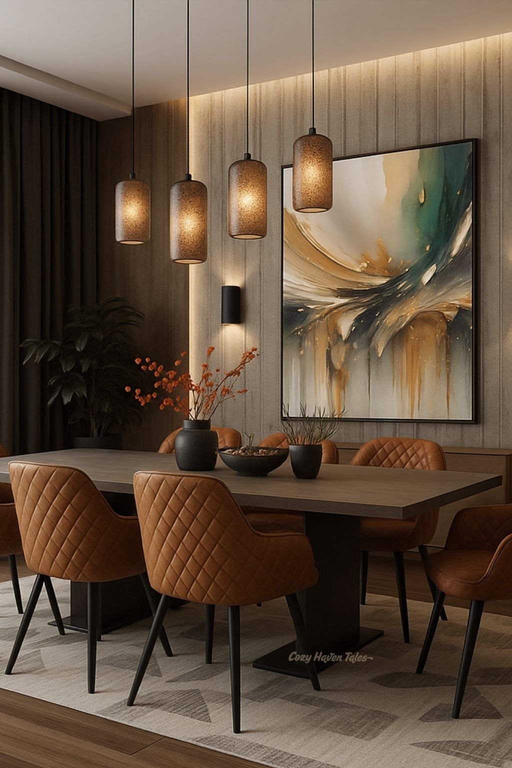
Light is more than just visibility—it affects mood, colors, and how textures appear. There are three main types to work with:
- Ambient lighting: general room lighting (like ceiling fixtures).
- Task lighting: directed light for activities (like study lamps or under-cabinet lights).
- Accent lighting: to highlight a feature or create mood (like spotlights on artwork).
This dining area is a brilliant example of layered lighting done right. Notice how indirect lighting from the ceiling softly brightens the space without glare, while the wall sconces highlight textures and art, adding ambient warmth. Finally, the ceiling pendants focus task light directly onto the dining table. Together, they create dimension, mood, and functionality.
👉 Designer Tip: Use a combination of ambient (like wall lights), task (like pendants), and accent lighting (like hidden ceiling strips) to bring depth and atmosphere to your space.
5. Color – Let the Palette Speak
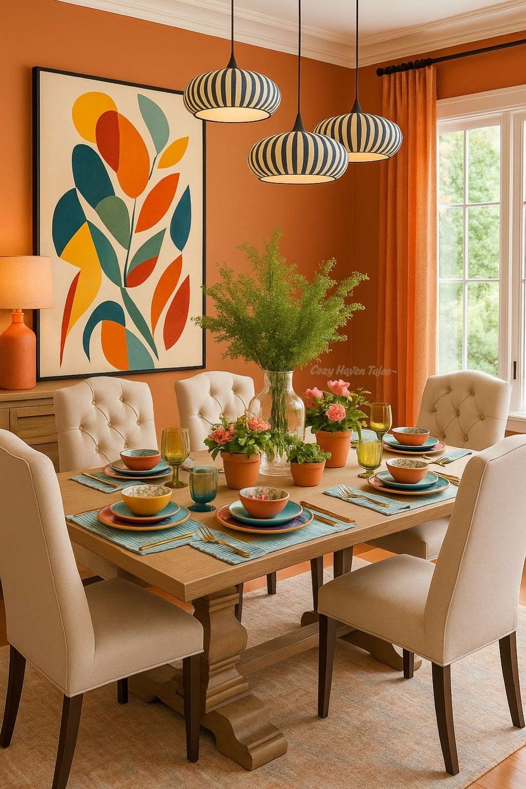
Color isn’t just about personal preference—it affects how a space feels. It can energize, calm, or even make a room feel larger or smaller.
Examples of basic color psychology:
- Blue: calming, ideal for bedrooms or offices.
- Yellow: cheerful, great for kitchens or playrooms.
- Neutrals: timeless and versatile.
This vibrant dining space uses a bold orange palette that repeats through the curtains, wall art, and table settings. Notice how the warm tones are softened by light neutrals in the furniture and background, preventing the color from becoming overwhelming. It feels cheerful, modern, and intentional.
👉 Designer Tip: Choose one dominant color and build around it with supportive neutrals or subtle accent colors for cohesion.
Suggested Article:
- How to Use Colour Psychology in Interior Design: A Simple Guide
- Orange Bedroom Decor Done Right: 6 Tips to Avoid Overdoing It
6. Texture – Create a Touchable Look
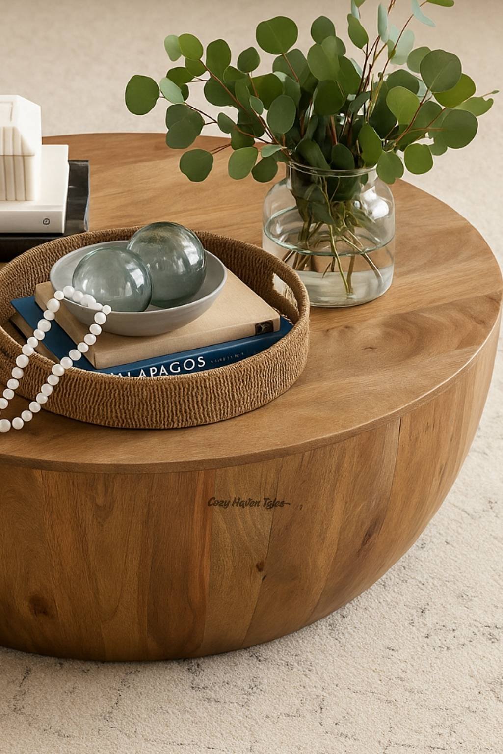
Texture adds depth and makes a space feel more layered and complete. It can be visual (what something looks like) or tactile (what it feels like).
- Visual texture: shiny marble, linen curtains, grainy wood.
- Actual texture: furry rugs, smooth ceramic, rough brick.
Mixing textures gives even a neutral-toned room personality.
Even without bright color, this close-up captures a cozy vibe through texture. The image layers coarse weaves, plush fabrics, and smooth finishes—you can almost feel the differences with your eyes. Texture brings depth to otherwise neutral palettes, making the room feel more alive.
👉 Designer Tip: Mix at least three textures in a room—such as wood, fabric, and metal—for visual depth and comfort.
7. Pattern – Add Movement and Personality
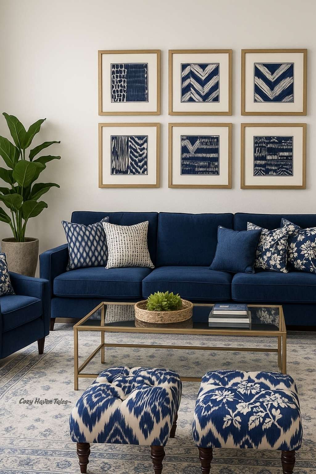
Patterns bring rhythm, movement, and storytelling into the space. They can be subtle or bold, and they often reflect your personal style.
Some popular patterns:
- Stripes = order and structure
- Florals = softness and nature
- Geometrics = modern edge
- Abstracts = creativity and energy
In this modern blue living room, patterned artwork and matching ottomans create a rhythm across the space. Motifs in varied scales draw attention but don’t overwhelm, thanks to the calming blue-and-white color palette. The patterns feel deliberate, not chaotic—demonstrating how balance can be achieved by anchoring varied designs in a consistent shade. If you’re working with different colored patterns, make sure the styles feel cohesive in shape, theme, or repetition to avoid visual noise.
👉 Designer Tip: When mixing patterns, stick to a unified color scheme and vary the scale—combine large patterns with smaller ones. If you’re mixing both color and pattern, ensure the patterns relate to each other in shape or style to keep things feeling cohesive.
Related Video:
Here is how to mix different patterns for unique environments!
How These Elements Help Aspiring Interior Designers 🎓
If you’re just starting your journey in interior design, mastering these elements of interior design gives you a strong and reliable foundation. Instead of relying solely on instinct or trends, you’ll start seeing spaces through a more intentional lens—like a designer does.
Here’s how these elements support your growth:
- ✅ They give structure to your creativity – Instead of guessing what looks good, you’ll understand why certain designs work.
- ✅ They improve your design vocabulary – Whether you’re presenting mood boards or discussing a layout with a client, using the right terms (like “negative space” or “visual texture”) makes you sound professional.
- ✅ They train your observation skills – You’ll start noticing how lighting changes a room or how form and color interact. These subtle details separate a decorator from a designer.
- ✅ They make your designs more balanced – Once you master these elements, your spaces will feel cohesive, functional, and tailored—rather than random or cluttered.
- ✅ They prepare you for client projects – Understanding these fundamentals helps you explain choices clearly and solve design problems with confidence.
As you continue learning and experimenting, these core elements will become second nature—your internal checklist for every design decision.
🧠 Final Thoughts: Design with Intention
These 7 core elements of design in interior design aren’t just abstract concepts—they’re your tools. Whether you’re decorating your home for the first time or stepping into a design career, these elements help you move from “I think this looks nice” to “I know why this works.”
Start practicing by observing the spaces around you—what element stands out? What’s missing? As your awareness grows, so will your confidence.
The 7 elements are: Space, Line, Form, Light, Color, Texture, and Pattern. These are the foundational building blocks that help designers create balanced, functional, and visually pleasing interiors.
They guide how a space feels and functions. Understanding these elements helps you design with intention—choosing furniture, colors, lighting, and layouts that work together instead of randomly guessing what looks good.
“Shape” usually refers to 2D outlines (like a square or circle), while “form” refers to 3D structures (like a cube or sphere). In interior design, form includes the shape, depth, and structure of furniture and architectural features.
Start by observing your space. Ask yourself questions like: Is there enough light? Do the textures feel inviting? Are the colors working together? Even small adjustments—like changing pillow textures or repositioning furniture—can apply these principles.
Yes, mixing patterns works beautifully when done with care. Stick to a cohesive color scheme and vary the scale—pair large florals with smaller checks or thin stripes with bold abstracts to avoid visual clutter.
Texture is about how something feels (like smooth marble or rough jute), while pattern is about how it looks—a repeated design, like stripes, florals, or checks. Texture adds depth; pattern adds rhythm.
Absolutely. Light influences mood, highlights textures, and reveals the true color of your decor. A well-lit room feels more welcoming, and layering different types of lighting makes the space functional and cozy.
Focus on maximizing light and space. Use vertical lines to add height, light colors to open up the room, and minimal patterns to avoid overwhelm. Add mirrors to reflect light and balance positive/negative space wisely.
Yes, whether it’s modern, bohemian, traditional, or Japandi—every interior design style uses these 7 elements. What changes is how each element is expressed. For example, minimalism favors more negative space, while maximalism embraces more color and pattern.