Every home tells a story, and color is often the very first line. Living room paint colors work subtly but powerfully—lifting energy, calming nerves, sparking joy, or fueling creativity. I like to think of them as the secret language of design. Once you understand how to use them, you can completely transform the way a space feels without moving a single piece of furniture.
This isn’t about strict design rules. It’s about noticing how different living room paint colors influence mood and then choosing them to create spaces that feel right for you. Sometimes that means layering colorful décor against a neutral backdrop, while other times it’s about letting the walls themselves become the canvas. Since walls cover the largest surface in a room, they play the biggest role in shaping the atmosphere.
Related Articles:
- Modern Contemporary Living Room Ideas to Add Personality and Warmth
- Paint Colors to Avoid When Selling Your Home
- How to Create a Stunning Maximalist Living Room Full of Personality
Stop Choosing Living Room Paint Colors Without Knowing This Secret
From bold reds to calming blues, cheerful yellows to grounding neutrals—living room paint colors bring their own personality. In this post, we’ll explore how they shape not just the style of a living room, but the emotions and experiences it inspires.
As you explore these 24 shades, keep in mind that all paint shade links direct to official brand websites for reference. Always test samples in your own space before finalizing a color.
Among all paint colors, red is one of the most expressive and transformative choices for a living room—so we’ll begin with red.
Readers Also Enjoyed: The Healing Power of Cozy Spaces: More Than Just Décor
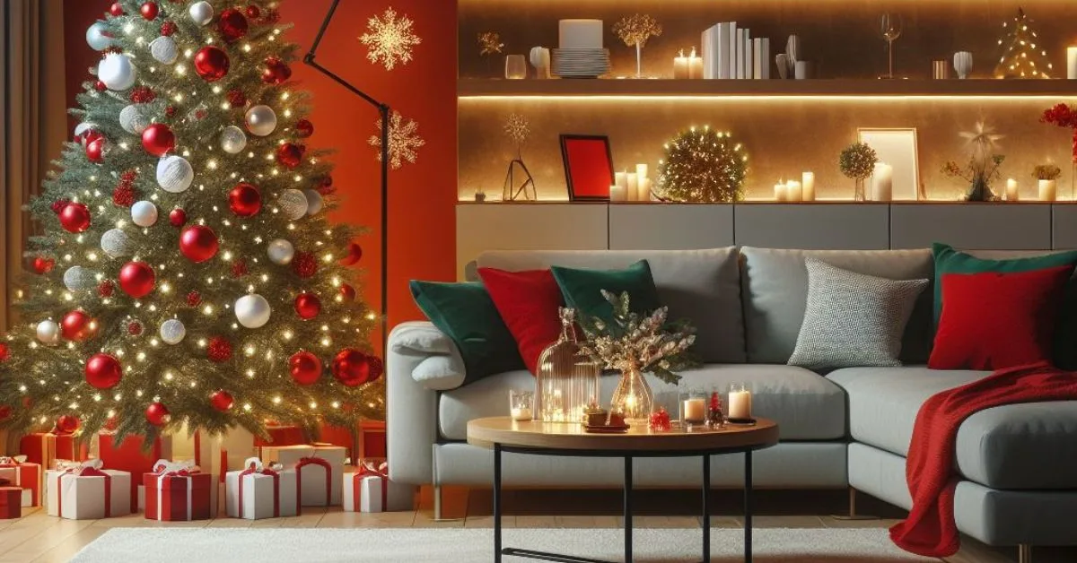
Red Walls: Bold, Passionate, and Full of Energy
Red is one of the most powerful wall colors. It instantly transforms a space with energy, passion, and drama. But red isn’t just one look — depending on the shade and what you pair it with, it can feel traditional, modern, or even cozy.
1. Eclectic Red with Traditional Warmth
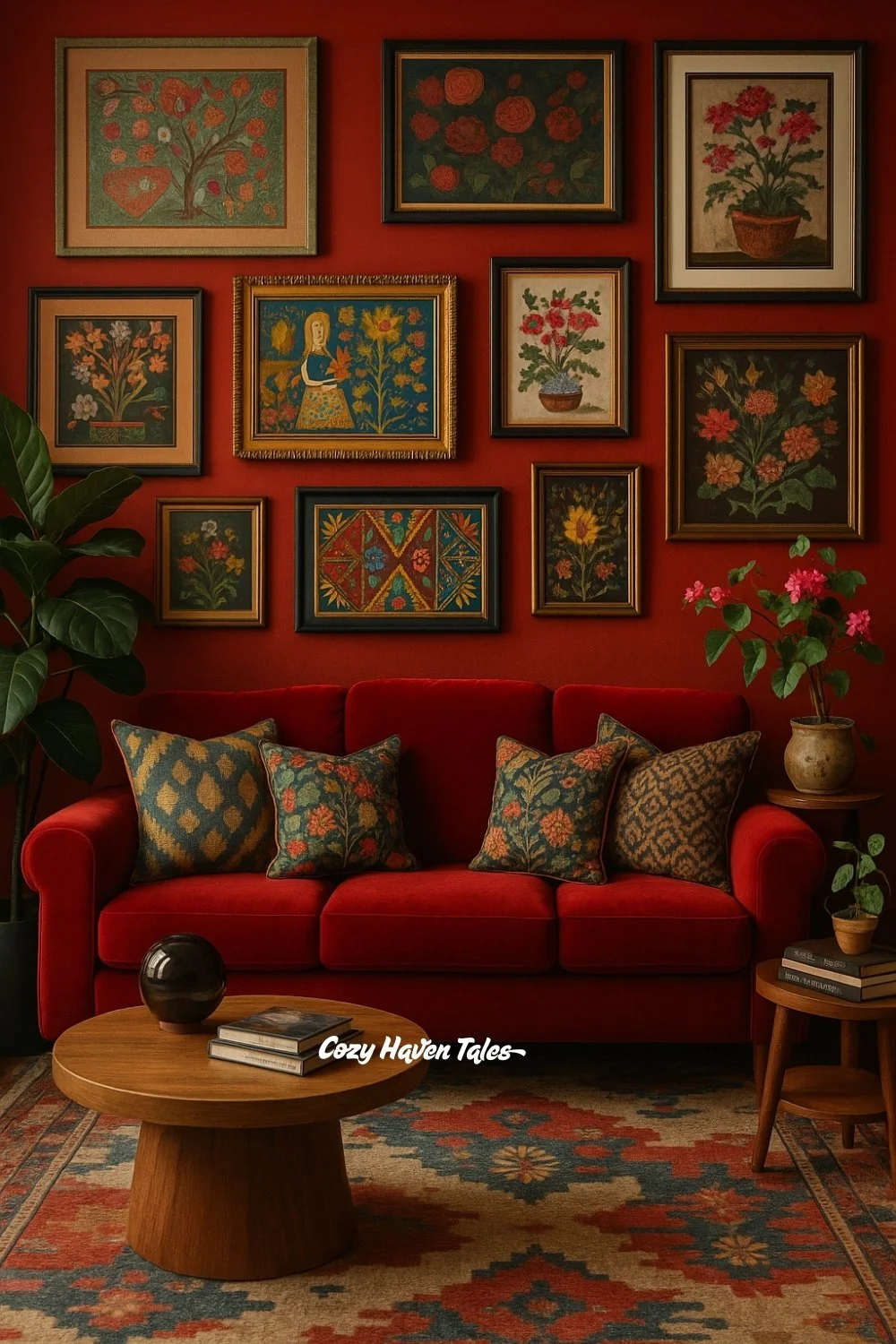
Red, in its deeper shades, feels timeless and rich. It works beautifully when paired with layers of pattern and texture. For this inspiration, I chose a deep red wall and continued the color story with a plush red sofa. To keep the look from feeling too heavy, I added patterned cushions in muted greens and blues. The gallery wall of floral artwork brings in tradition and storytelling, making the room feel like it’s evolved over time. This shows how red can support an eclectic, heritage-inspired style without losing balance.
👉 Similar Paint Shades That Closely Match This Inspiration:
Benjamin Moore – Million Dollar Red (2003-10)
2. Wine Red with Contemporary Elegance
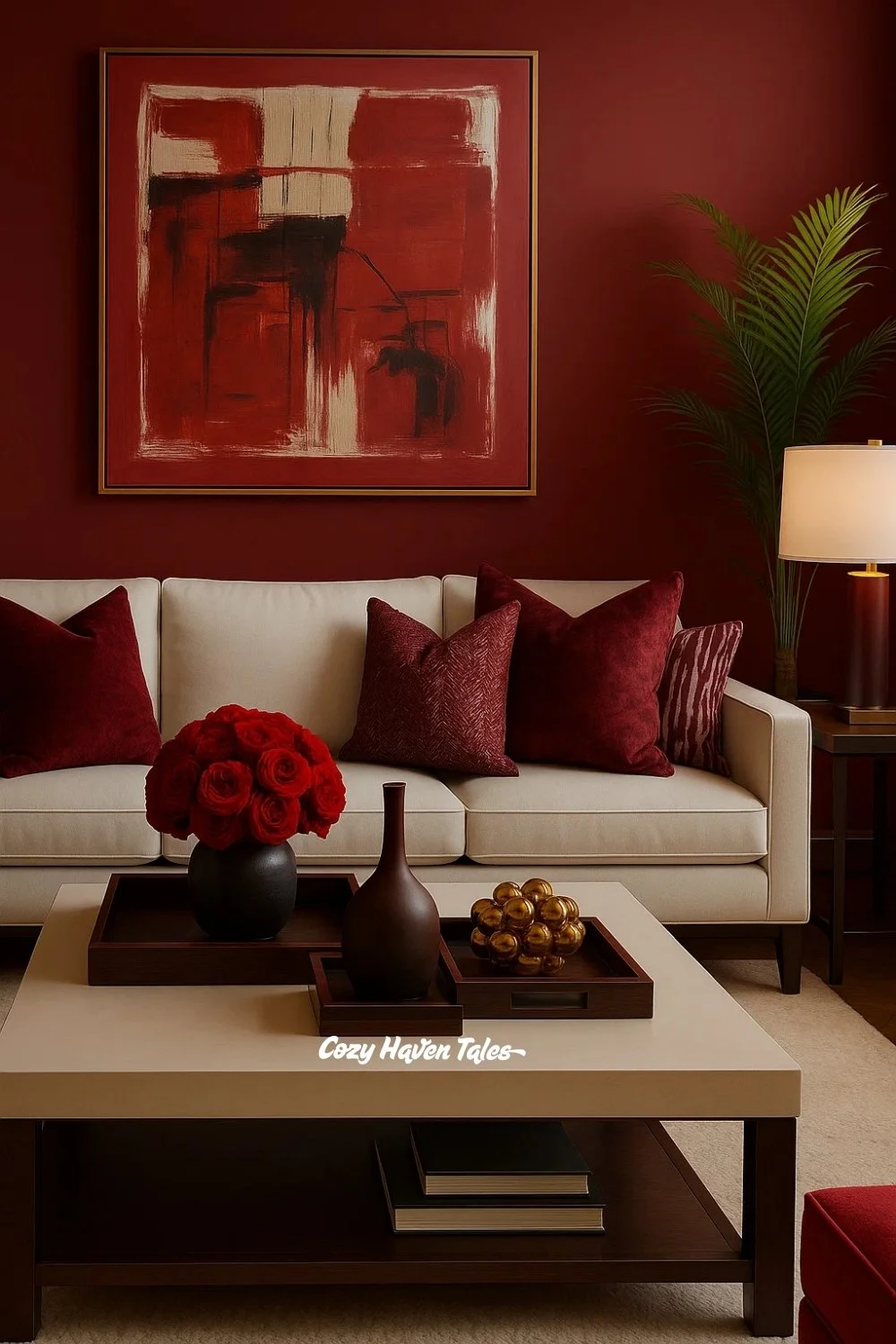
Different tones of red bring different moods. Wine red feels refined, almost like a glass of merlot in the evening. For this space, I paired wine-colored walls with a crisp cream sofa — the contrast keeps the look modern and fresh. Instead of layering multiple artworks, a single large abstract painting carries the drama, tying the palette together. The design proves how red walls can be both bold and minimal when styled with restraint.
👉 Similar Paint Shades That Closely Match This Inspiration:
Benjamin Moore – Classic Burgundy (HC-182)
Related Post: 8 Things to Consider When Selecting Wall Paint Colours.
3. Bright Red Dining Room
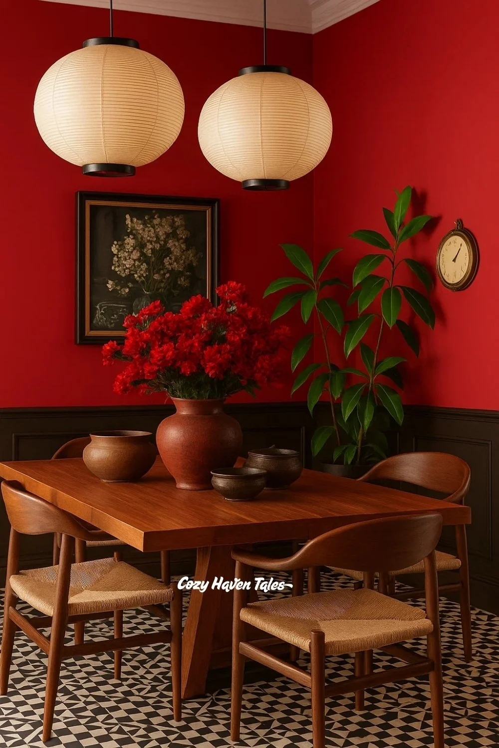
Red also has a strong connection with appetite and energy, which is why it works so well in dining spaces. Here, I used a brighter, clearer red to create vibrancy around the table. The wooden furniture and black paneling ground the look, keeping it warm and approachable. Accessories like paper lanterns and greenery soften the intensity. This inspiration highlights how red walls can turn a dining room into a lively, conversation-filled hub.
👉 Similar Paint Shades That Closely Match This Inspiration:
- Sherwin-Williams – Brick Paver (SW 7599)
- Benjamin Moore – Audubon Russet (HC-51)
4. Burnt Red with Modern Contrast
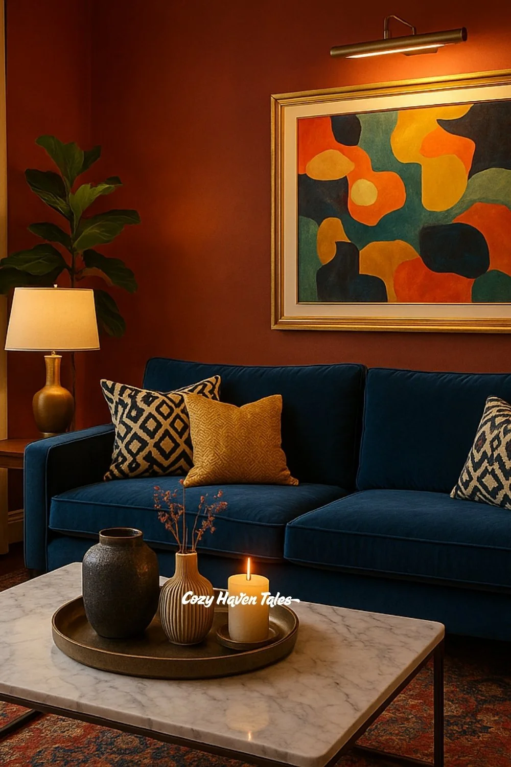
Red doesn’t always need to be vivid. Burnt red or terracotta shades bring a more grounded, earthy character. In this design, I paired burnt red walls with a navy sofa to create a striking, modern contrast. Gold lighting and abstract wall art bring warmth and variety, showing how red can also feel contemporary and stylish when balanced thoughtfully.
👉 Similar Paint Shades That Closely Match This Inspiration:
• Sherwin-Williams – Brick Paver (SW 7599)
Green Walls: The Natural Balancer
Green and its many shades connect interiors back to nature. It brings freshness, grounding, and balance. What’s fascinating is how versatile green can be — shifting from formal to eclectic, calm to bold, depending on the shade and styling.
5. Deep Green Entryway with Classic Charm
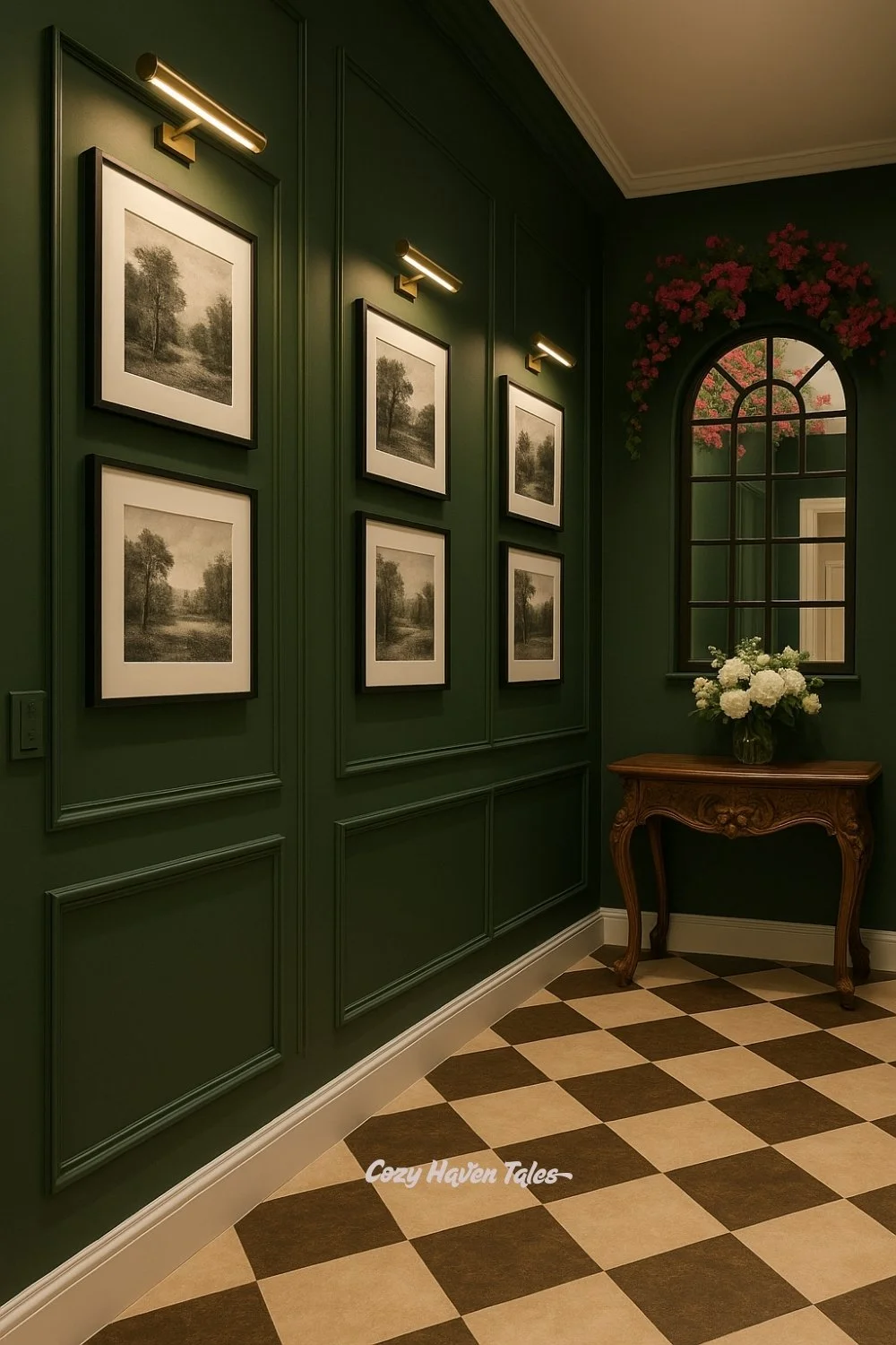
Dark green walls feel formal and grounding, which is why I used them in this entryway inspiration. Paneled walls painted deep green create a stately first impression. To enhance the classic feel, I added black-and-white sketches under brass picture lights. The carved wooden console and floral arrangement bring warmth and elegance. This shows how green walls can instantly elevate transitional spaces like corridors or entryways into something memorable.
6. Teal Green with Modern Playfulness
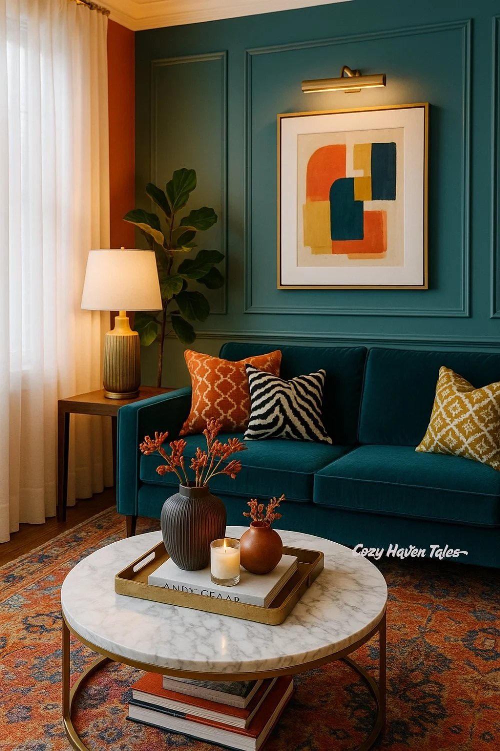
When green leans towards teal, it takes on a fresher, more modern personality. In this design, I paired teal walls with a matching sofa for continuity, then broke the color block with patterned cushions in orange, yellow, and black-and-white. The abstract artwork above reinforces the playful, contemporary vibe. It’s a reminder that green doesn’t always have to be serious — it can feel youthful and stylish too.
7. Forest Green with Bold, Eclectic Layers
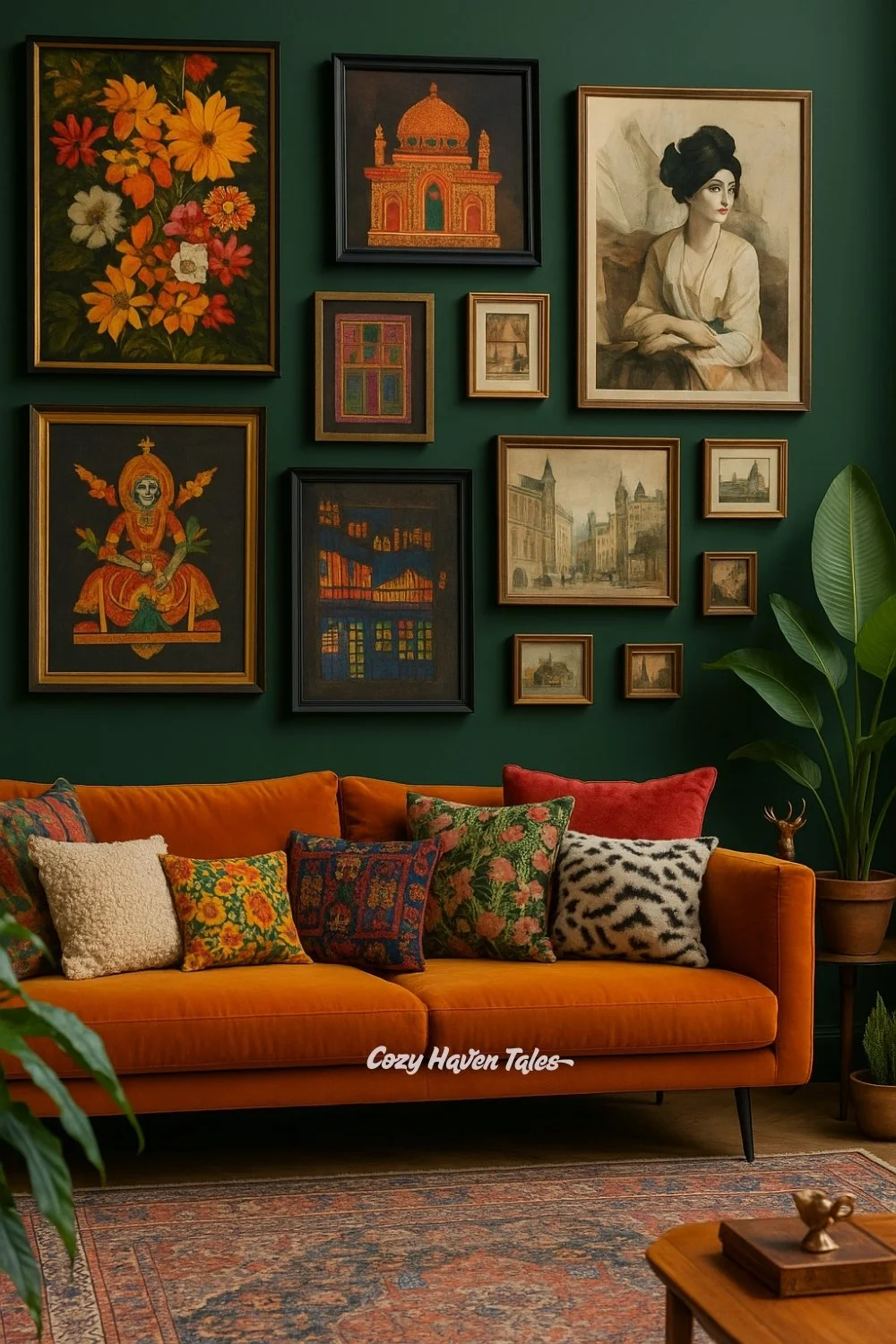
Forest green is one of the boldest shades — strong enough to pair with equally vibrant furniture. For this inspiration, I chose forest green walls and added a burnt orange velvet sofa to balance depth with warmth. To avoid a plain backdrop, I layered the wall with portraits, traditional art, and Indian-inspired pieces. The result feels collected and global, proving that green walls can support eclectic storytelling without chaos.
8. Olive Green with Timeless Calm
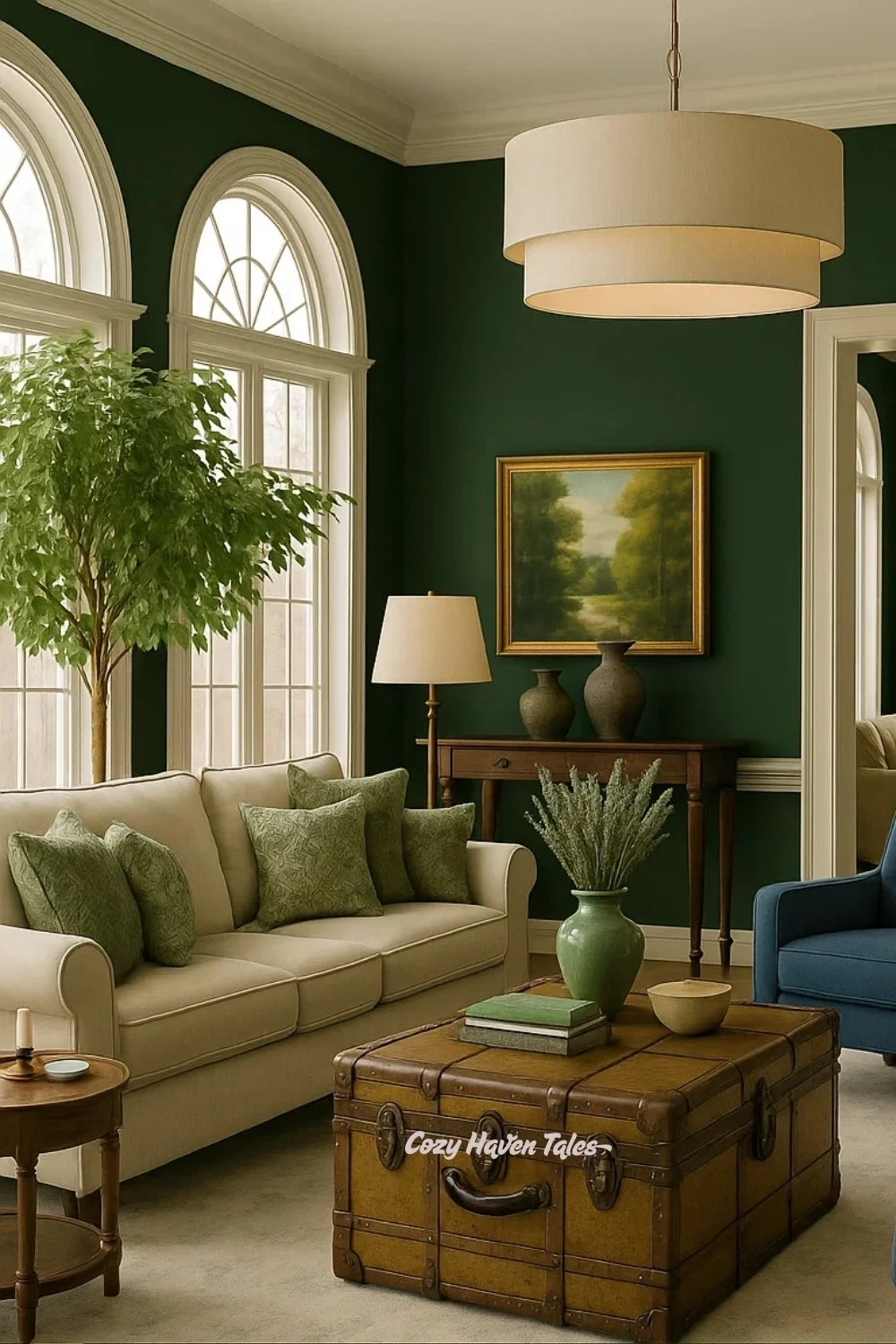
Olive green offers a softer, more neutral approach. In this living room design, olive walls create a calm background for beige seating. Navy armchairs add subtle depth, while a vintage trunk and classic artwork tie everything together. The overall effect is timeless and grounding — showing how green can work as a sophisticated neutral when you don’t want the walls to dominate.
Yellow Walls – A Dose of Sunshine Indoors
Yellow has an energy that no other color brings. It’s cheerful, uplifting, and instantly makes a space feel alive. Whether it’s a bold golden tone or a softer buttery shade, yellow connects interiors to sunlight — filling the room with warmth even on cloudy days.
9. Mustard Yellow with Expressive Art
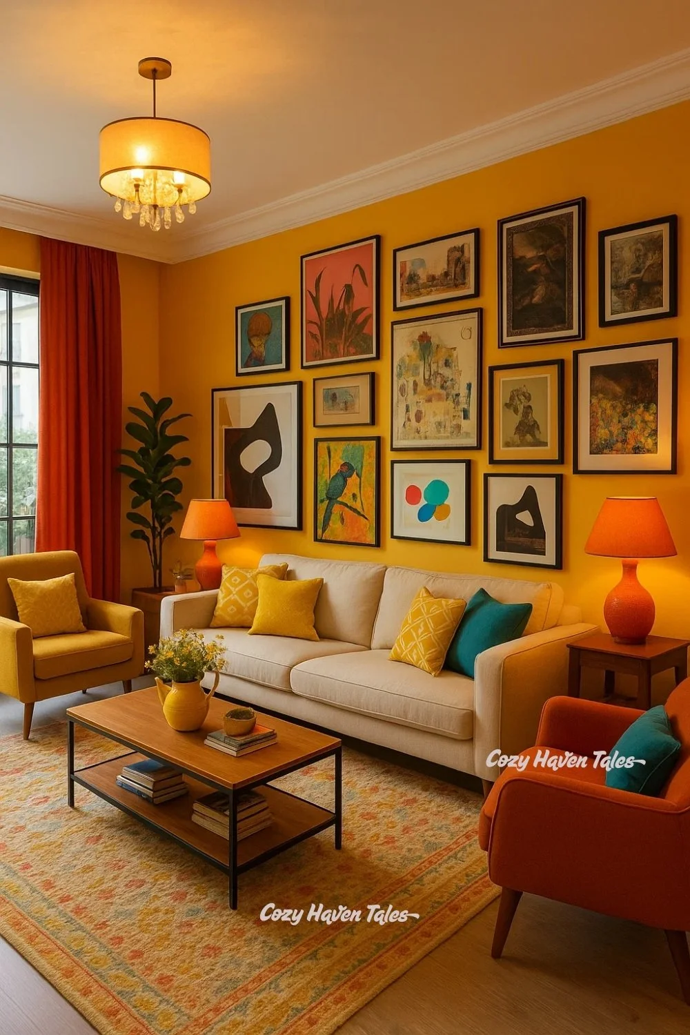
Yellow walls, when used in a living room, immediately set a cheerful and inviting tone. To balance this brightness, a gallery wall filled with colorful and eclectic artwork works beautifully. Yellow can sometimes feel overpowering on its own, but art creates a sense of storytelling and movement, allowing the eye to travel across different shades and textures. A warm sofa and orange drapery help tie the palette together, showing how yellow blends harmoniously with nearby warm tones.
10. Soft Buttery Yellow for Warmth
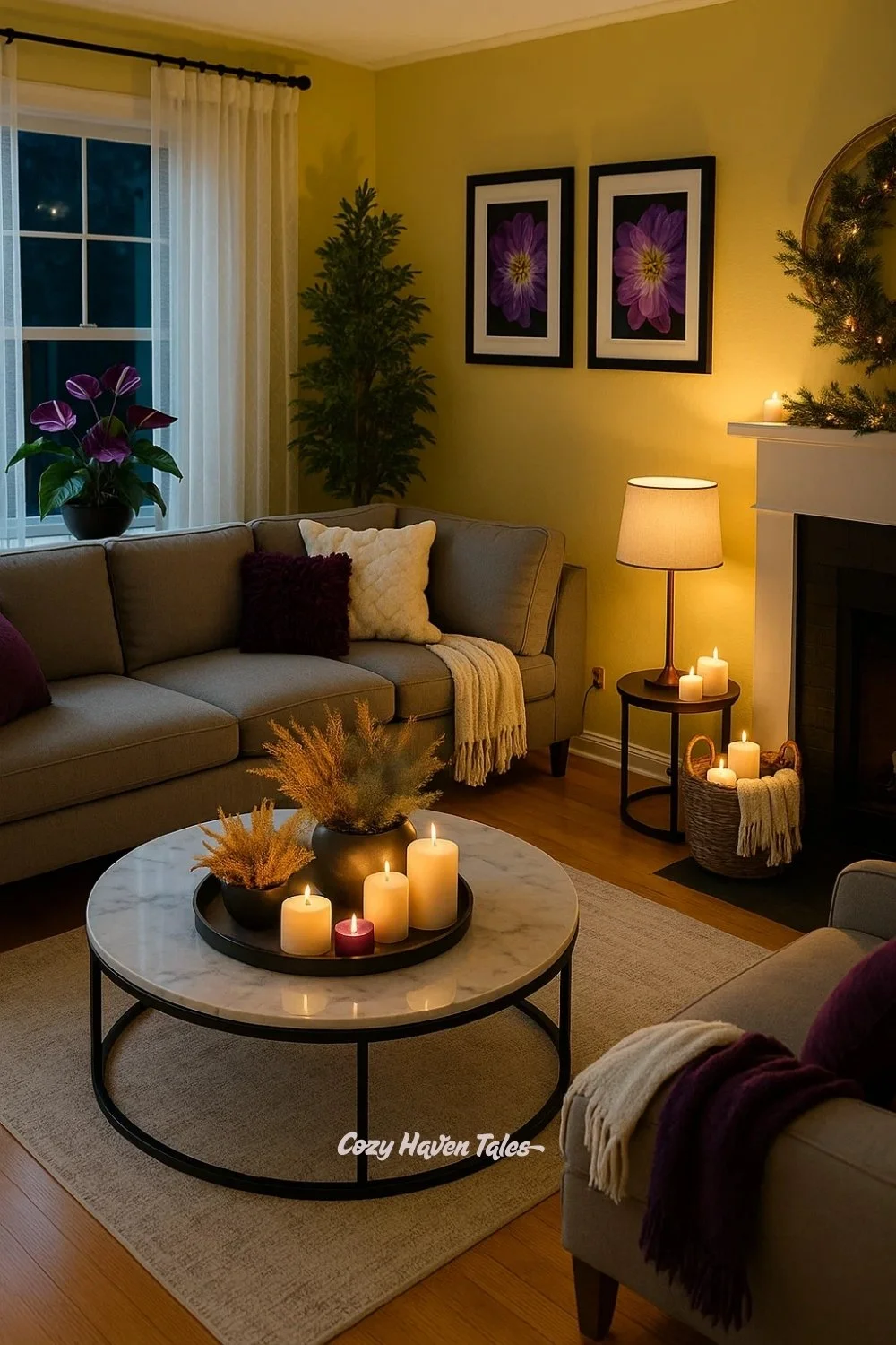
Yellow has a natural glow, and in this room, it creates a cozy and welcoming backdrop. Soft lighting from candles and lamps enhances this effect, while purple cushions add depth and contrast. Darker furniture and a touch of greenery bring in balance, keeping the room grounded and fresh. This combination shows how yellow doesn’t have to be loud—it can feel calm and comforting when paired with softer elements.
11. Hallway Glow with Natural Touches
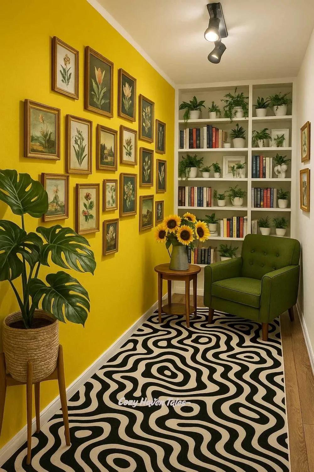
Yellow walls can sometimes feel too intense on their own, but when paired with graphic or patterned elements, the color softens and becomes more balanced. That’s why the bold black-and-white rug works so well here—it cuts through the brightness and grounds the space. The gallery wall of botanical prints also breaks up the yellow, giving the eye places to rest. Adding a green chair and plants was a natural choice, since green works as yellow’s complementary color, making the hallway feel lively yet composed.
12. Confident Yellow with Graphic Contrast
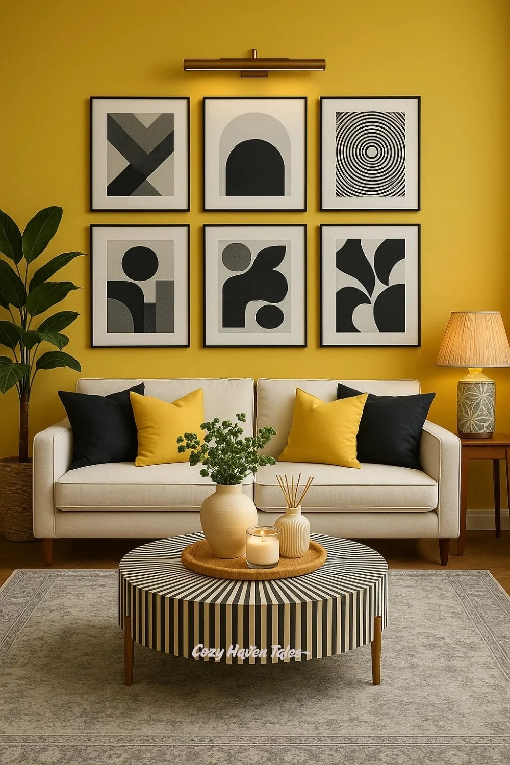
In this room, the yellow backdrop creates instant warmth, but I wanted it to feel sophisticated. I wanted to balance the brightness. That’s why I introduced graphic black-and-white artwork—when strong shapes pop against yellow, the color feels more muted and refined instead of overwhelming. The striped coffee table and monochrome cushions carry this balance forward, while softer beige and wood tones keep the room from feeling too stark. I wanted to show how yellow works beautifully when bold graphics step in to share the spotlight.
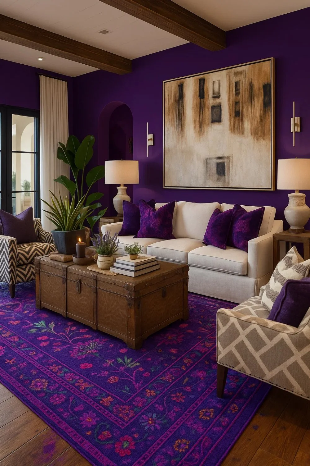
Purple Walls – Drama, Luxury & Depth
Purple is a color that naturally leans toward drama and sophistication. From deep plums to bold violets, it carries a sense of luxury that instantly elevates interiors. Unlike neutrals or softer tones, purple doesn’t fade into the background — it takes center stage, and the design around it must either harmonize or boldly contrast. These inspirations show how purple walls can transform living and dining spaces into statements.
13. Regal Purple with Monochrome Contrast
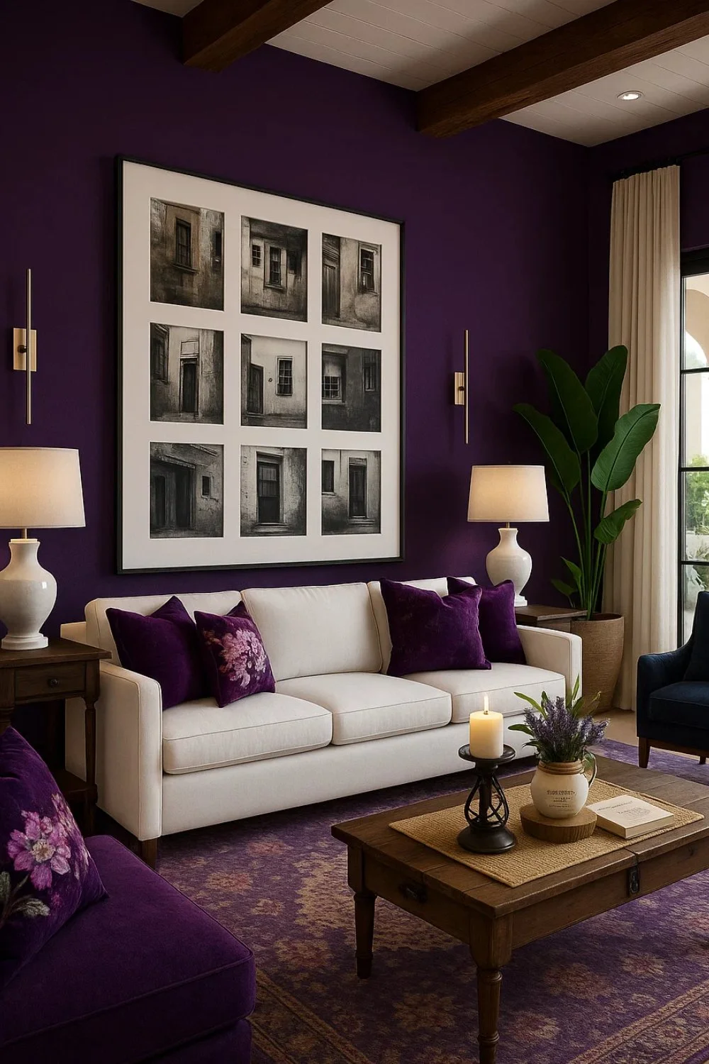
Here, the deep purple wall sets an instantly dramatic tone, but I wanted it to feel balanced and inviting. That’s why the light sofa and soft lavender accents come in—they keep the space from feeling too dark. The gallery wall of black-and-white photographs also plays an important role, making the purple look elegant rather than overpowering.
14. Layered Richness with Purple
Purple can quickly dominate a space, so I thought of using it both on the wall and the rug, but grounding it with beige seating. The mix creates a layered richness without overwhelming the eye. The cushions echo the purple tones, showing how repeating a color in measured ways ties the room together.
15 Modern Drama with Teal & Gold
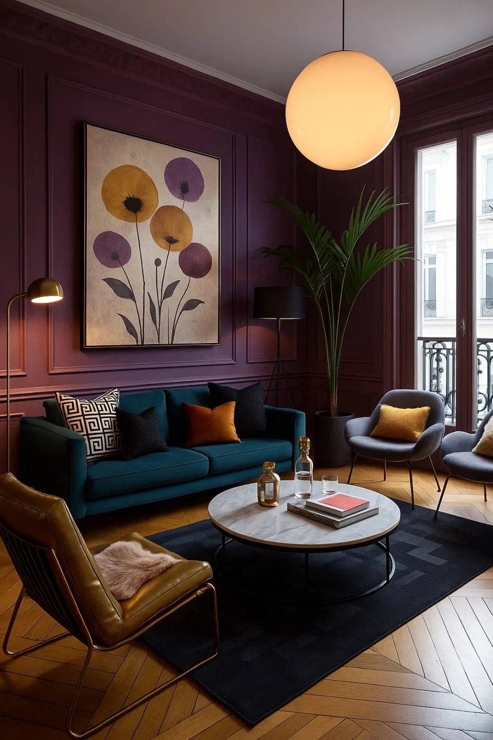
In this room, I wanted purple to feel warm and modern, so I considered pairing it with teal seating and golden accents. The combination makes the space feel both dramatic and cozy. The large floral artwork softens the wall, preventing the purple from looking too heavy.
16. A Floral Story in the Dining Room
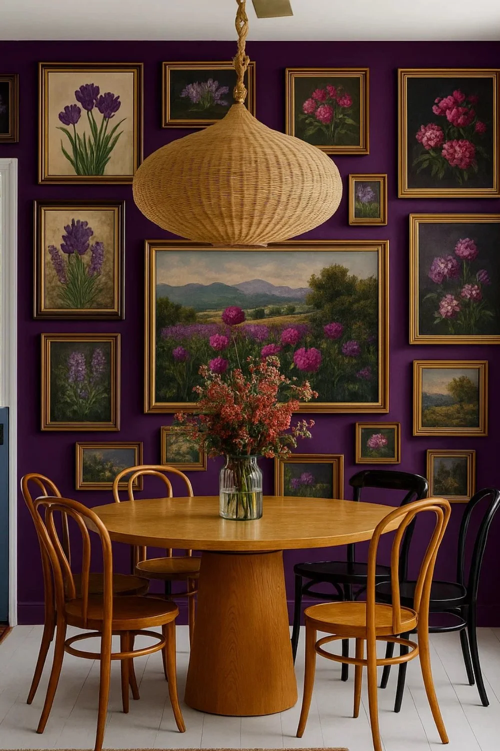
Purple often carries a formal vibe, but I wanted it to look more welcoming in this dining area. That’s why I introduced a floral gallery wall—it creates a story-like backdrop. The rattan pendant light and wooden chairs bring natural warmth, showing how texture keeps bold colors approachable.
Blue Walls – Calm, Cool, and Timeless
Blue has a natural ability to soothe and ground interiors. It reminds us of the sky and sea, bringing calmness and clarity into a room. From deep navy tones that feel dramatic to softer powder shades that feel refreshing, blue adapts beautifully to different moods. It’s a versatile color that can look bold or subtle depending on how you style it.
17. Jewel-Toned Blue with Vibrant Accents
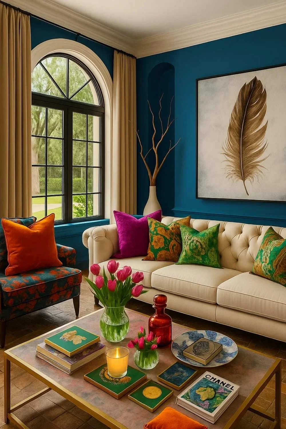
In this room, I wanted the blue walls to act like a jewel backdrop—something rich yet welcoming. To keep the energy alive, I paired them with bright orange and magenta cushions. The arched window brings in natural light, which softens the intensity of the colors, while the feather artwork grounds the look with a natural, earthy touch. For me, this setup shows how blue can carry vibrant accents without feeling chaotic.
18. Navy Blue with a Touch of Elegance
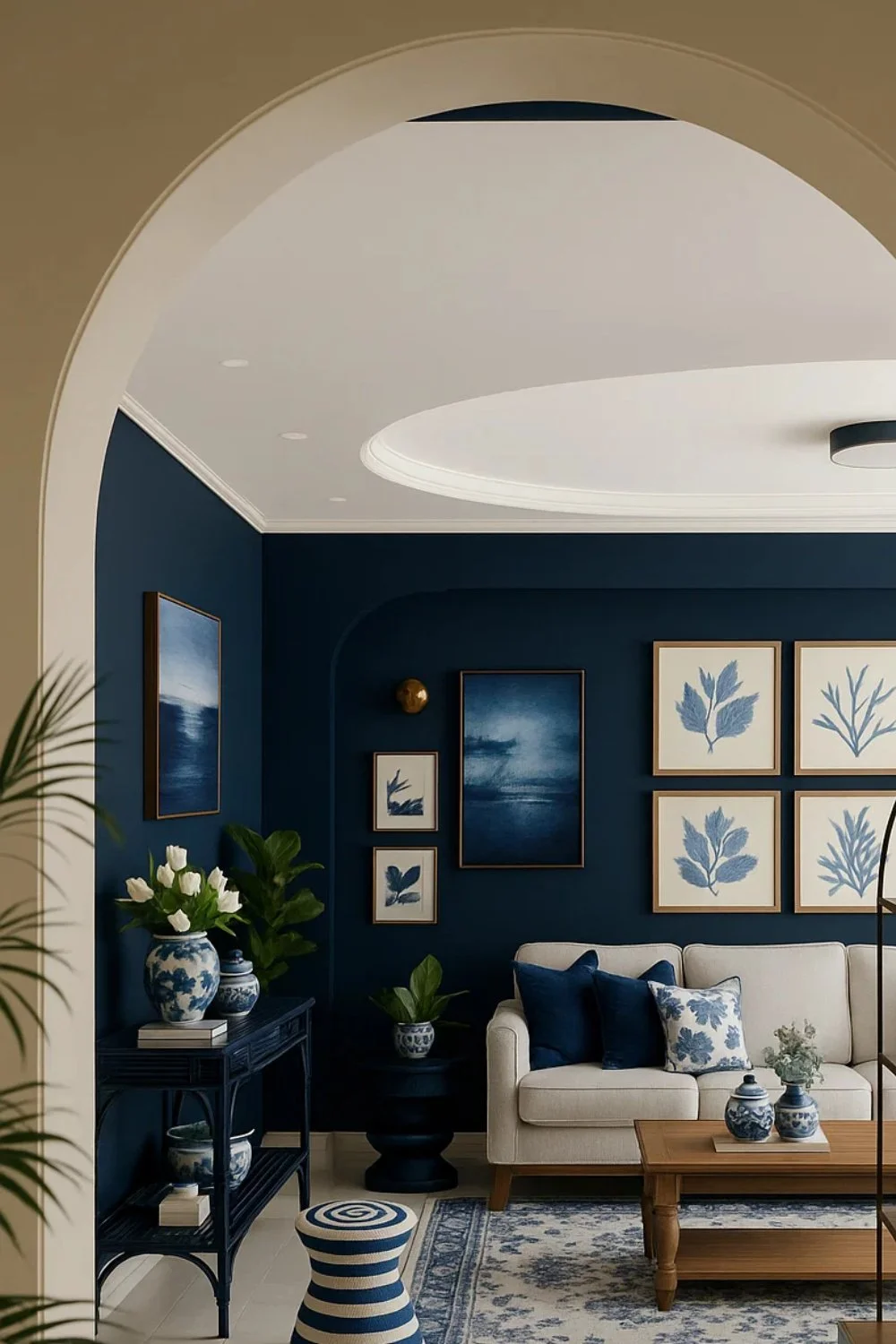
The navy walls immediately give this room a rich, classic atmosphere. I wanted to make sure it didn’t turn too heavy, so I paired them with light seating and botanical prints to lift the mood. The archway naturally frames the space, and adding gold accents gave me just enough warmth to balance the coolness of the blue. For me, this shows how blue can be traditional yet still feel fresh.
19. Deep Blue with Orange Contrast
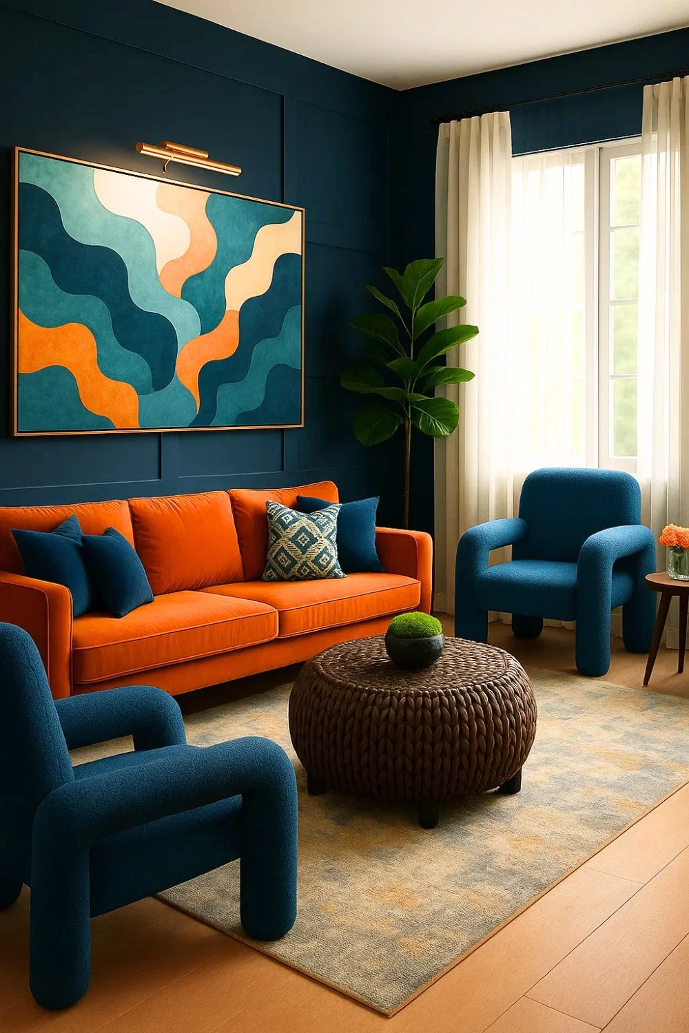
Blue finds its boldest expression when paired with orange. In this room, the deep walls set a dramatic stage, while the vibrant orange sofa adds confidence and energy. The abstract artwork bridges the two shades, proving how art can pull contrasting tones together. By keeping the rest of the space minimal with a simple rug and natural textures, the bold color duo takes center stage without overwhelming the room.
20. Soft Blue for a Relaxed Living Room
Unlike its deeper versions, this soft blue creates a light and airy backdrop. A gallery wall of black-and-white photographs adds contrast while keeping the palette calm. The neutral sofa and warm wooden table prevent the space from feeling cold, while greenery brings life to the corners. This room shows how pale blue can be the perfect choice for a relaxed, everyday living room—fresh, soothing, and endlessly versatile.
Orange Walls – Warmth with Bold Personality
Orange is a color that radiates warmth and vitality. It can feel lively yet grounding, making spaces both inviting and full of character. I often find orange interesting because it has the power to energize a room while still holding a sense of coziness. Depending on how it’s styled, it can look playful, dramatic, or even sophisticated.
21. Playful Contrast with Bold Patterns
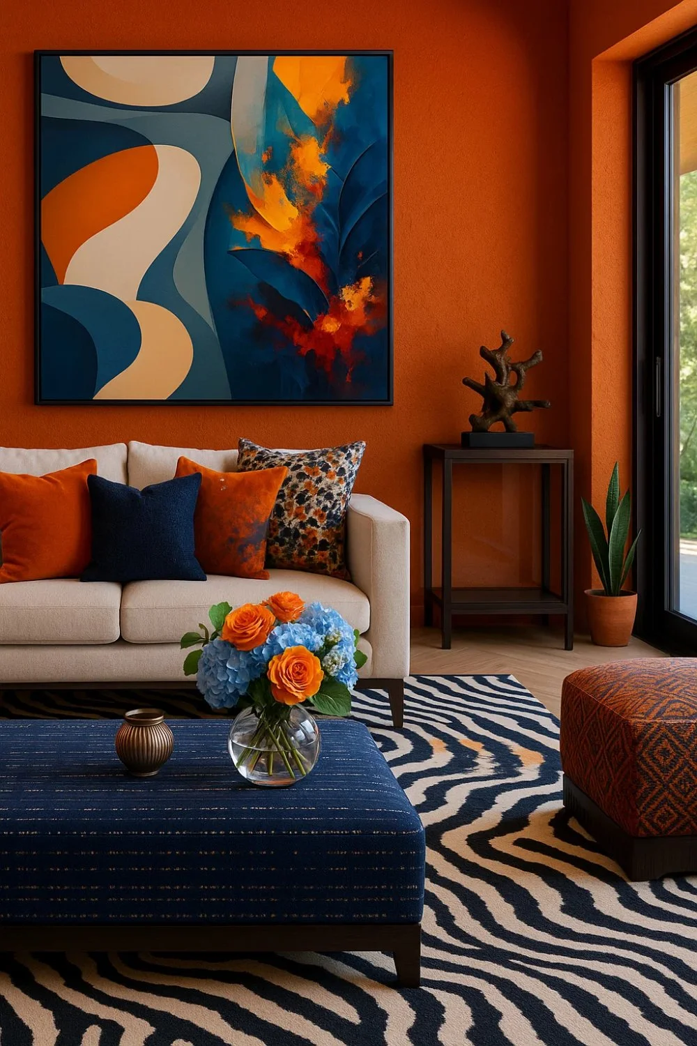
In this room, the orange walls set a vibrant backdrop that feels instantly alive. Somewhere I saw a design where a striped rug and a deep blue ottoman cut through the intensity, and I got inspired to try something similar here. I thought pairing them with abstract artwork would make the space more dynamic. The result is bold yet playful, with orange providing the warmth and blue adding striking contrast.
22. Terracotta Calm in a Transitional Space
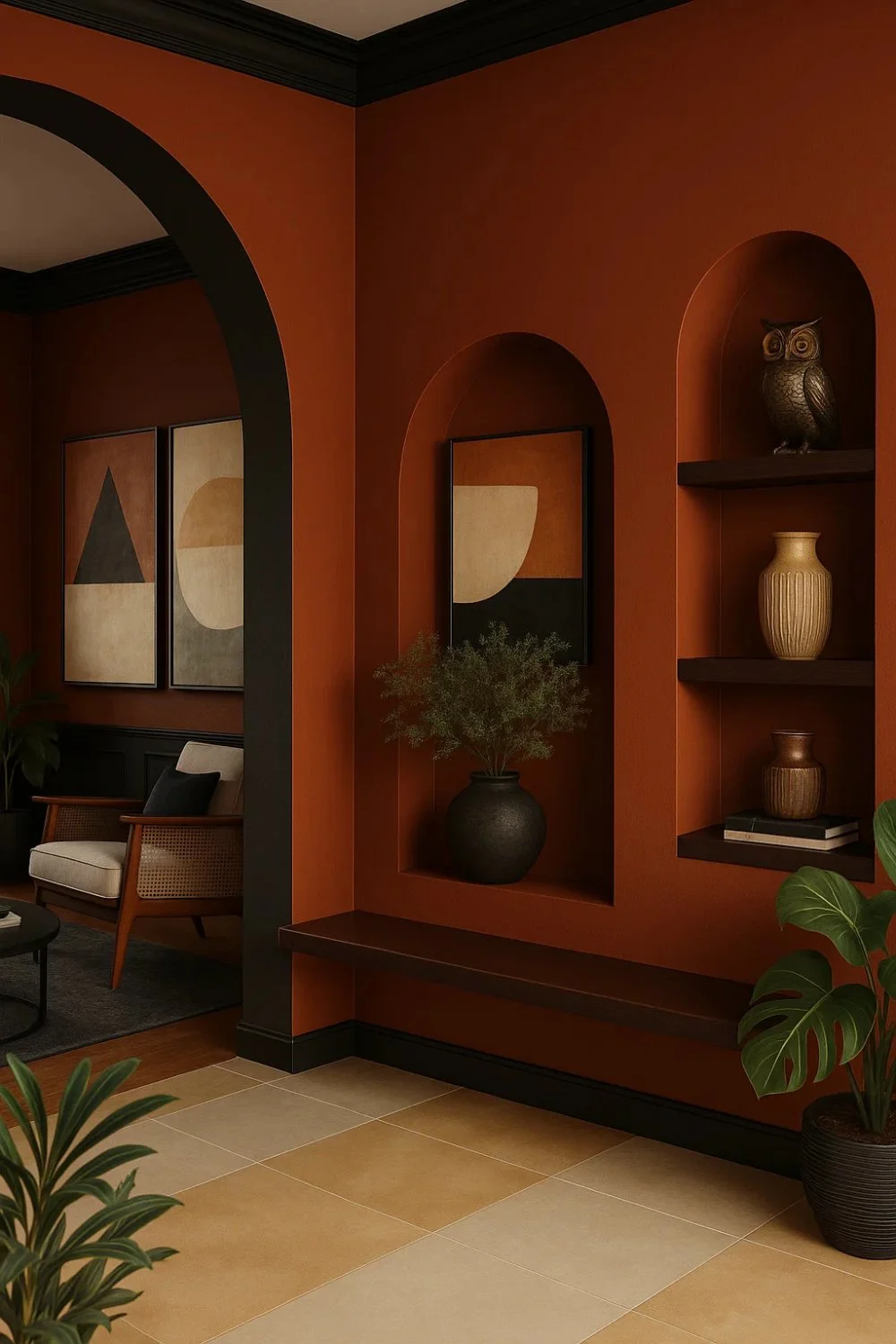
The terracotta-toned orange already felt strong, so I decided to balance it with earthy accessories. Adding pottery, wood textures, and greenery softened the boldness and connected the alcoves to nature. The curved niches naturally framed these elements, and the result is a warm, welcoming corner where orange feels grounded rather than overpowering.
23. Cozy Glow with Modern Accents
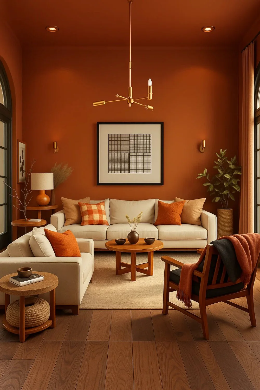
When working on this room, I thought about why I wanted orange to dominate. The idea was to create warmth without clutter, so I kept the furniture neutral—beige seating and soft wooden tones—letting the walls stay center stage. Orange cushions tied everything together, showing how you can keep the mood cozy and modern while still celebrating a bold wall color.
24. Dramatic Elegance by the Fireplace
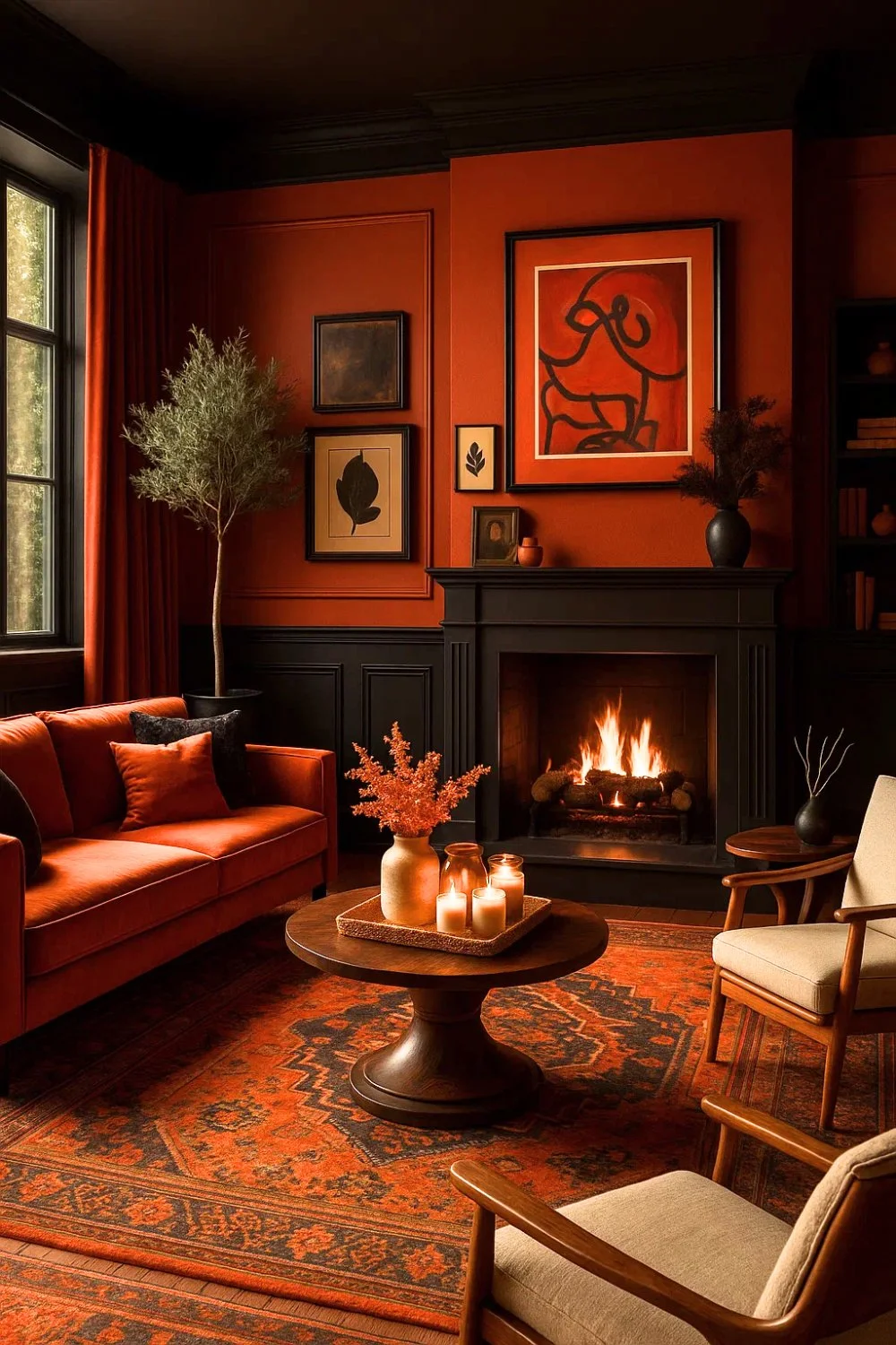
Sometimes people already have orange pieces—like a sofa or a rug—and don’t want to add contrasting colors. For this setup, I thought of using wainscoting in a deep grey just up to sofa height, while keeping the upper wall orange. This way, the palette stays predominantly orange but feels more layered and sophisticated. The darker base grounds the look, while the orange above keeps the energy alive.
Bringing It Together
Wall colors aren’t just backdrops—they set the tone for how a room feels. A deep red can energize, blue can calm, yellow can uplift, purple can add drama, and neutrals can ground the space. Each shade carries its own personality, and when chosen thoughtfully, it shapes both the look of a room and the emotions it evokes.
The walls are more than surfaces; they’re the canvas of a home. The right color doesn’t just decorate—it tells a story and creates an atmosphere that feels truly lived in.
FAQs
While lighter colors are often recommended for small living rooms because they reflect light and create an open feel, they aren’t the only option. Small spaces can look equally beautiful with deeper or bolder colors when used intentionally. Rich shades like deep blue, olive green, charcoal, or warm terracotta can add depth, character, and coziness rather than making the room feel cramped. The key is choosing a color that suits the room’s lighting, furniture, and overall mood—because feeling comfortable and connected to the space matters more than making it look bigger
Start by looking at your key pieces—sofas, rugs, and artwork. Neutral wall colors like off-white, greige, or warm gray create a versatile backdrop. You can then pull accent shades from décor elements (such as cushions or art) to develop a cohesive palette that ties the room together harmoniously.
Soft muted colors—such as light blues, gentle greens, warm taupe, or creamy neutrals—tend to make spaces feel serene and welcoming. These shades create a soothing backdrop, helping the room feel relaxing and comfortable without overpowering the senses.
Both options can work, depending on the mood you want. Neutral shades are timeless and flexible, making them great for long-term appeal and pairing with decor. Bold colors, such as deep blues or rich terracotta, add personality and drama when used thoughtfully—often as an accent or feature wall to avoid overwhelming the space.
Lighting dramatically changes how paint appears. Natural daylight makes colors look brighter and truer to tone, while indoor lighting (warm or cool bulbs) can make colors look softer or harsher. Always test paint samples in your room at different times of day to see how light transforms the hue.
Yes—choosing widely appealing and balanced colors like warm neutrals or subtle greiges can make a living room feel more inviting to buyers, which may improve resale appeal. These versatile colors allow potential homeowners to imagine their own furniture and décor in the space more easily.
Strong, highly pigmented colors—like neon shades or very deep tones—can feel overwhelming in some living rooms, particularly when natural light is limited. While these colors can be striking, using them in smaller doses often works better. Incorporating bold shades through feature walls, artwork, or décor allows you to enjoy their impact without sacrificing comfort or visual balance.
Purchase small sample pots and paint swatches directly on your walls. Observe them at different times of day under natural and artificial light. This lets you see how the colors truly behave in your specific space before committing to a full paint project.