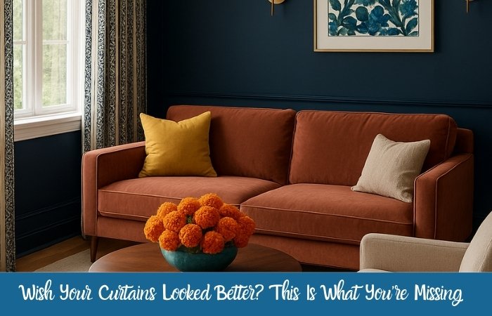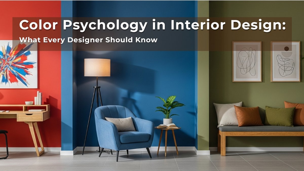
Color isn’t just about looks—it’s about feeling. A room painted in soft blues can calm your nerves. A splash of red can energize your senses. When you understand how colors affect emotions, you can design spaces that truly connect with people. That’s the magic of color psychology in interior design.
Let me walk you through the basics so you can start using color more intentionally in your designs.
Related Articles:
- How to Train Your Eye for Good Interior Design: A Beginner’s Guide
- Principles of Interior Design to Make a Room Feel Just Right
- The Best AI for Interior Design – Free Tools for New Designers
Why Does Color Psychology Matter?
As an interior designer, your job isn’t just to make rooms “pretty.”
It’s to make them feel right.
That’s where color psychology comes in—understanding how different colors impact mood, energy, and perception.
Even subtle changes in hue or saturation can make a room feel:
- Warm or cool
- Spacious or cozy
- Stimulating or soothing
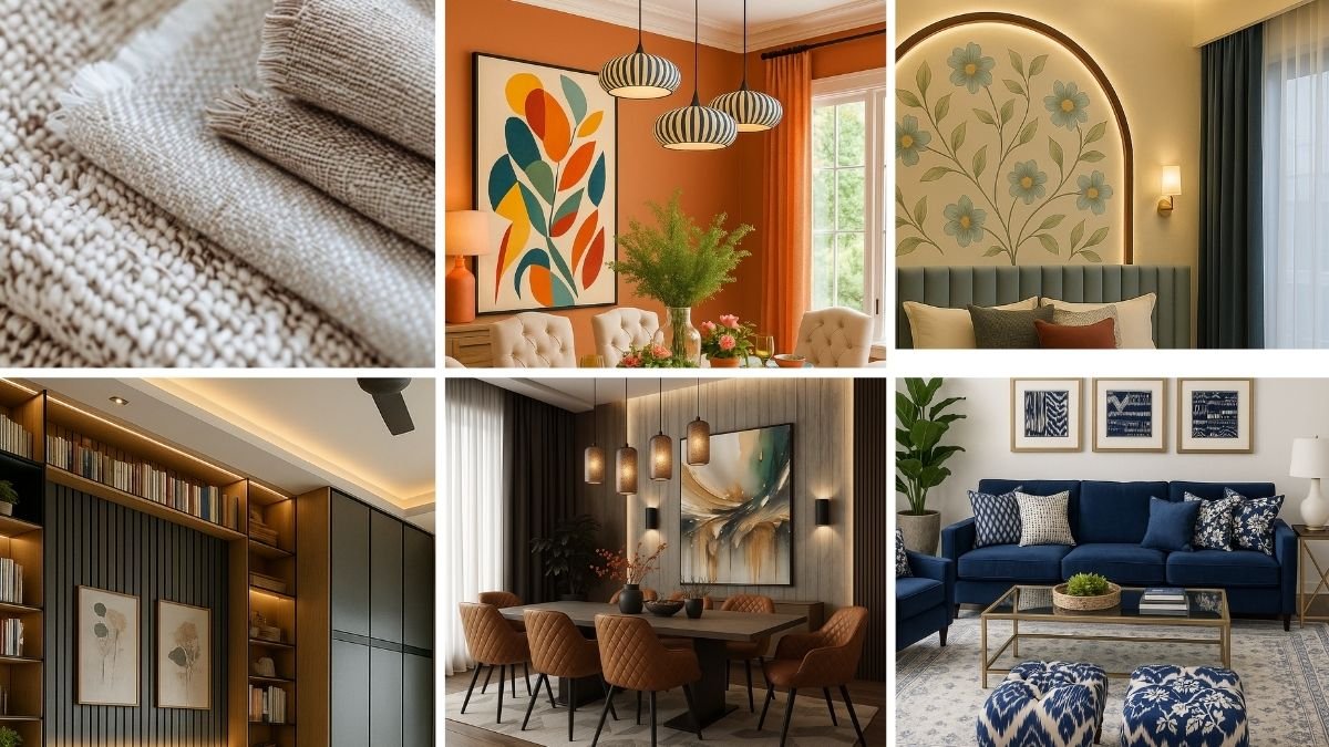
The Emotional Power of Common Colors
Here’s a quick guide to how common colors are often perceived:
🔵 Blue: Calm, Focus, Stability
Great for bedrooms, offices, and bathrooms
Lighter shades feel peaceful, while deeper blues feel grounded and sophisticated.
🔴 Red: Energy, Passion, Warmth
Works well in dining rooms or social areas
Best used as an accent color—it can feel overwhelming in large doses.
🟡 Yellow: Cheerfulness, Optimism, Warmth
Brightens small spaces like kitchens or hallways
Soft buttery tones feel cozy; bright yellows can be energizing but should be balanced.
🟢 Green: Harmony, Nature, Renewal
Perfect for living rooms or reading nooks
Feels balanced and relaxing—especially when paired with wood and natural textures.
⚪ White: Clean, Simple, Open
Makes rooms feel bigger and brighter
But too much white can feel sterile—layer it with textures and warm accents.
⚫ Black: Sophisticated, Bold, Dramatic
Adds depth and contrast
Use in moderation to highlight features or create focal points.
🟤 Brown/Beige: Stability, Comfort, Earthiness
Great for grounding a space and creating a cozy, timeless backdrop
Works well in transitional and rustic designs.
How to Choose Colors That Fit the Purpose of a Room
Ask yourself:
- What is the main function of this space?
- Do I want people to feel relaxed, energized, focused, or playful?
Then, select colors that support those feelings.
For example:
- Bedrooms → calming colors like blue, green, soft neutrals
- Dining areas → warm tones like terracotta, gold, or even red
- Home offices → cooler tones like soft gray-blue or sage green for focus
Don’t Forget Cultural and Personal Associations
Color meaning can also vary by culture and personal experience.
For example, white symbolizes purity in some cultures and mourning in others.
Always consider your client’s background and emotional connection to certain colors—what feels soothing to one person might feel cold or sad to another.
Final Thoughts
Color psychology is more than theory—it’s a powerful tool in your designer toolkit.
When used wisely, color can:
- Set the mood
- Influence how people interact in a space
- Even affect how big or small a room feels
Practice observing how different colors make you feel in real-life environments. That’s how your intuitive color sense will grow.