Working from home has become a new normal for many of us. While I absolutely love the comfort and flexibility it brings, I also realized that the space we work in has a huge impact on our mood, energy, and focus. One of the most underrated ways to improve your home office is by choosing the right paint color. Believe me, after experimenting with a few shades myself, I noticed how certain colors either made me feel sluggish or surprisingly productive.
If you’ve ever struggled with staying motivated or focused in your home office, your wall color might have more to do with it than you think. Today, I’ll be sharing 8 paint colors that can truly help boost productivity when working from home. These aren’t just trends—they’re backed by color psychology and personal experience.
Related Article-
- Bedroom Refresh Ideas to help you achieve transformation!
- Paint Colors to Avoid When Selling Your Home
- 15 Budget Friendly Decor Ideas to Make Your Home Cozier
1. Paint colors for home office For Calm Focus – Soft Blue
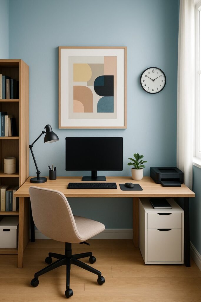
Blue has always been known for its calming properties, but a soft, muted blue can actually help you stay focused for longer periods. It lowers your stress levels while keeping your mind alert. I once painted my workspace a pale sky blue and felt an instant sense of calm every morning—it really helped reduce that overwhelmed feeling.
🖌️ Try shades like: Sherwin-Williams ‘Misty’ or Benjamin Moore ‘Breath of Fresh Air’
2. Warm White – For Clarity and Clean Thinking
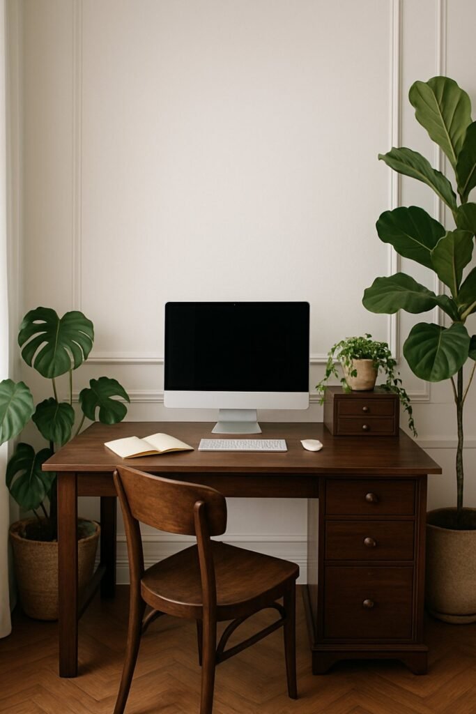
If you like a minimalist and clutter-free space, warm white is a wonderful choice. Unlike stark white, a warm white feel cozy yet bright enough to keep your mind sharp. I often recommend this to friends who are easily distracted by bold colors. It pairs well with wooden furniture and natural light too.
🖌️ Try shades like: Behr ‘Swiss Coffee’ or Farrow & Ball ‘Pointing’
3. Earthy Green – For Mental Balance
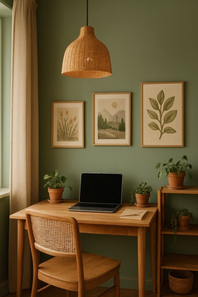
Green reminds us of nature, and nature, in turn, reminds us to breathe. An earthy green can ground your thoughts and offer a subtle backdrop for creative and strategic thinking. It’s perfect if your work involves decision-making or you simply want to avoid burnout.
🖌️ Try shades like: Benjamin Moore ‘Saybrook Sage’ or Dulux ‘Oregano’
4. Muted Yellow – For Energy Without Overstimulation
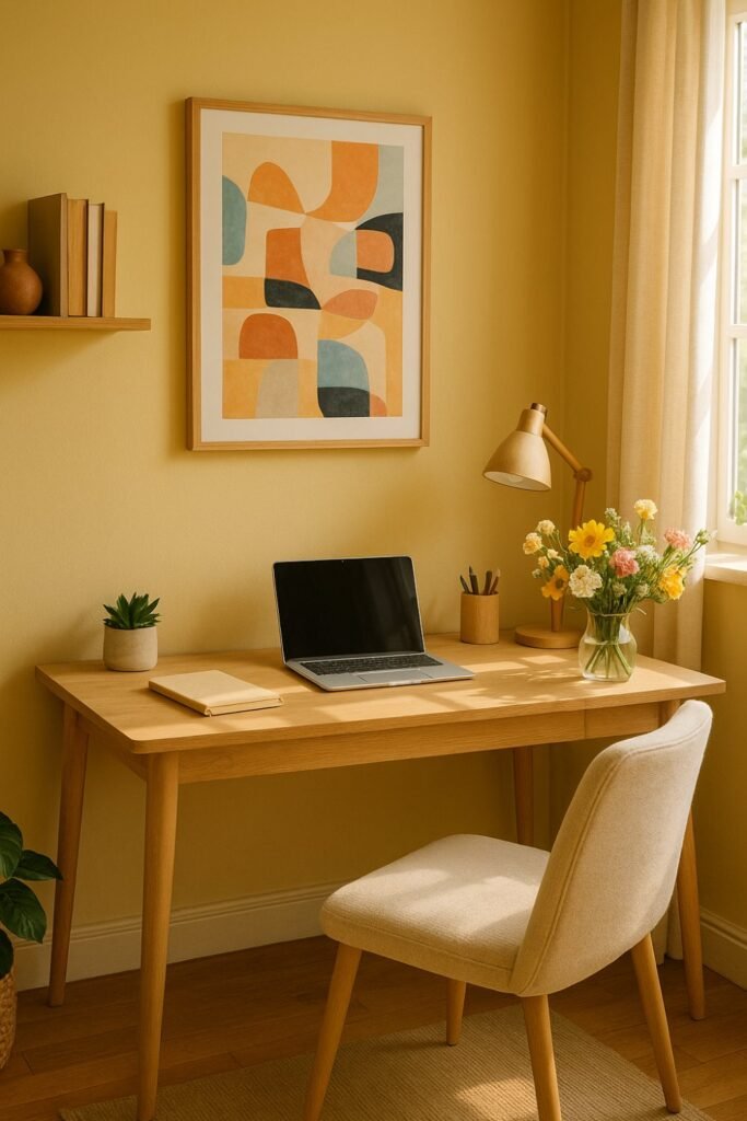
I used to be sceptical about yellow—wouldn’t it be too loud? But when done right, a soft muted yellow brings warmth and positivity without being too bright. It’s perfect for those grey mornings when you need a gentle energy boost to get going.
🖌️ Try shades like: Valspar ‘Golden Maize’ or Sherwin-Williams ‘Friendly Yellow’
5. Pale Lavender – For Creative Flow
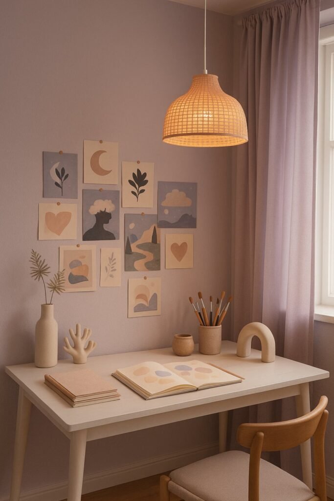
Lavender has this magical way of calming your nerves while unlocking your creativity. I once added a pale lavender accent wall behind my desk, and it subtly encouraged a more creative mindset—especially helpful during writing or brainstorming sessions.
🖌️ Try shades like: Behr ‘Periwinkle Bud’ or Benjamin Moore ‘Lavender Mist’
6. Dusty Rose – For a Gentle Motivator
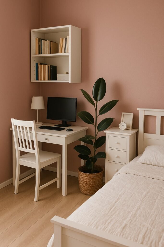
If you like soft feminine tones, dusty rose or blush pink might be your unexpected productivity partner. It brings a sense of comfort and emotional balance. A designer friend of mine swears by it for her client calls—it gives the room a friendly, welcoming glow.
🖌️ Try shades like: Farrow & Ball ‘Pink Ground’ or Sherwin-Williams ‘Rosy Outlook’
7. Cool Gray – For a Sophisticated, Distraction-Free Zone
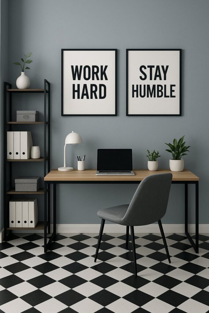
Gray gets a bad rap for being dull, but a soft, cool gray actually helps eliminate visual noise. It creates a sense of order, especially if you like your workspace to feel neutral and grown-up. It works beautifully with black, white, or natural wood accents.
🖌️ Try shades like: Benjamin Moore ‘Gray Owl’ or Behr ‘Silver Drop’
8. Teal – For Balance Between Calm and Energy
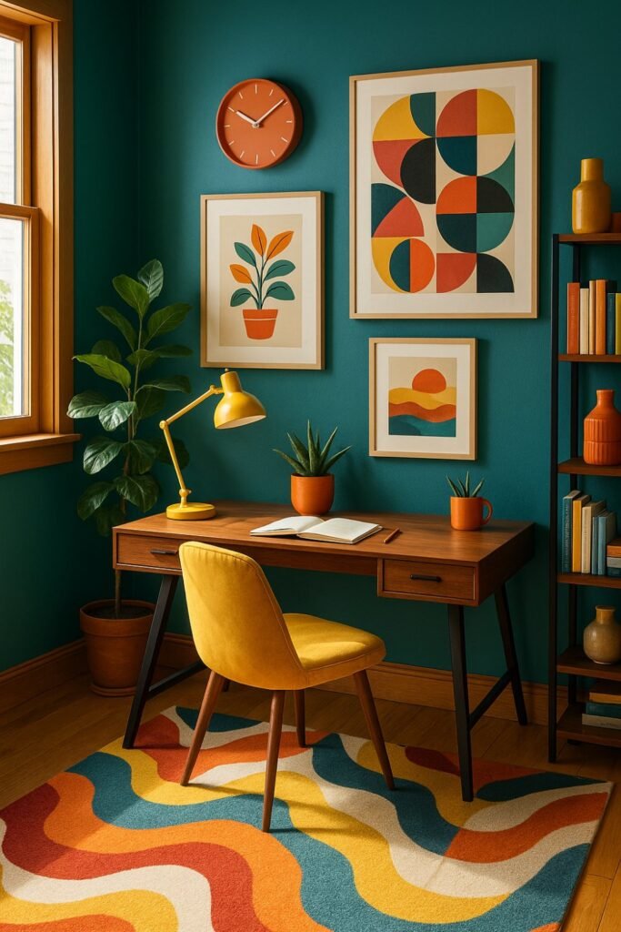
Teal is one of those colours that somehow energizes and calms at the same time. It’s a confident choice—great for those who need mental stimulation without feeling frantic. I recently saw a client use teal for their Zoom backdrop, and it looked absolutely striking without being distracting.
🖌️ Try shades like: Sherwin-Williams ‘Waterscape’ or Valspar ‘Sea Swell’
Final Thoughts:
Choosing the right paint color for your home office isn’t just about aesthetics—it’s about creating a space where your mind can thrive. Each shade I’ve shared here has a unique personality, and the best part is, you can find one that suits your kind of workday.
Take a moment to reflect on how you want your workspace to feel—do you need energy, calm, clarity, or creativity? Your answer will lead you to the right color.
After all, our walls are silent companions throughout the workday—why not let them help you do your best work?